Children’s Healthcare of Atlanta Mural Designed for Paint Love
Illustration, Environmental
2019
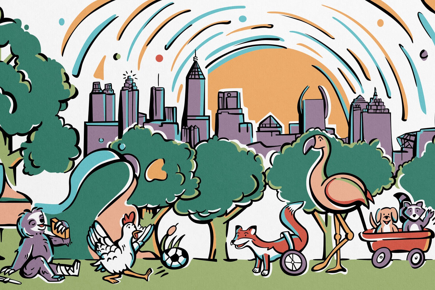
A collaboration with the Children’s Healthcare of Atlanta (CHOA) and Paint Love to bring to life playful characters in a colorful mural that warms and welcomes kids in the hospital’s intake hallway.
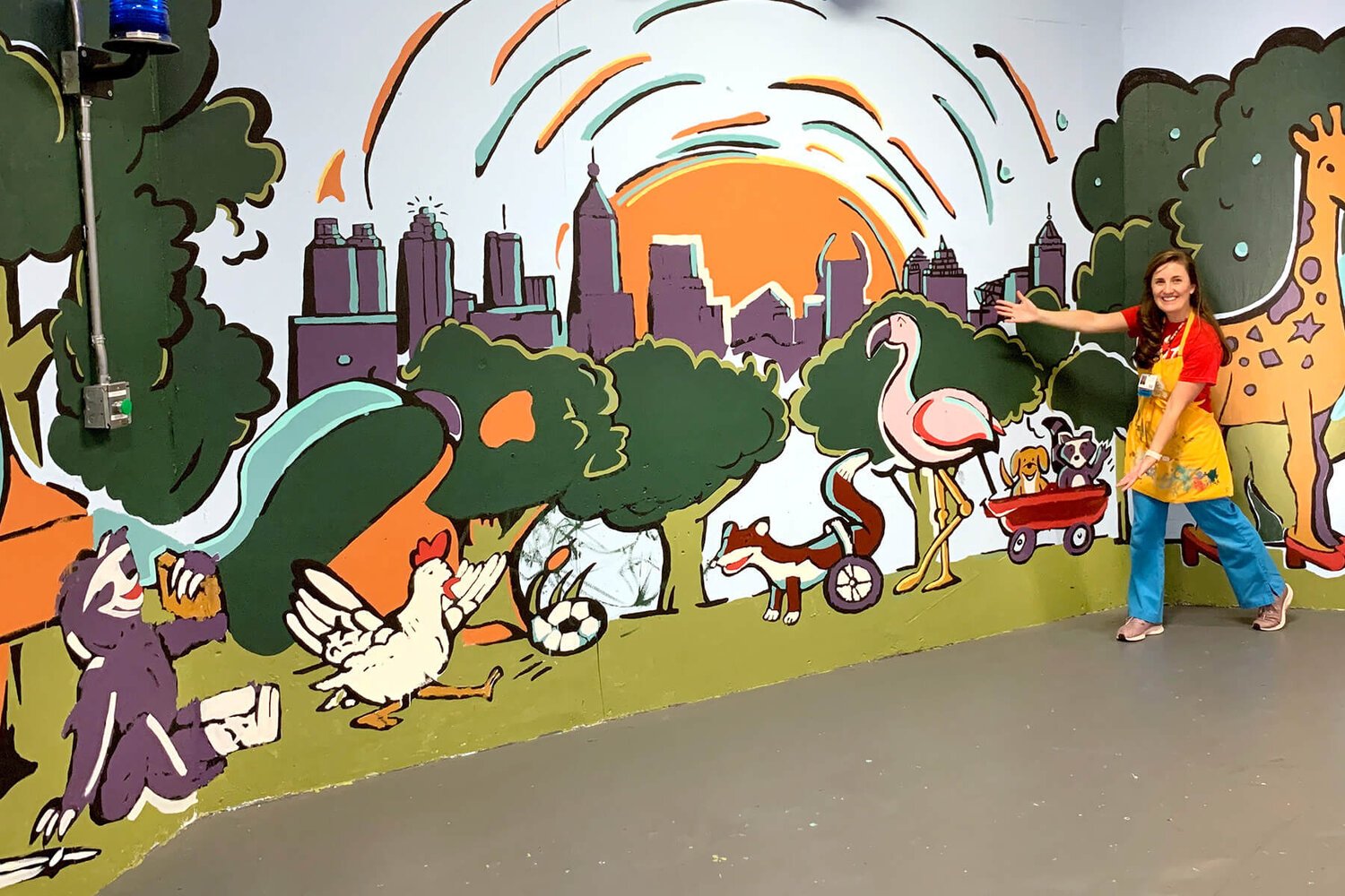
This illustrated mural depicts colorful characters that were brainstormed by the children in the hospital and is designed to span three walls along an 80ft hallway that serves as the entrance to the hospital. As kids enter, the canvas’ colors all start to pull together in shapes and blobs and create a rich scene filled with the characters playing together to warm up the hallway and welcome the kids to the hospital and make them feel a little less afraid (and, per the kids’ direction: the animals who may be injured are all having just as much fun!)
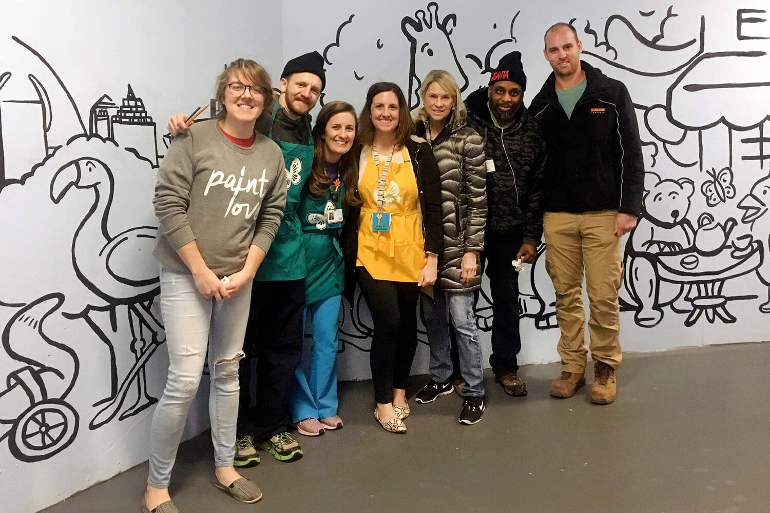
This was an absolute joy and privilege to work on, and a wonderful collaboration between CHOA’s Artist in Residence, Caroline Snodgrass, and Paint Love, a nonprofit in Atlanta that provides extraordinary arts programming to kids facing poverty and trauma. Thank you to Caroline and Paint Love for working with me on this, and to all of the kids at the hospital and Paint Love volunteers who came to paint the mural and bring it to life!


CHOA’s Artist in Residence, Caroline Snodgrass, worked with the kids to come up with a list of characters that they wanted to see created for the mural. The kids developed these playful animal figures with a special focus on showing some animals that may be injured or ill – but that are having just as much fun as any of the other animals! So from a pig dancing around her IV pole to a wheel-bound fox playing soccer, all 17 of the mural’s characters were brainstormed by the kids themselves.
Some of the characters are just playful and silly – like a giraffe in high heels – while some of the characters have special meaning to the kids. For example: in the hospital, older children help younger children by pulling them around in little red wagons. The kids wanted to depict this by the taller flamingo pulling around a couple of smaller, baby animals.
Measuring out the space, I then designed all of the characters that the kids came up with and created a scene around them to fill the walls – placing each character at slightly varying heights so that at least one character can meet the eye height of a younger or older, taller or shorter, walking or wheelchair-bound child. This way, the mural is interactive and personal for every child that comes in.
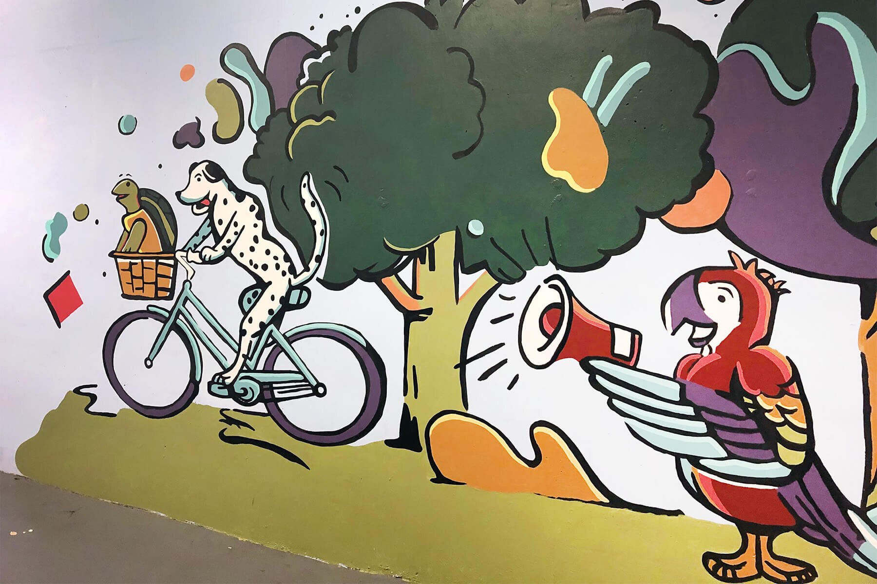
The mural’s design tapers off at the left and right sides, as if the paint runs out at the ends. The result creates a special effect for kids entering from the intake door. As each child enters (from the left), the colors come together, and the scene gets more and more full, colorful, and filled with characters as they approach the door. The idea behind this was to start to warm up the hallway with color and fun so that it feels less scary as a child approaches the hospital entrance at the far right end of the hallway (it also creates a fun opportunity for two characters, the Dalmatian and the turtle, to try to bicycle off of the edge of the “canvas” for an escape!)


Planning the style of the mural was also a special challenge. The mural was going to be completed by a mix of kids from the hospital, their parents, and volunteers from Paint Love – which would include some less-artistic volunteers as well as some professional artists. Because of this, I designed with a relatively limited color palette (for cost effectiveness) and with a black-outlined style around all of the buildings, objects, and characters, with larger solid areas of color fills inside the lines. This way, the more advanced artist volunteers could come in first and lay out the black layer which would effectively then make filling in the colors a paint-by-numbers assignment. Then, having the kids and their parents get involved became an easier opportunity for anyone of any artistic background to contribute to the mural! At the end, Paint Love artists retraced the black lines to help clean up the edges and complete the mural.


