New York Magazine, Summer Wine Pairings
Illustration
2019
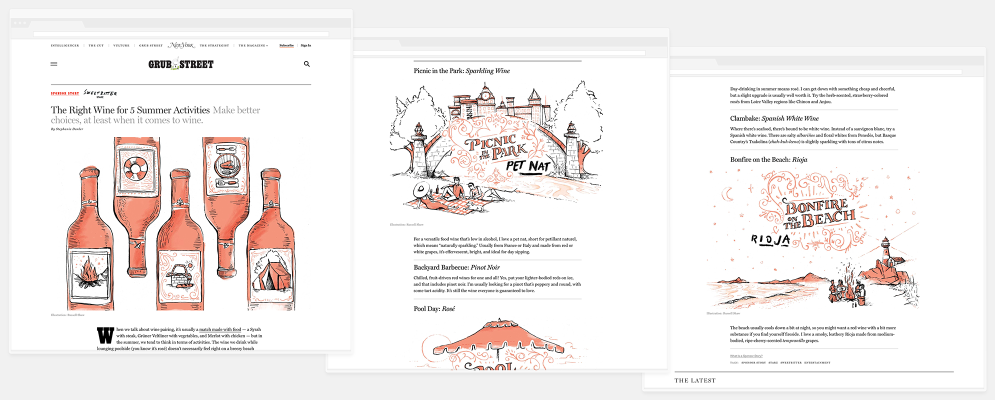
Illustrations for New York Magazine’s article with Sweetbitter’s Stephanie Danler on five wines that pair well with your favorite summer activities.
I worked with the New York staff to create the artwork for this article, “The Right Wine for 5 Summer Activities: Make better choices, at least when it comes to wine,” written by Stephanie Danler, ahead of the Season 2 premiere of the Starz adapation of her book, Sweetbitter.
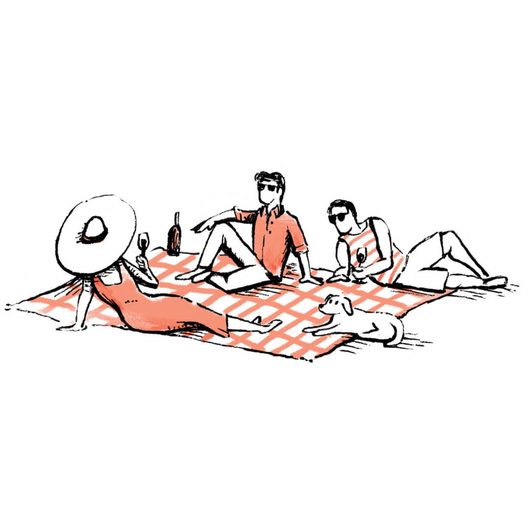
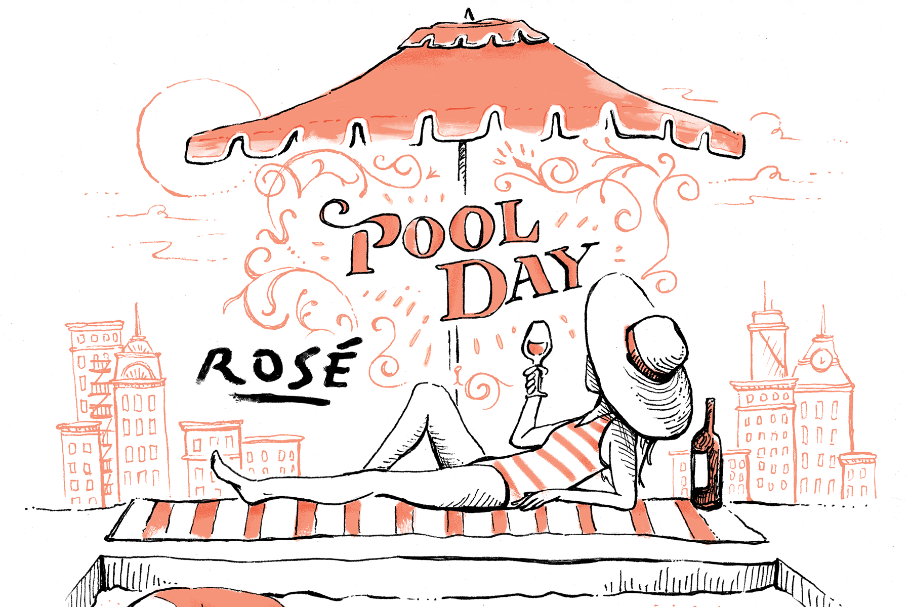
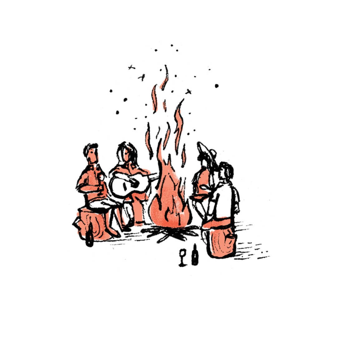
The artwork has a rough, hand-drawn illustration and lettering quality that pairs well with the messy, charcoal lettering of the book and show’s title. It also uses a single pop of color — the book and the show’s warm, peachy color — to carry through all of the illustrations. Each illustration shows the scene that the article is referencing (a picnic in the park, for example, for a sparkling wine), and features an elegant hand-lettered and classically detailed wine label with that activity — almost like each summer activity becomes the wine label itself.
“A Bonfire on the Beach pairs with Rioja”

“A Picnic in the Park pairs with Sparkling Wine”


“A Pool Day pairs with Rosé”
Credits
Art Directors
Jon Varriano, Kristina DiMatteo
Illustrator
Russell Shaw


