Coxe Curry & Associates
Branding, Creative Direction, Art Direction, Strategy, Guidelines, Design, WEb
2024
Coxe Curry & Associates is the Atlanta consulting firm creating the strategies and connections that help nonprofits thrive. They believe in a high-touch, high-standard, high-performing approach to doing business—and doing good.
For decades, Coxe Curry & Associates helped large and small organization with big dreams take their next step—or leap—forward. As they approached their 70th anniversary, they decided it was time to take a leap of their own.
Leading up to this pivotal milestone, Ali Abercrombie (Chief Operating Officer) and Paige Sullivan (Associate Director) reached out to me to partner directly with their team on a complete rebrand that would more accurately reflect the firm's direction, culture, values, and vision. Together, we worked through strategic positioning. Along with an entirely new visual identity that put the renewed brand strategy on display, we also created a comprehensive set of brand guidelines, updated internal and external collateral, partnered with an architecture firm on visuals for their new office space, and entirely overhauled their website.
Thank you to Ali, Paige, and the entire Coxe Curry & Associates team — they are truly a special organization full of exemplary people, and an institution in their industry and in Atlanta. It was an honor to collaborate with them on charting the course for the next chapter.

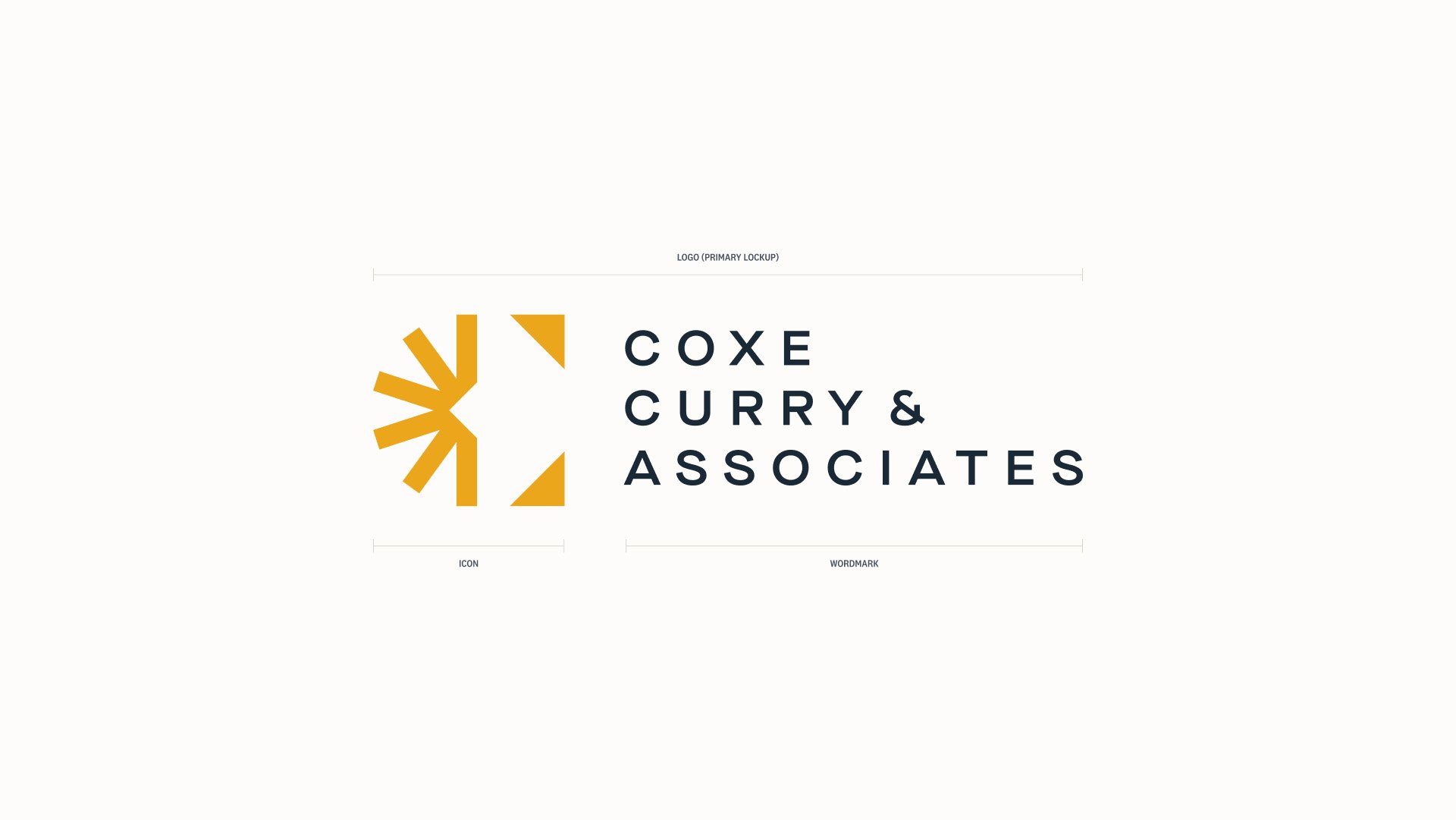

Logo Design
The heart of the new logo is the Radiant Monogram—an abstract capital “C” representing the brand as both a connector and as a multiplier effect.
from the Brand Guidelines
“Optimistic and focused on the future—we believe a bright future is attainable when innovative leaders navigate the way.
“Building blocks of collaboration, bringing together and connecting leaders and organizations from various backgrounds.
“Growth-oriented, ever stretching and scaling the bounds onward and outward.”

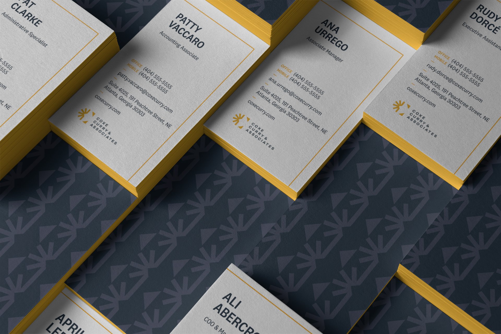
The firm’s new color palette features a striking and energetic gold color, used with creamy whites and a range of dark, slate tones. It brings a boldness to all of the visuals that was lacking in the muted, earthy tones of the previous identity.
The typographic system is built around National 2 Narrow by Klim Type Foundry — an agreeable and workmanlike sans-serif whose tall letterforms balance nicely against the customized, expanded typography of the wordmark.
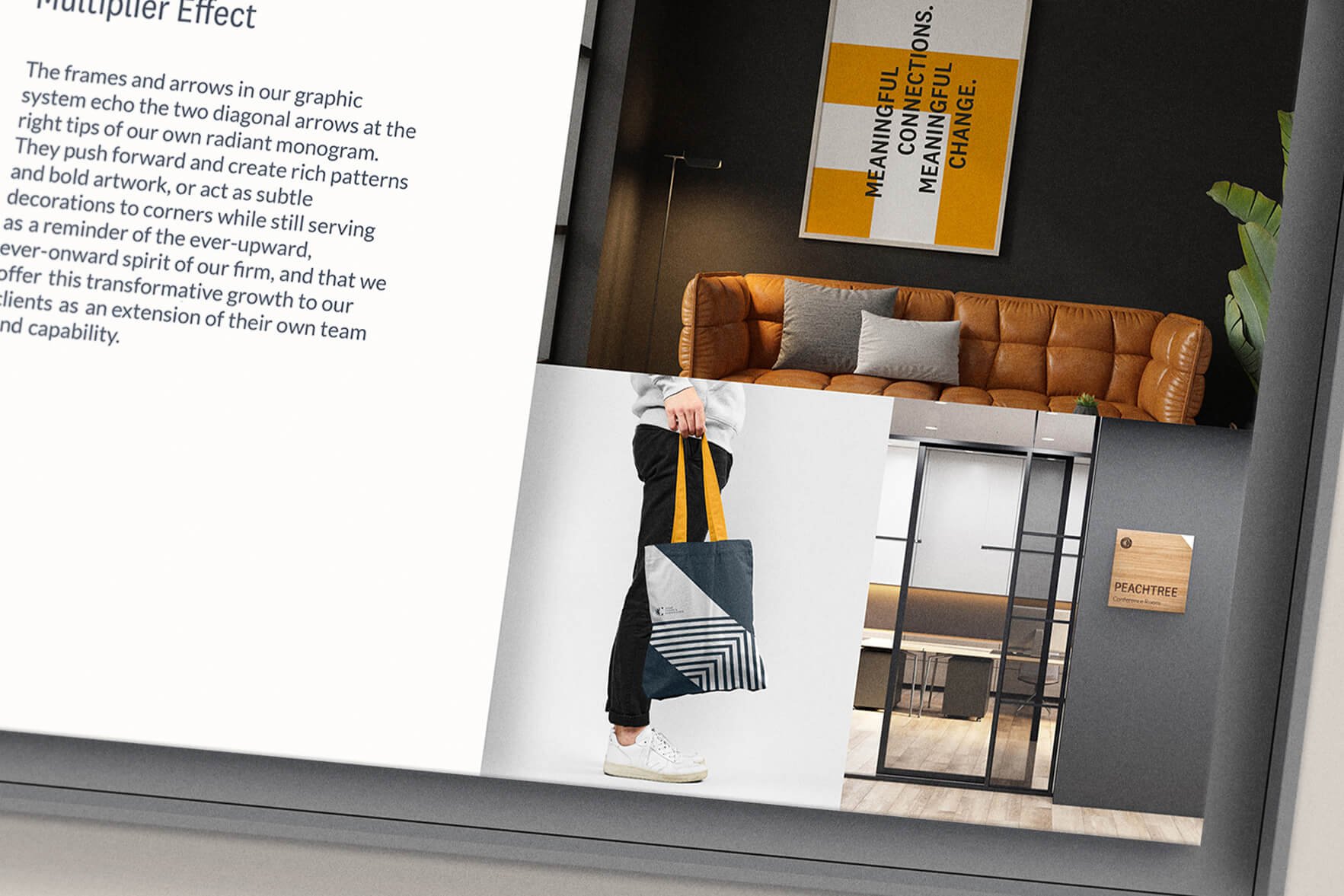
The creative and art direction is built around the multiplier effect motif: the frames and arrows in the graphic system echo the two diagonal arrows at the right tips of the radiant monogram. They push forward and create rich patterns and bold artwork, or act as subtle decorations to corners while still serving as a reminder of the ever-upward, ever-onward spirit of the firm, and that Coxe Curry & Associates offers this transformative growth to their clients as an extension of their own team and capability.

We created a library of over 50 icons that cover concepts related to the firm’s work, as well as represent their newly established set of core values: People First; Tailor Made; Extra Mile; and Future Focused.

Web Design
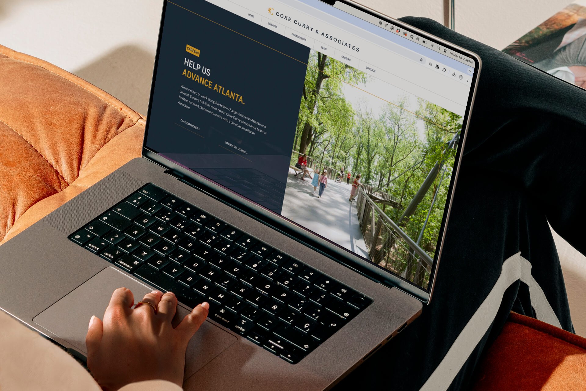
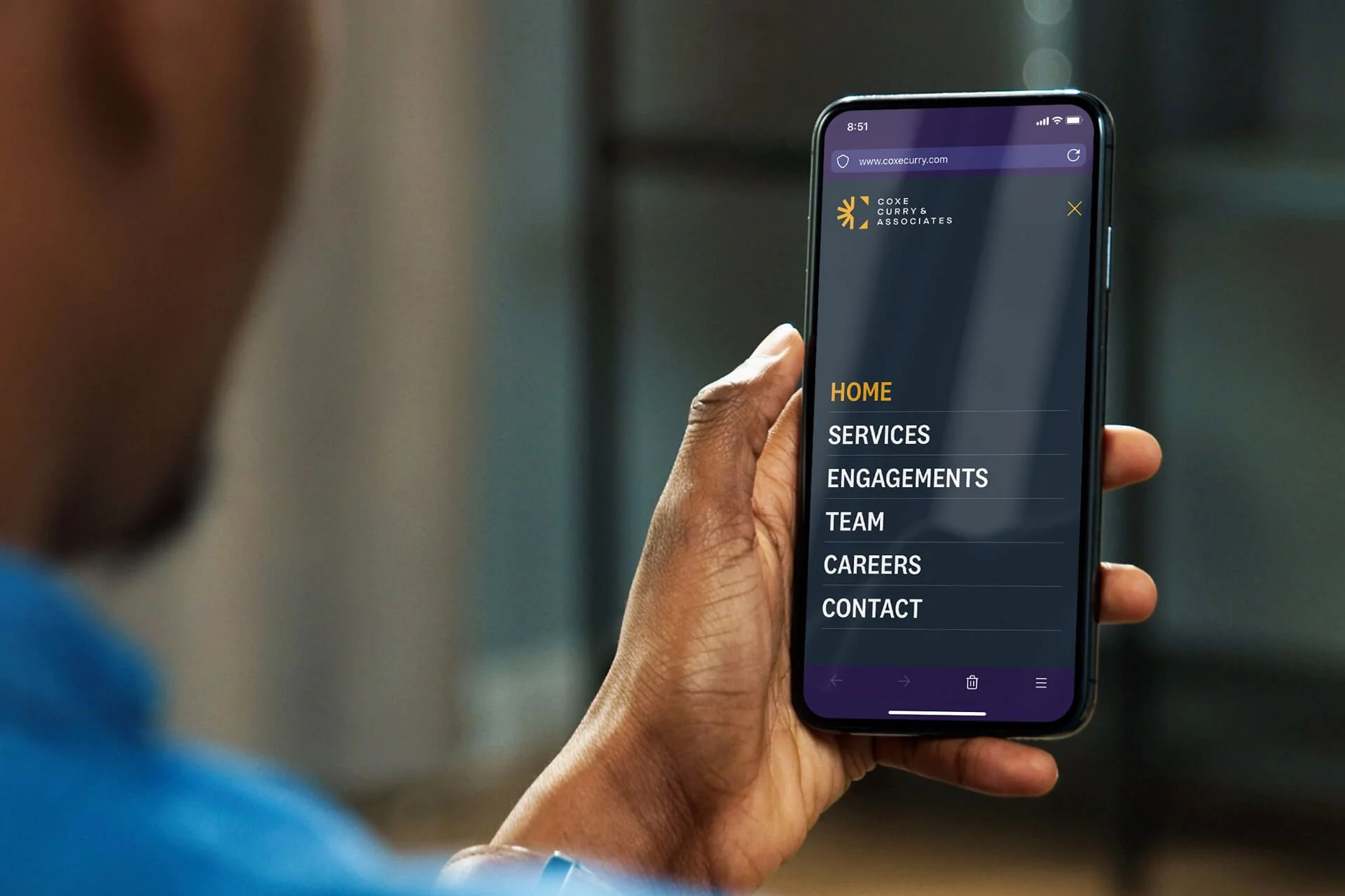
The previous website ran on a platform that was outdated and cumbersome for the team to update. We re-platformed the site to a CMS that would be easier to maintain, and completely redesigned the visuals and content from the ground up in the process. The result is a website that more comprehensively tells the brand story and the stories of impact that the firm has had on the community through its engagements with local nonprofits and organizations.

We partnered with the wildly talented Molly Dickinson and Acree Macam to verbally push the brand forward by leaps and bounds—they created brand messaging and brand voice guidelines that strongly and succinctly communicated the story of the firm, and also established guidance for the internal team to write stories and messaging in a consistent tone of voice in the future.

One of my favorite elements of the new site design is the page that showcases the entire team. We commissioned cohesive, art-directed portraits of the entire staff, partnering with the talented Andrew Thomas Lee for all of the photography.


Social Presence
We also overhauled all social surfaces for the brand and created—and are continuing to add to—a suite of templates for the internal team to continue to share on-brand images and stories.


Presentations
We also worked together on establishing a master slide presentation template that uses all of the new branding and graphic elements in a flexible way for staff to continue to use.


Office Branding
Another one of my favorite expressions of the brand was how it has translated to the physical office: we created a custom wallpaper that uses the branded pattern.

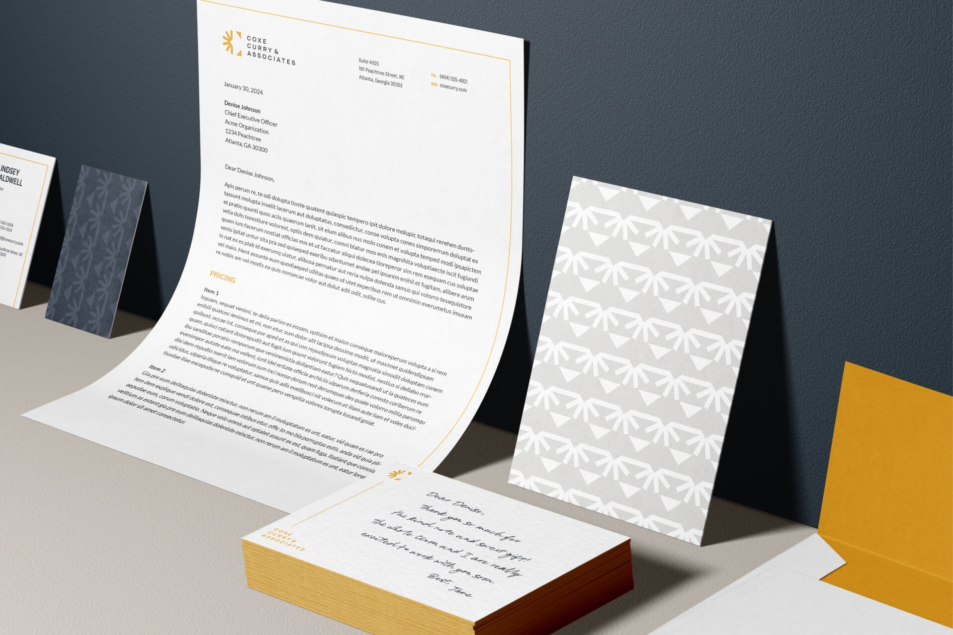
We also created a suite of collateral, branded apparel, and gifts to instill pride in the new brand for the employees, as well as present a consistent and cohesive look-and-feel in all materials.


