
Docusign
CReative Direction, Art Direction, Strategy, Guidelines, Design, Illustration
2024
“The world knows Docusign as a digital dotted line — but that’s changing.
As pioneers and leaders of the eSignature category, our brand has always been associated with the signature. It’s well established and much loved throughout the world by both senders and signers, but it's more representative of the last 20 years than the next 20 years.
We are now pioneering a new category — Intelligent Agreement Management — and launching a new platform for it with Docusign IAM. We think of it as a full company reinvention. We needed to do more than just refresh the brand — we needed to build a new foundation and create a brand that could bring the IAM vision to the world. This meant designing a new brand architecture, new logo marks, new color palette, new icon system, new sonic brand, and more.”
— Carla Weis, Senior Director, Brand and Creative, Docusign
”Our Bold New Brand: Bringing Agreements to Life”
In late 2023, Carla Weis (Senior Director, Brand and Creative) reached out to me to work closely alongside Docusign’s internal brand team on an exciting project: crafting an entirely new brand identity for this well-known and beloved platform. The company was in the midst of a major directional change—moving away from its origin story as an eSignature company, and defining a new product category (Intelligent Agreement Management) that it sought to lead.
This is the type of rebranding work that carries so much importance to me: not a logo change, color palette overhaul, or different suite of visual assets merely for the sake of change. Instead, the external changes serve as a signal for a larger, more fundamental shift for the organization.
I worked closely with the amazingly talented internal brand team full of truly wonderful humans on brand strategy and architecture, messaging, creative direction, brand guidelines, new illustrations, icons, and more to help tell the world about Docusign’s new brand promise: Bringing Agreements to Life.
The new branding debuted at the company’s Momentum conference on April 11, 2024.
Before/After
The previous brand was heavily associated with eSignature. We needed Docusign’s new brand identity to emphasize the new intelligent agreement management category offering, reflecting the depth and breadth of our new solutions.
While eSignature continues to be a critical part of Docusign’s agreement offerings, it is no longer the sole focus of the company and logo.
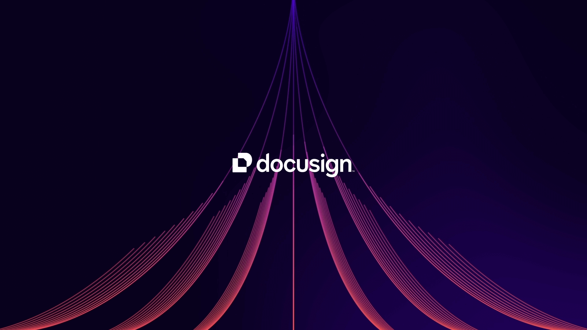
We call Docusign’s new mark The Nexus. It combines a capital D monogram (in bright, Poppy red) overlapping with an agreement in rich, Cobalt blue. At this intersection, the colors merge into what we like to call The Shape of Agreements.
The new wordmark is built from Docusign’s new custom typeface, Docusign Indigo. We customized it to infuse it with more of our own personality. Pulling inspiration from the Shape of Agreements, we crafted angled corners into both the D and I letterforms. We streamlined the U by removing the descender and brought the tail of the S in a bit closer to create a nestled space. Lastly, we dipped into the inktraps in the G and the N softening those intersections to create a very friendly, almost smile-like shape.

Brand Introduction
The new branding came with an introduction that explains the need for change—and the new era that Docusign is embarking upon, signaled by its new image.
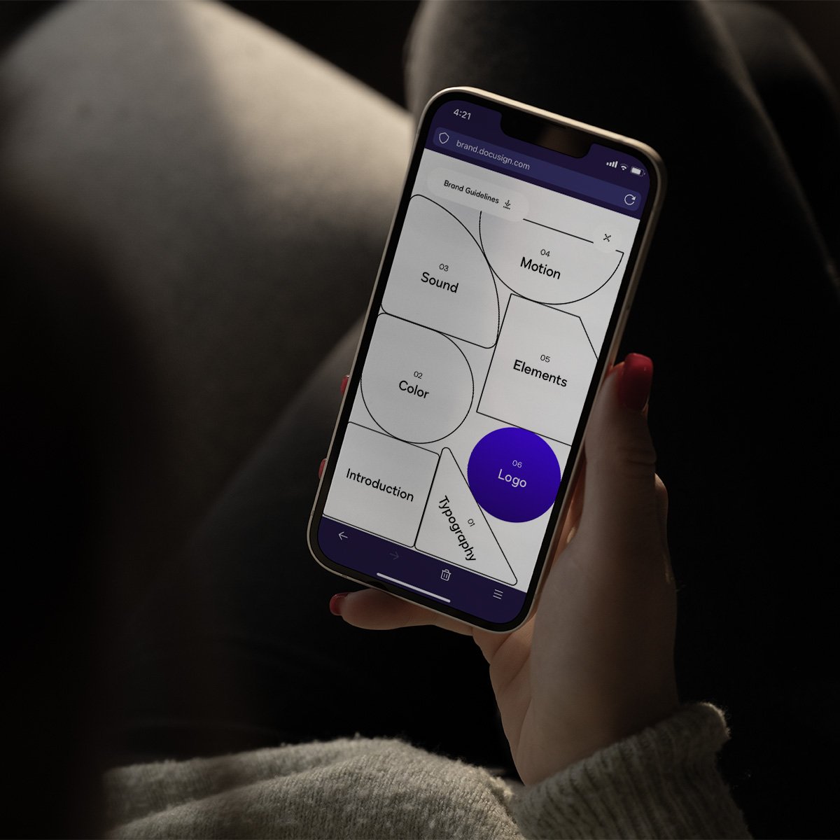
The site brand.docusign.com showcases the intro and full system that was developed for Docusign, in a truly beautiful and unique experience (my favorite piece: the interactive menu built around the colorful, geometric system underlying the icons and illlustrations).

Sizzle Reel
The sizzle reel really sums up so much of the new visual identity system, alongside the beautiful score of the new sonic branding as well. From logo design to colors, guidelines, typography, illustrations, and more, take a look below at the breadth of work that the team created for Docusign’s rebrand.

Typography
Docusign’s custom typeface, DS Indigo, is the perfect family of fonts to convey a smart, crisp, and modern look for everything from brand messaging to product interfaces.


Color
“Docusign Cobalt is iconic. It is the primary color of our brand and reflects our brand archetype and ethos. Inkwell, Deep Violet, White and Mist are our secondary colors and their use is heavily paired with Cobalt. Our brand red—Poppy—is used sparingly as an accent color to bring energy and attention to elements on a layout.” — Docusign’s Brand Guidelines

Art Direction:
The Creative Platform
Docusign’s previous visual system reflected office supplies and analog paperwork methods like sticky notes, highlighters, pens, and sign labels.
But this motif no longer reflects where the company wants to go. We crafted a new visual identity that is modern, dynamic, and unmistakably Docusign.
We translated the essence of Docsusign’s new brand promise, “Bringing Agreements to Life,” into a dynamic creative platform we coined “Dynamic Connection.” This platform not only breathes life into static documents, turning them into vibrant agreements, but also fosters connections between involved parties while seamlessly integrating with your business systems.
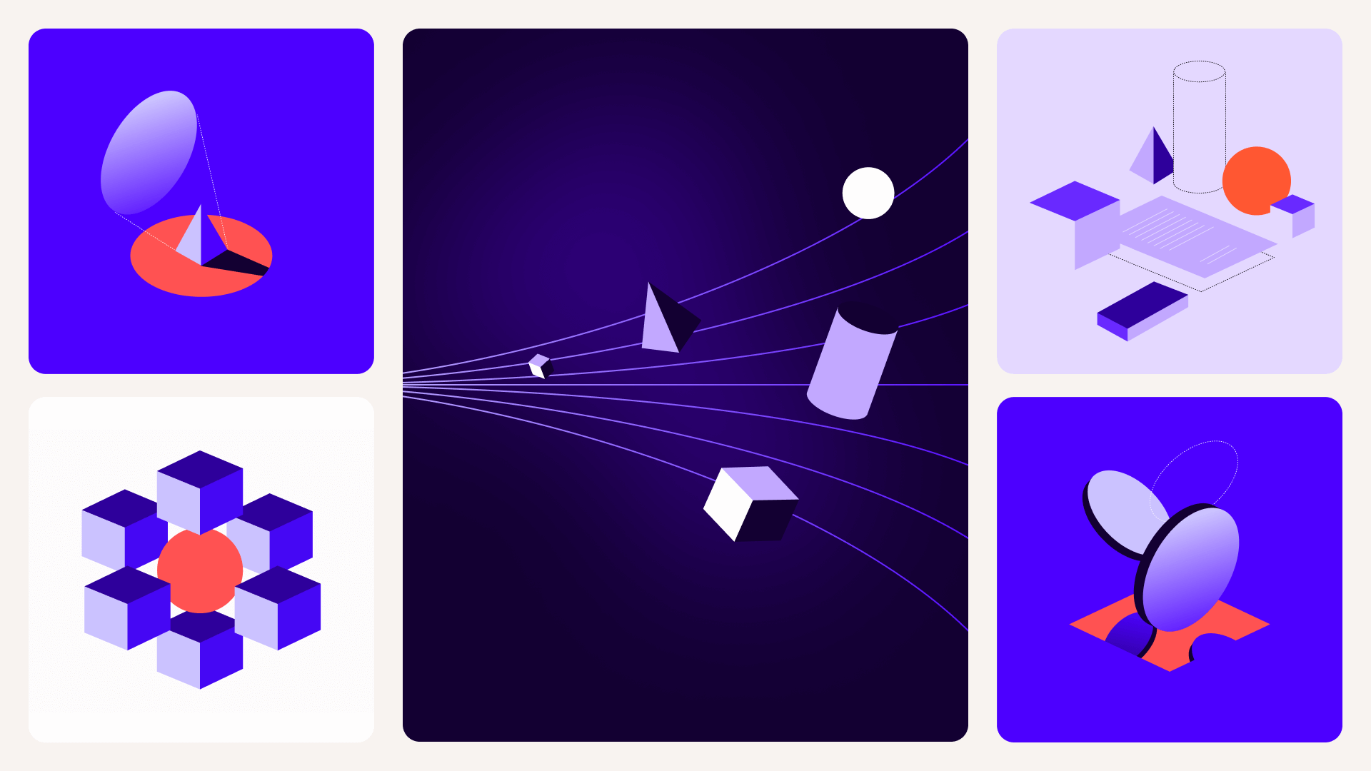
This overarching principle of “Dynamic Connection” informed new illustrations, pictograms, and custom assets that are now a part of Docusign’s new brand system and will give it extensibility for a long time to come.
“Dynamism is how we show agreements coming to life—what it means to take a static, inert document and help transform it into a living, breathing agreement.
Connection is how we show Docusign bringing parties together but also bringing agreements into one, easily accessible hub, connected to the rest of your business systems.”
— Docusign Brand Guidelines

The Agreement Trap
We even branded the problem that Intelligent Agreement Management is solving: the Agreement Trap.
We built out a series of illustrations and animations that visually show the pain when data, time, money, and opportunity are trapped inside static documents and disconnected from everyday business systems.

Glassmorphism
While the visual system heavily uses simple, geometric shapes in pictograms and icons that also can scale up nicely into more dimensional and full isometric illustrations, we also utilized geometry that has a subtle, semi-transparent, glass-like effect to it—where it overlaps with and intersects other graphics or photography to show the relationships between the two objects. It's a dynamic way to continue to use the shapes of the Nexus icon and bring the creative platform's concept to life.


Credits
Client
Docusign
DOCUSIGN BRAND TEAM
Carla Weis, Jeremy Loyd, Ryan Clark, Corey Pomkoski, Jess Novo, Chris Ballasiotes, Danny Afflito, Amy Li, Richard Shan, Christian Smith, Kylee Kiesow, Emma Anson, Omid Faghiri, Grace Min Shan, Nora Cameron, Mitchell Licht
+ many more amazing, cross-functional partners
MY ROLE
Creative Direction, Art Direction, Brand Guidelines, Brand Strategy, Design, Illustration
SONIC IDENTITY
AMP Sound Branding, Munich, Germany
BRAND SITE PARTNERS
BASIC/DEPT®, Niccolò Miranda, Ilja van Eck
Before/After Logo Motion Design Partner
Bonfire Labs
PRODUCT NAMING AGENCY PARTNER
Wild Geese Studio
DS INDIGO TYPE FOUNDRY PARTNER
PSY/OPS
BRAND SIZZLE REEL DIRECTOR
David Thompson

Coxe Curry & Associates
Branding, Creative Direction, Web
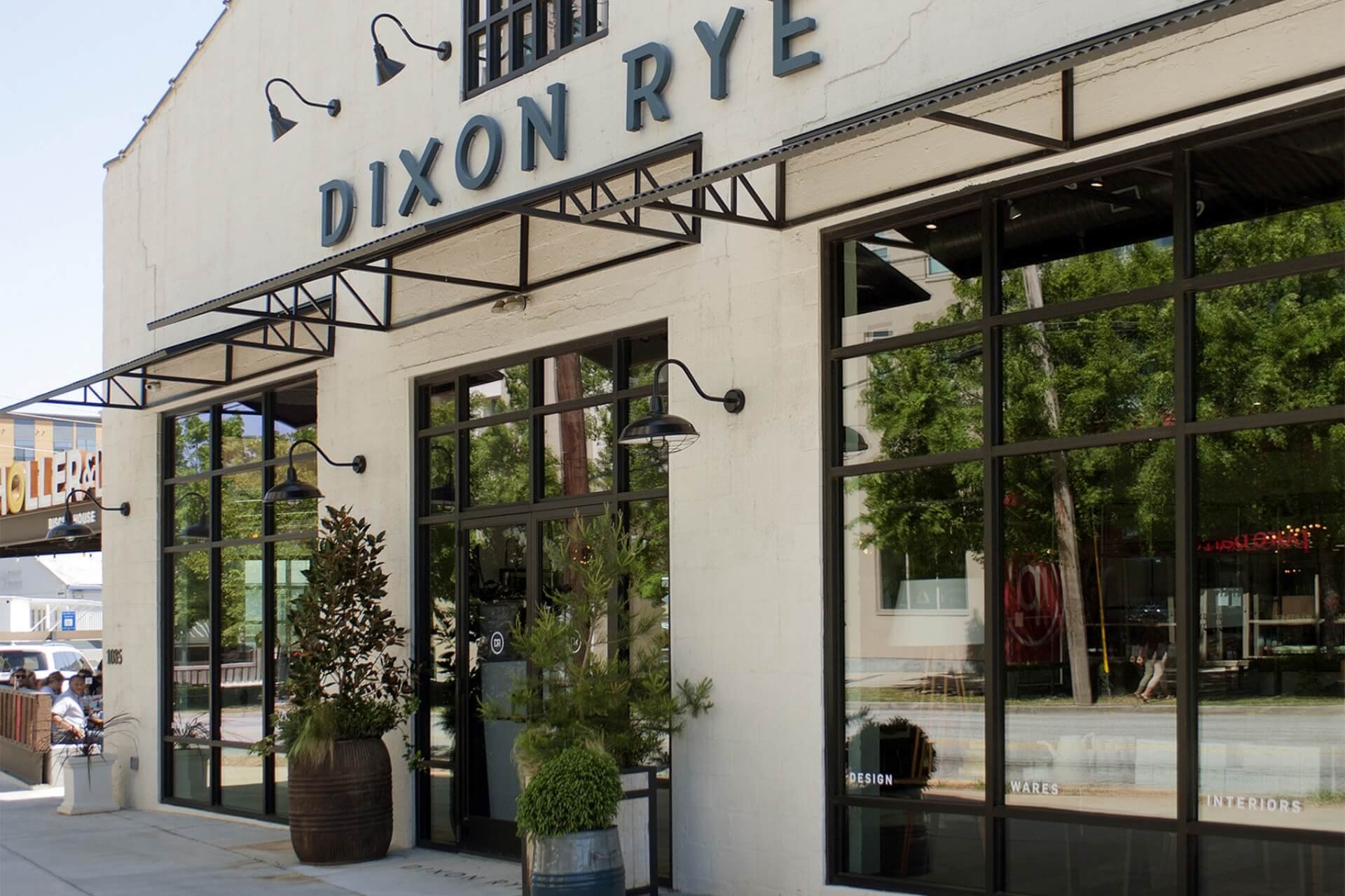
Dixon Rye
Branding
