Dixon Rye Chocolate
Packaging
2022
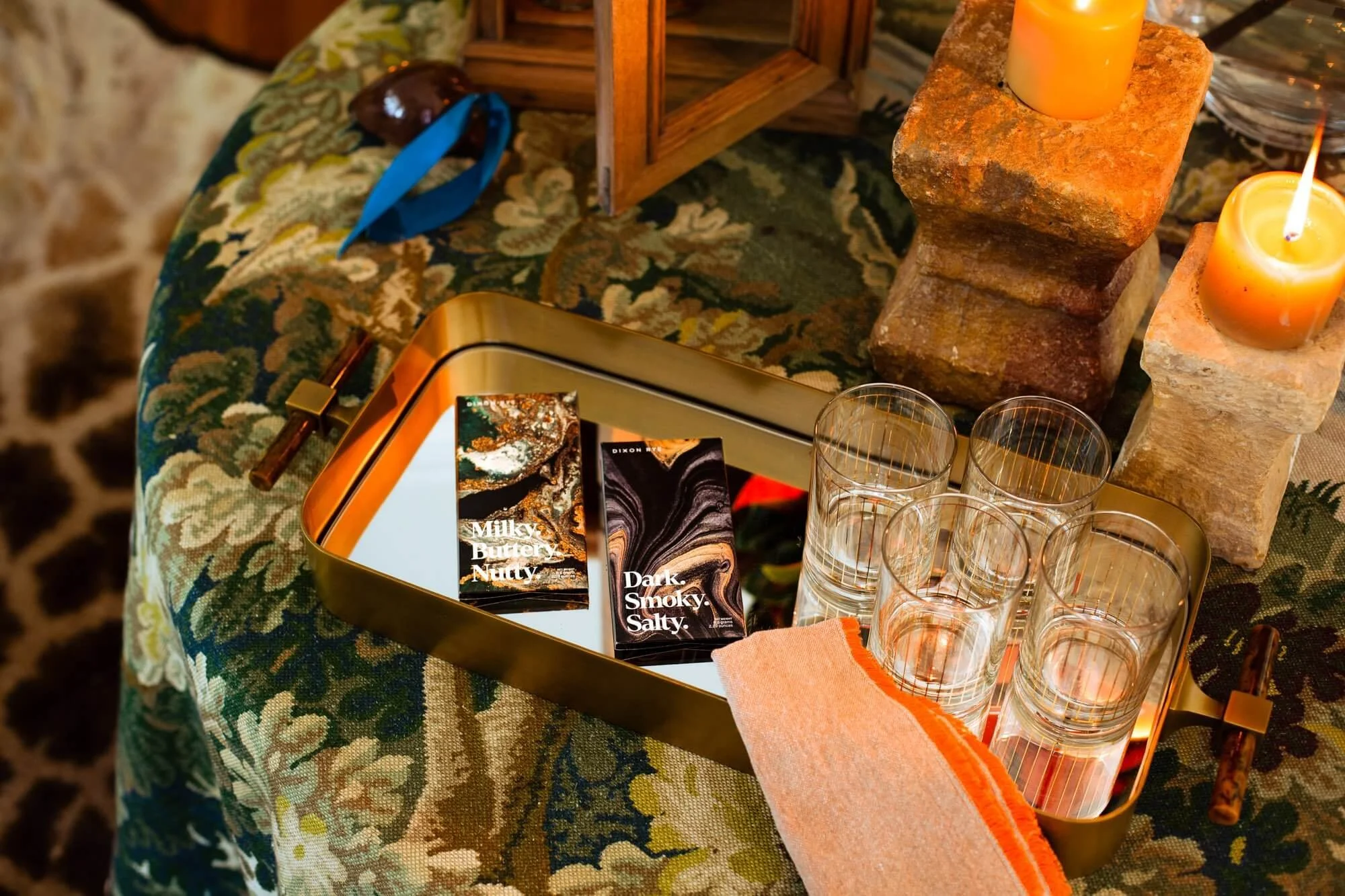
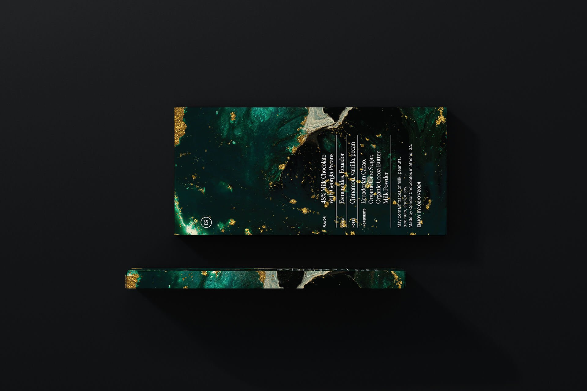
I designed the messaging and packaging around this duo of two chocolate bar products for Dixon Rye, available for purchase in their store on on their site. I started by developing the large, bold name for each product based on its flavor profile and having the title dominate the cover of the packaging in a beautiful serif display typeface. Each product was then paired with a marbleized background texture, and the back of each has a clean lockup of in-depth information on notes, origins, and ingredients. The inside of the packaging features the custom Dixon Rye-branded floral pattern in an inverted subtle gray on black for a luxe look.