Walgreens Brand Illustration Library and Guidelines
Guidelines, Illustration
2020
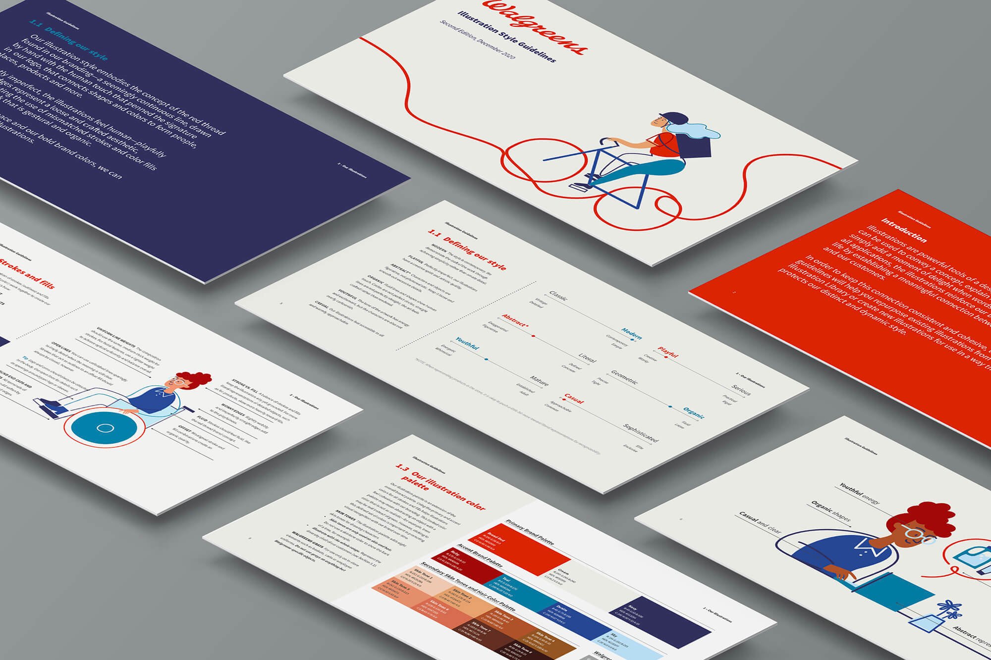
Following a brand refresh, Walgreens hired me to write, design, and produce a robust style guide document for their custom, branded illustrations. The guidelines detail how the marketing team and partners can utilize the assets as well as how future illustrators can continue to produce more work in the same style.
In addition to developing these illustration guidelines for the brand, I worked with the in-house illustrator, Dani Knight, to put together a shared library of hundreds of assets to pull from and create branded scenes — from diverse characters to different retail objects, environments, and more.
Agency
StudioNow
Walgreens Illustration Lead
Dani Knight
Walgreens Art Director
Tom Dang
StudioNow Producer
Isabel Jordan


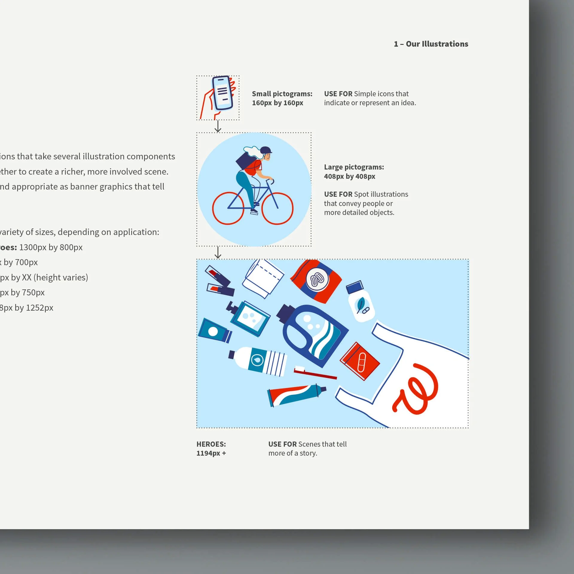
As I developed the illustration guidelines book, I also worked with the in-house illustrator, Dani, to build out a huge library of assets that marketers and designers could pull from. With the shared library, they can grab individual objects to build compositions and scenes.


