Levee & Loam Wine
Branding, Packaging
2024
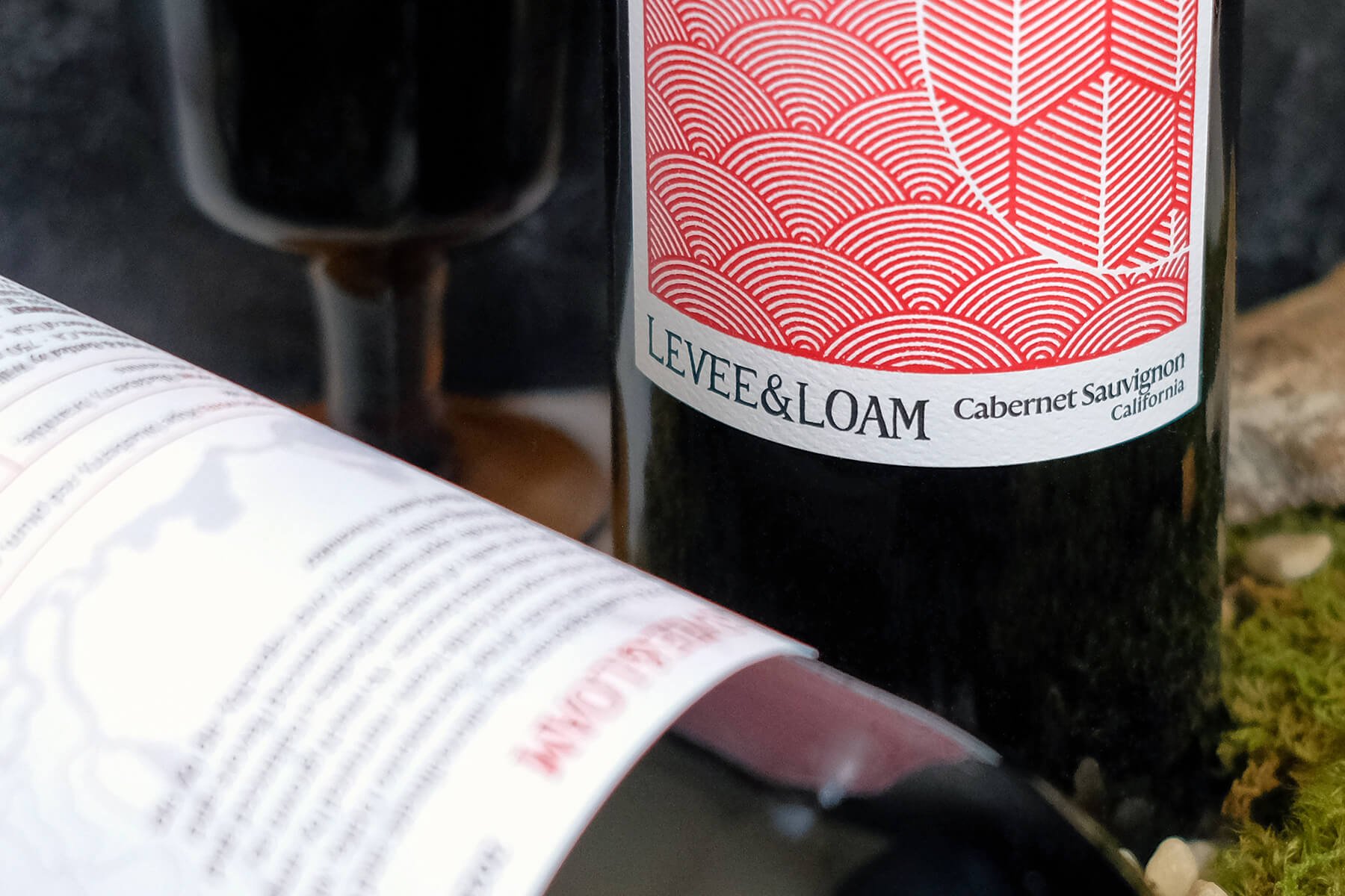
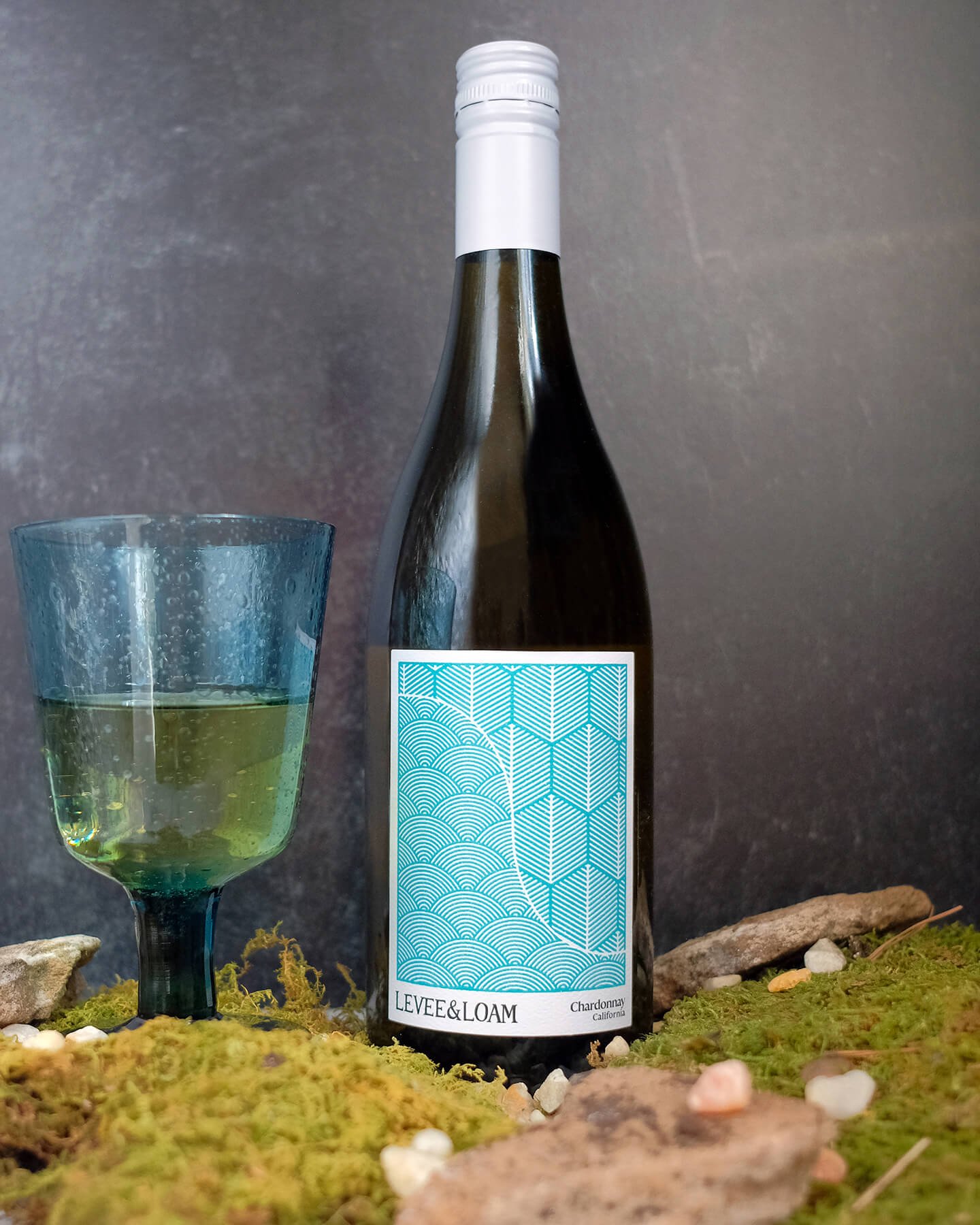
“Levee & Loam celebrates the microclimate and viticulture created by the levees of the Sacramento Delta, where vines thrive in the exposed fertile loam, nurtured by ample sun and cooling delta breezes.” — William Knuttel, Winemaker
An ode to the water and earth that form the deltas of northern California, the branding and label design for Levee & Loam carries a natural, organic touch through custom, hand-written lettering for the brand’s name to a distinctive, stamped pattern showing the meeting of water and earth—with waves made out of repeating concentric circles on one side, and row after row of vineyard field lines on the other.


The wordmark for Levee & Loam is custom-made with hand-drawn lettering. Small, flared serifs give it a classic quality while the bumpiness and imperfect lines showcase a contemporary and organic touch.
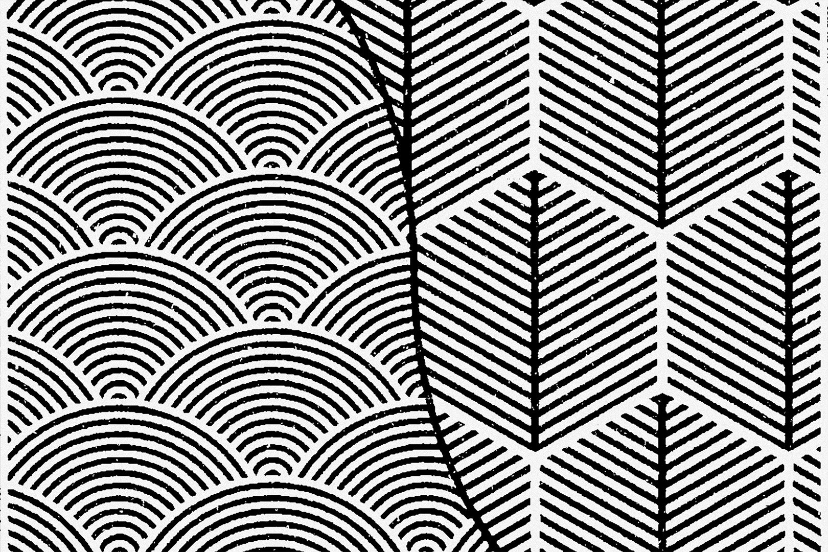
The look-and-feel from the wordmark extends to a stamped icon, where undulating waves indicate the levees along the top and diagonal lines of vineyard fields indicate the earth along the bottom—with a custom “L&L” monogram at its heart.
The waves and field lines then repeat to form a larger, distinctive pattern for the wine label itself. A sine wave—symbolizing the sloping curve of the bank of a levee—cuts down the middle, separating the water on the left and the earth on the right. The pattern is printed in a bright cyan for white wine varietals and a rich crimson for the reds, with a spot UV gloss coat accenting all of the line work.


Credits
Winemaker
William Knuttel
Client
Crafted Brands
Special Thanks to
Kate Knuttel, Bayard Crawley, David DuBou
Designer
Russell Shaw

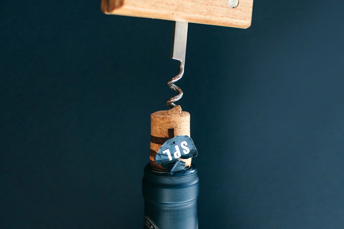
Square, Plumb & Level Wines
Branding, Packaging

Good Measure Wines
Branding, Packaging