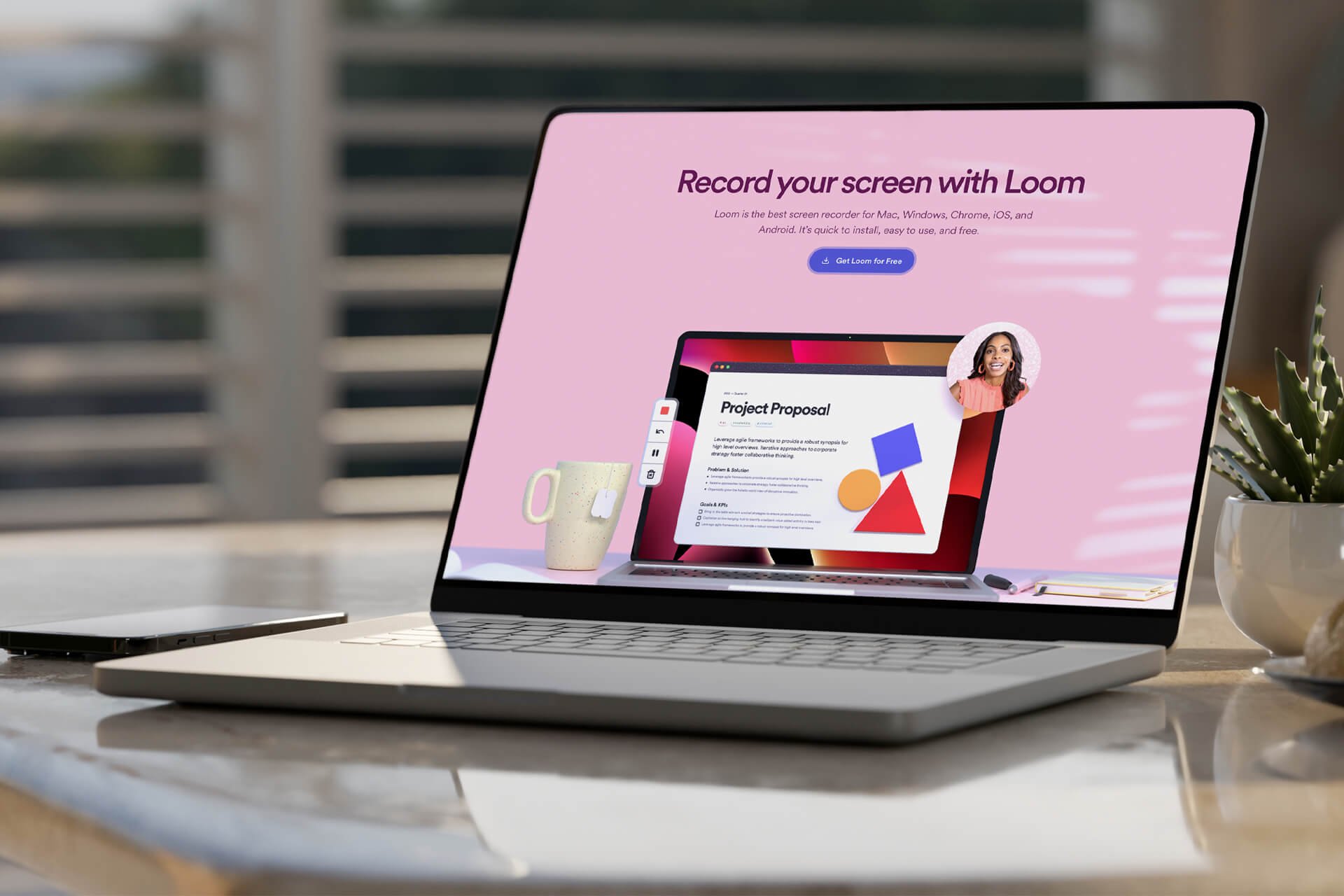
Loom
Marketing Site Design
Collection, Web Design
2021–2022
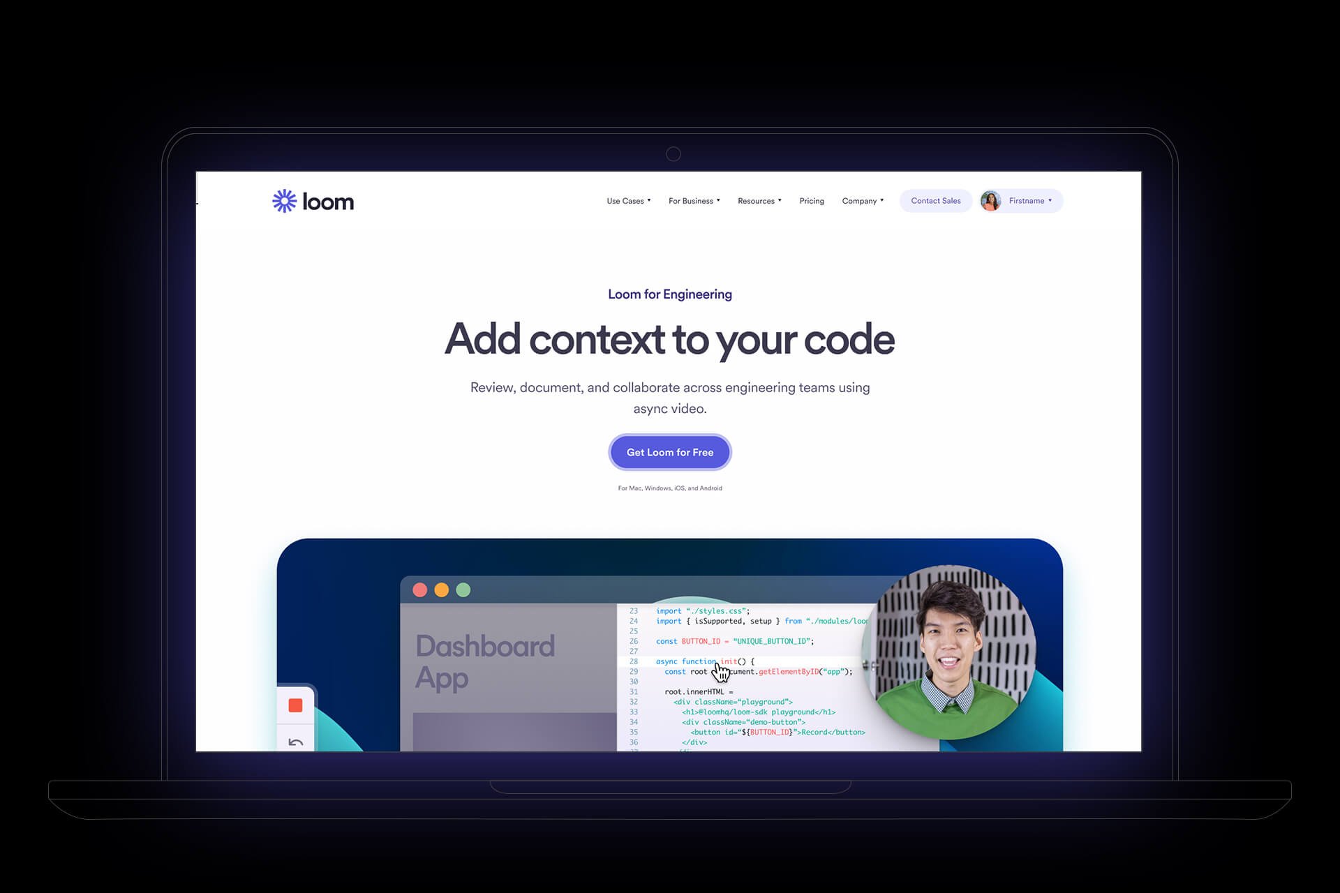
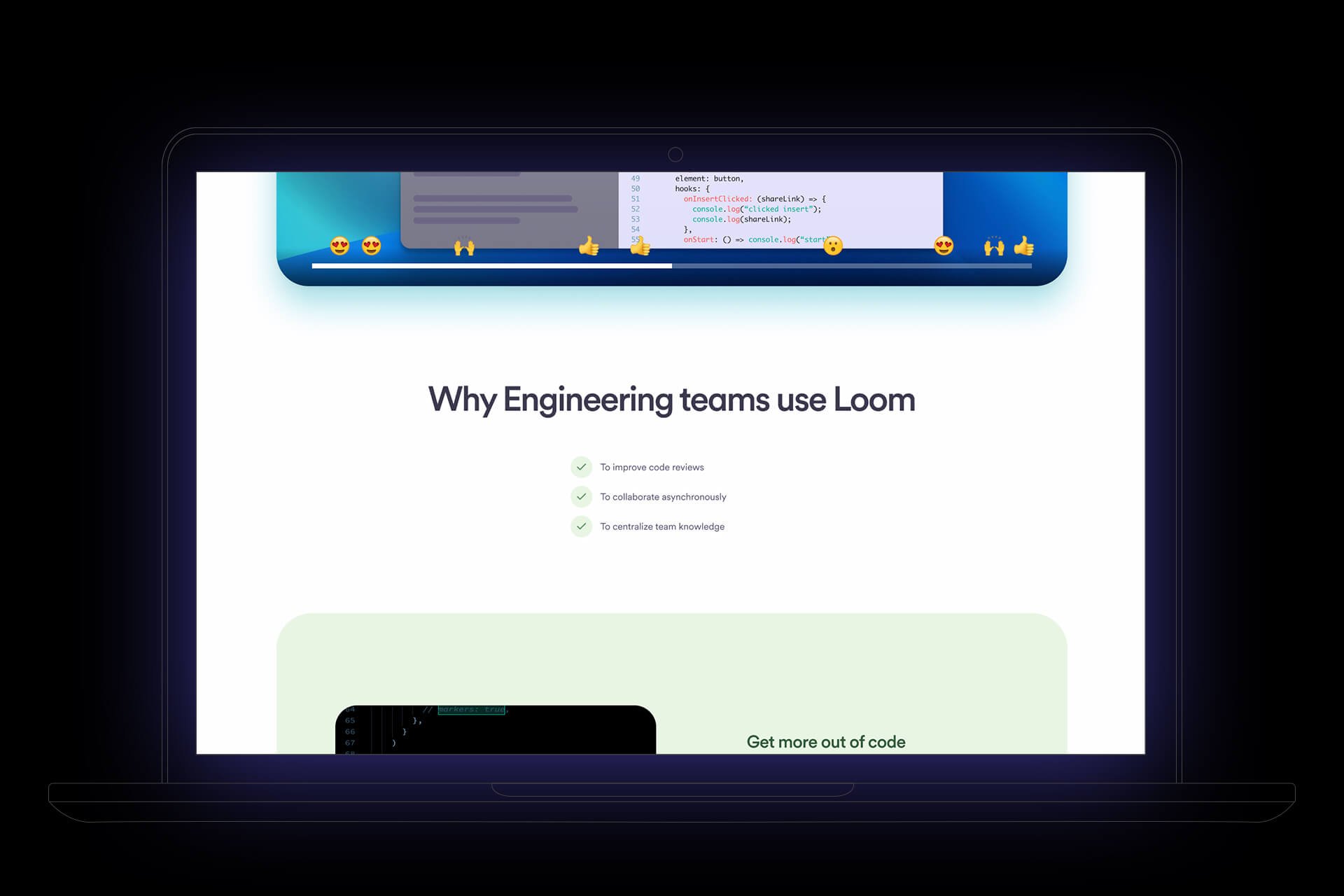
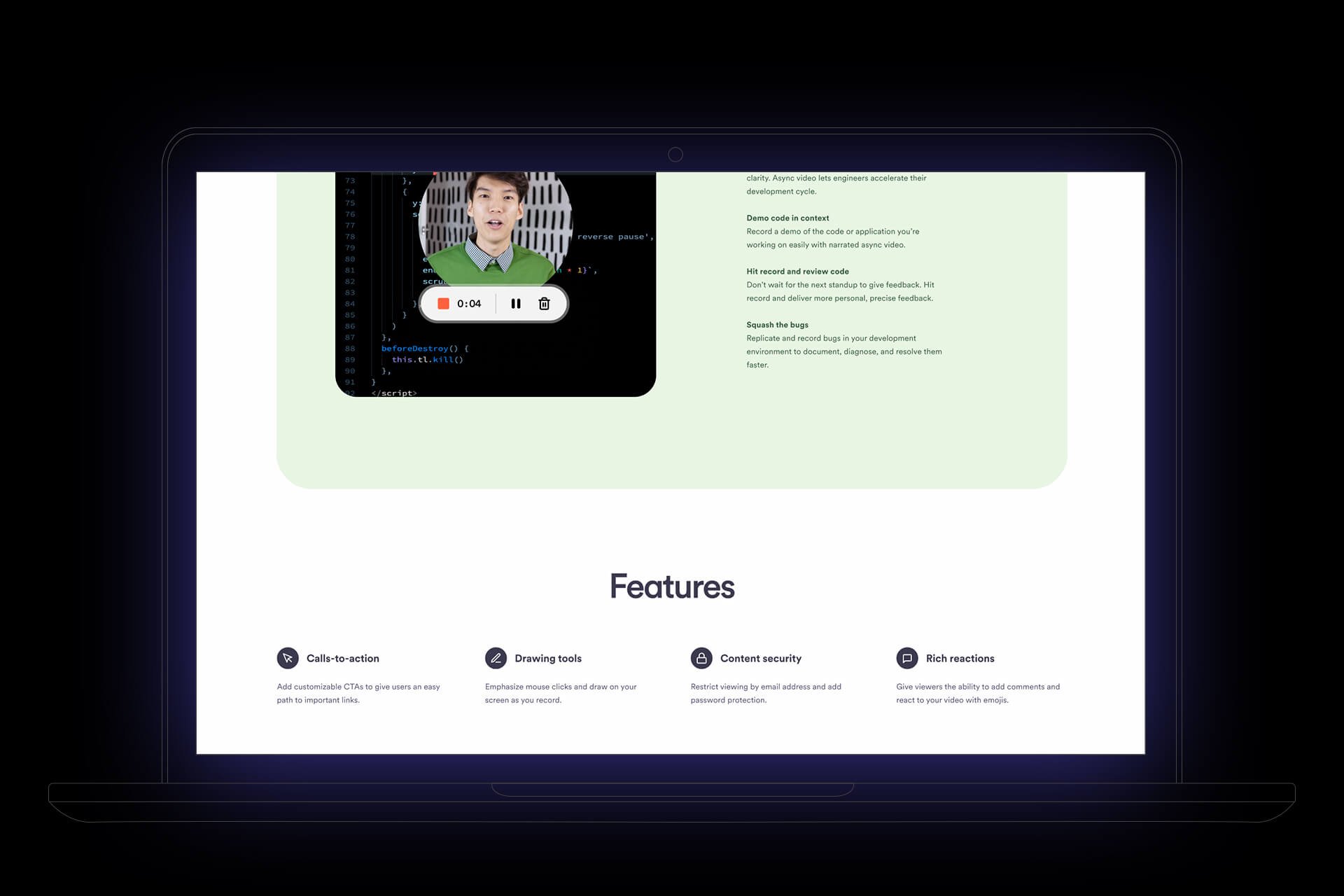
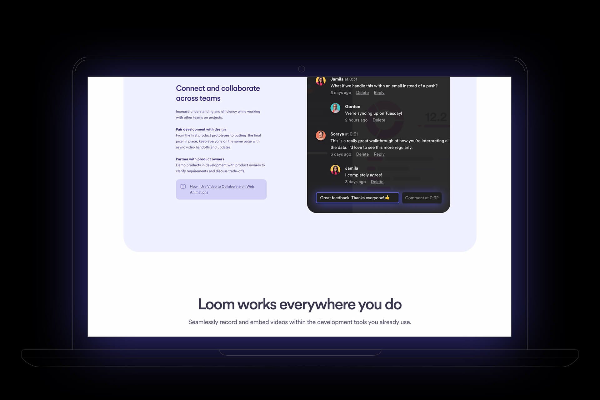
Working with the internal brand designers in collaboration with some really all-star engineers, we developed Loom’s “Thread” Brand Design system to overhaul and the entire marketing system with an updated look and streamline and define its typography system, color palette, and components.
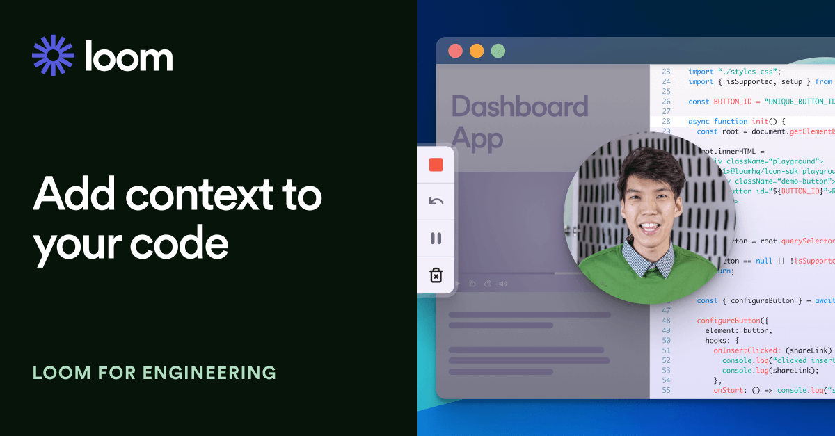
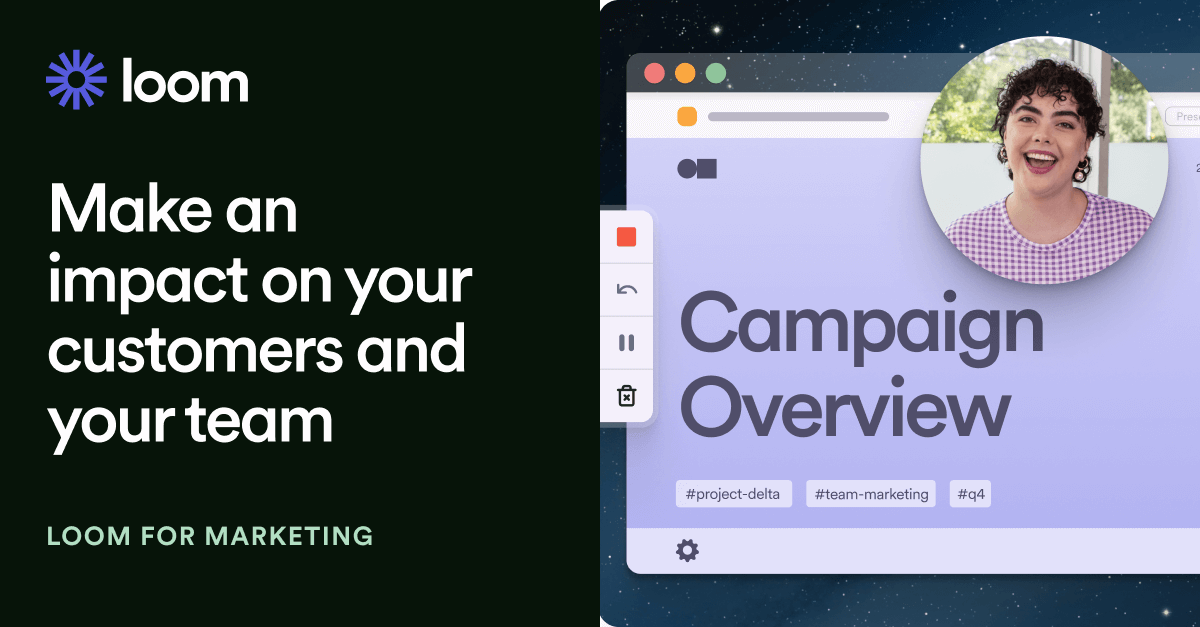
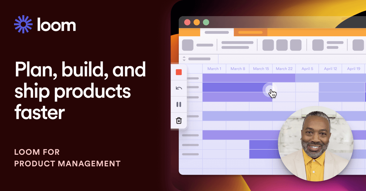
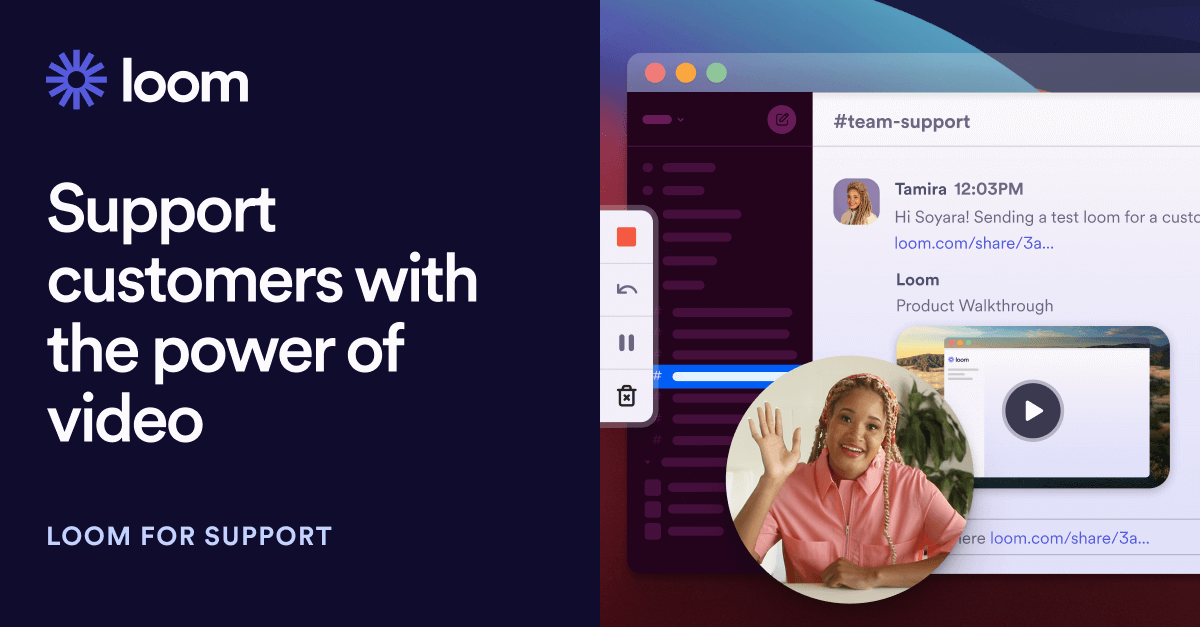
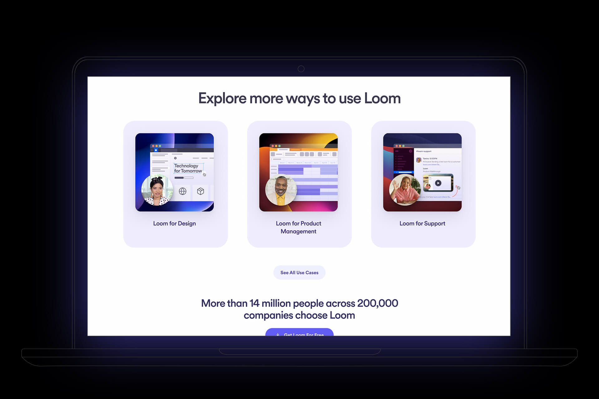
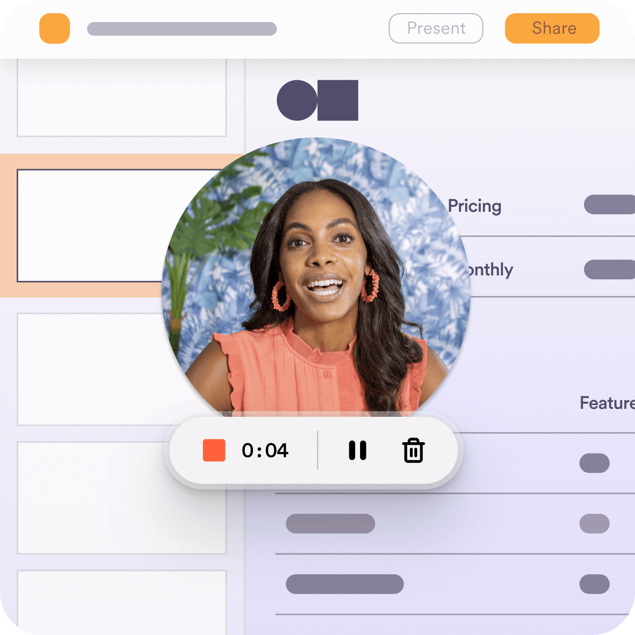
I also helped create bespoke assets that showed off the product with new product abstraction illustrations to demonstrate things like user case studies and more.

Case Study Pages
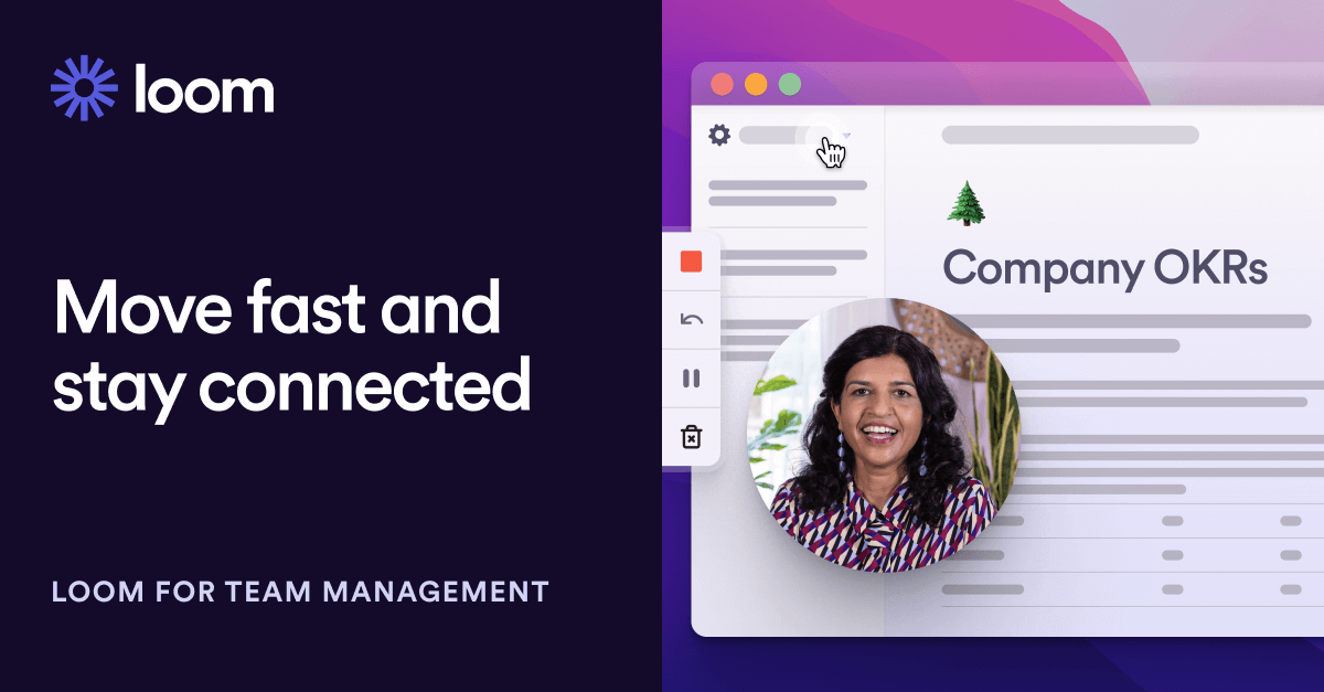
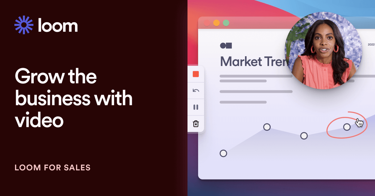
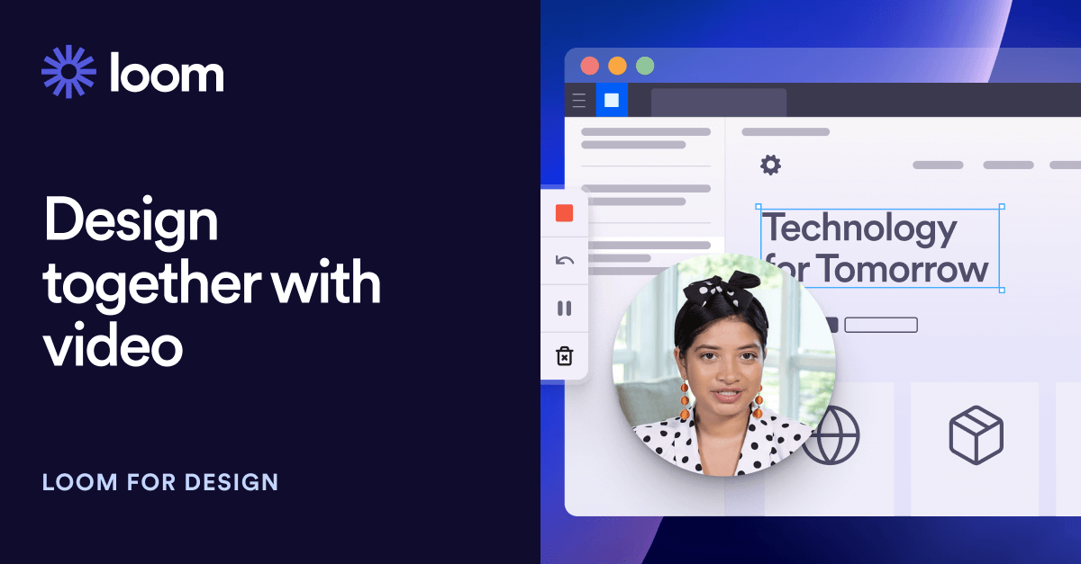
I designed the suite of eight case studies demonstrating how Loom can benefit users of all backgrounds from sales and design to development and education. Each hero area of the page had a coded animation built by engineer Amanda Cheung.




Pricing Page
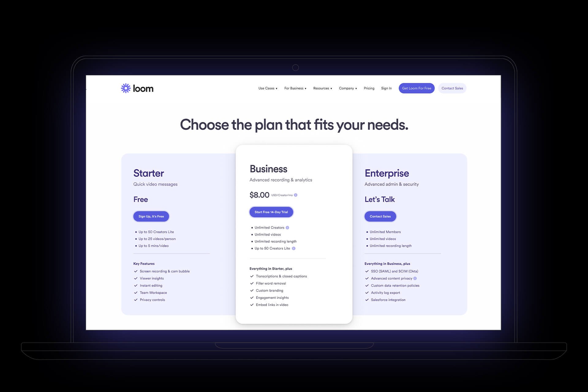
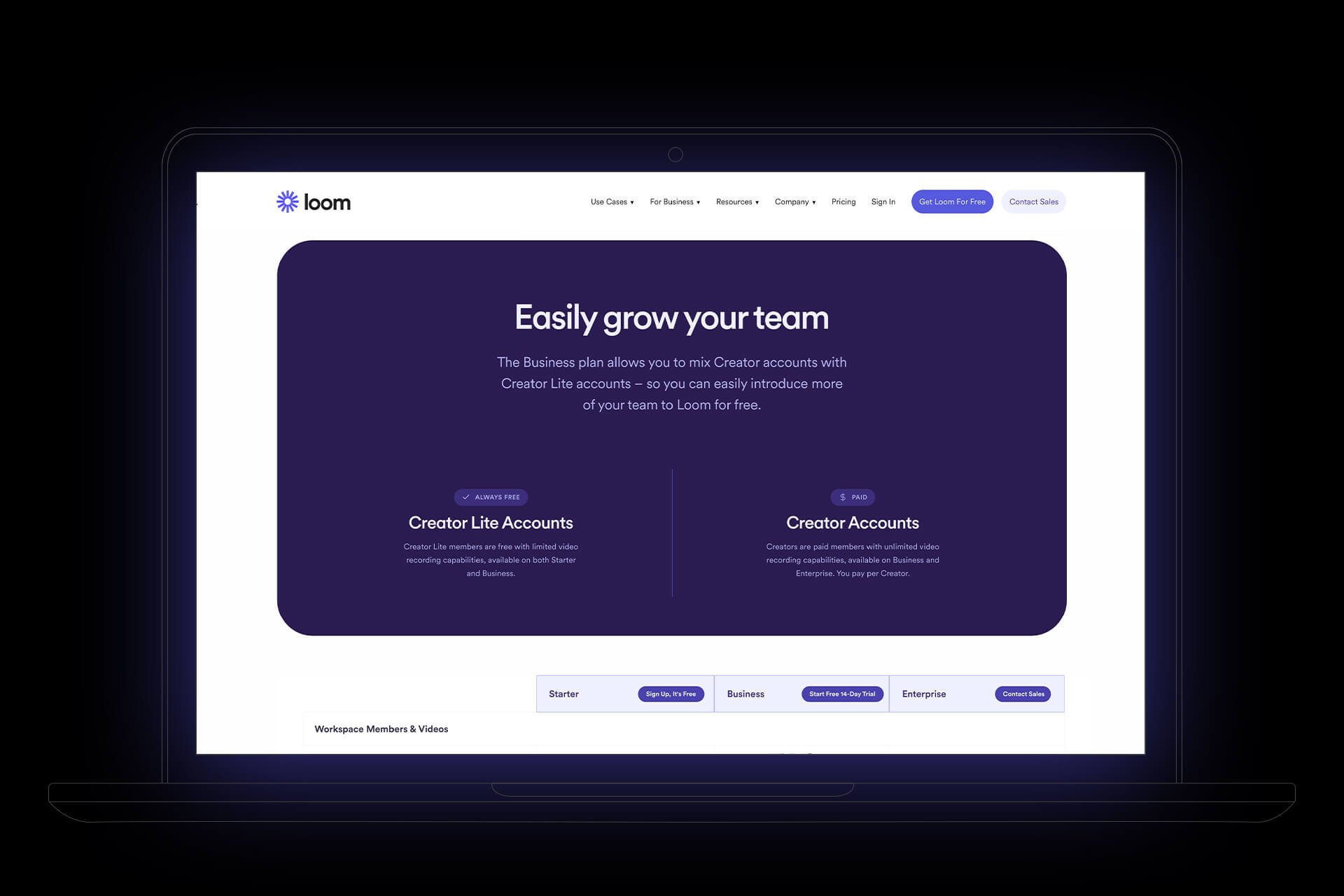
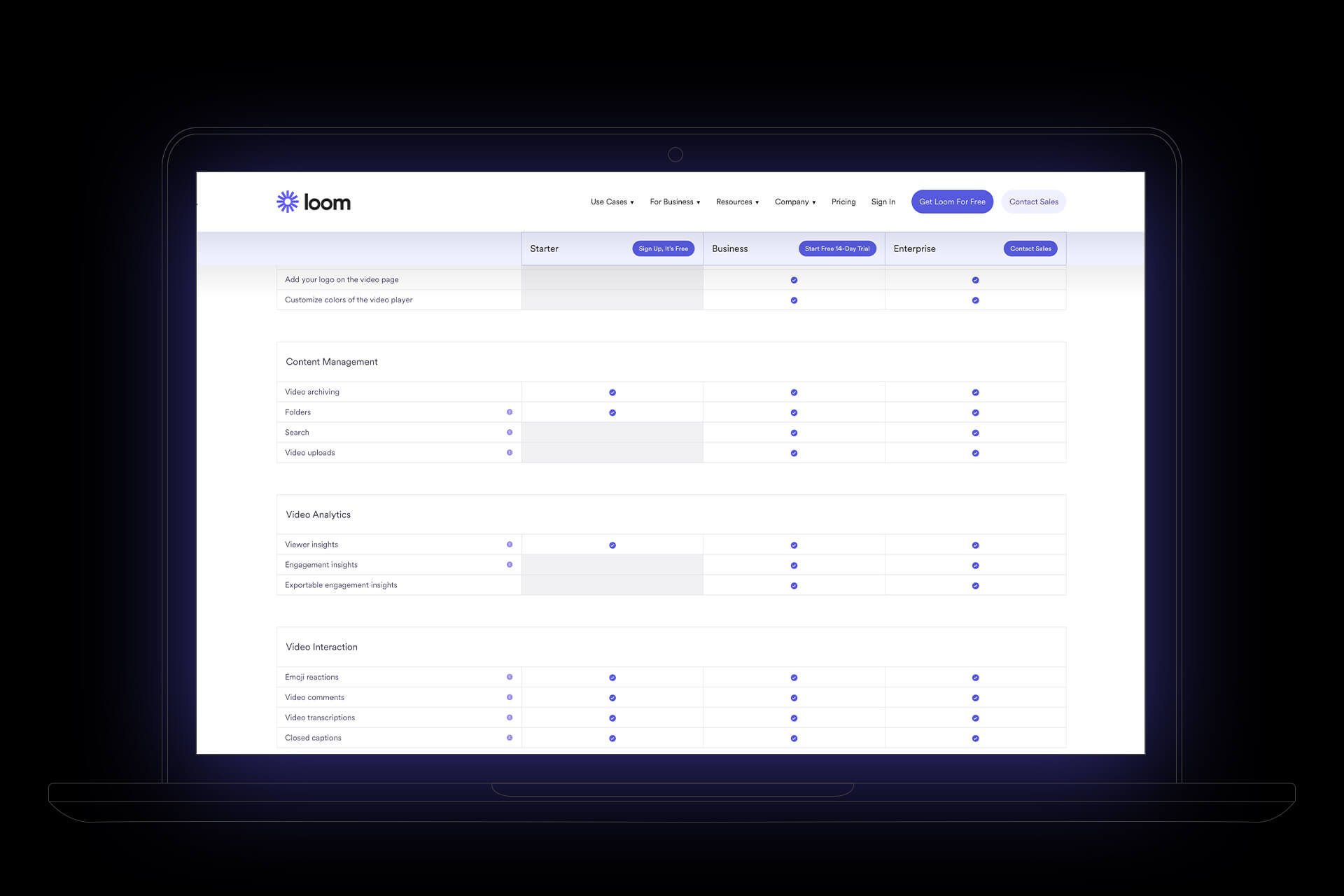
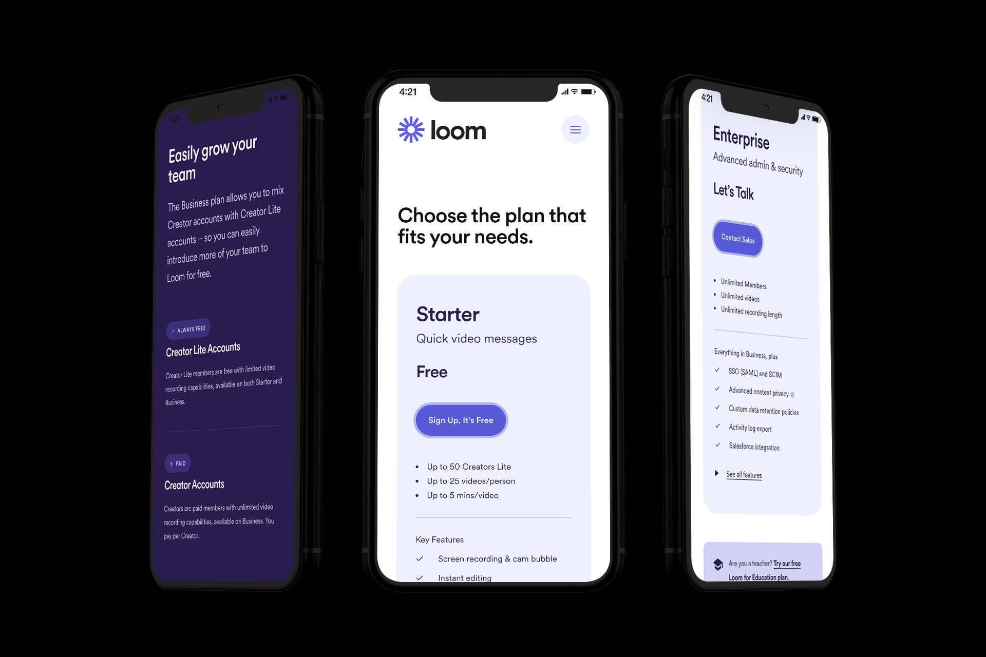
I worked with the marketing team to redesign the pricing page in accordance with the new design system, as well as upgrading the way we show the information in the pricing tables and the benefits of each tier.

Careers Page
I worked with internal brand designers on the redesign of Loom’s Careers page, and developed unique spot illustrations for each section of the page.


Post-Submit Contact Form
I designed a custom page after a user submits a contact form to the company sales team. It has a carousel of other content that the user can jump to, as well as a giant “Thanks!” button at the top that, if clicked, showers the screen with raised hands emoji.


Together with the internal brand design team, we designed a page that showcases integrating the SDK directly into other products. I came up with the concept of a curved grid showing the software as the underpinning layer for other tech to use, with radiating pins along the plane, as well as an abstracted illustration of the code base rising up from a gridded tower with a swirling gradient on top representing dynamic content.
SDK


