Lumena
Branding, Guidelines
2020
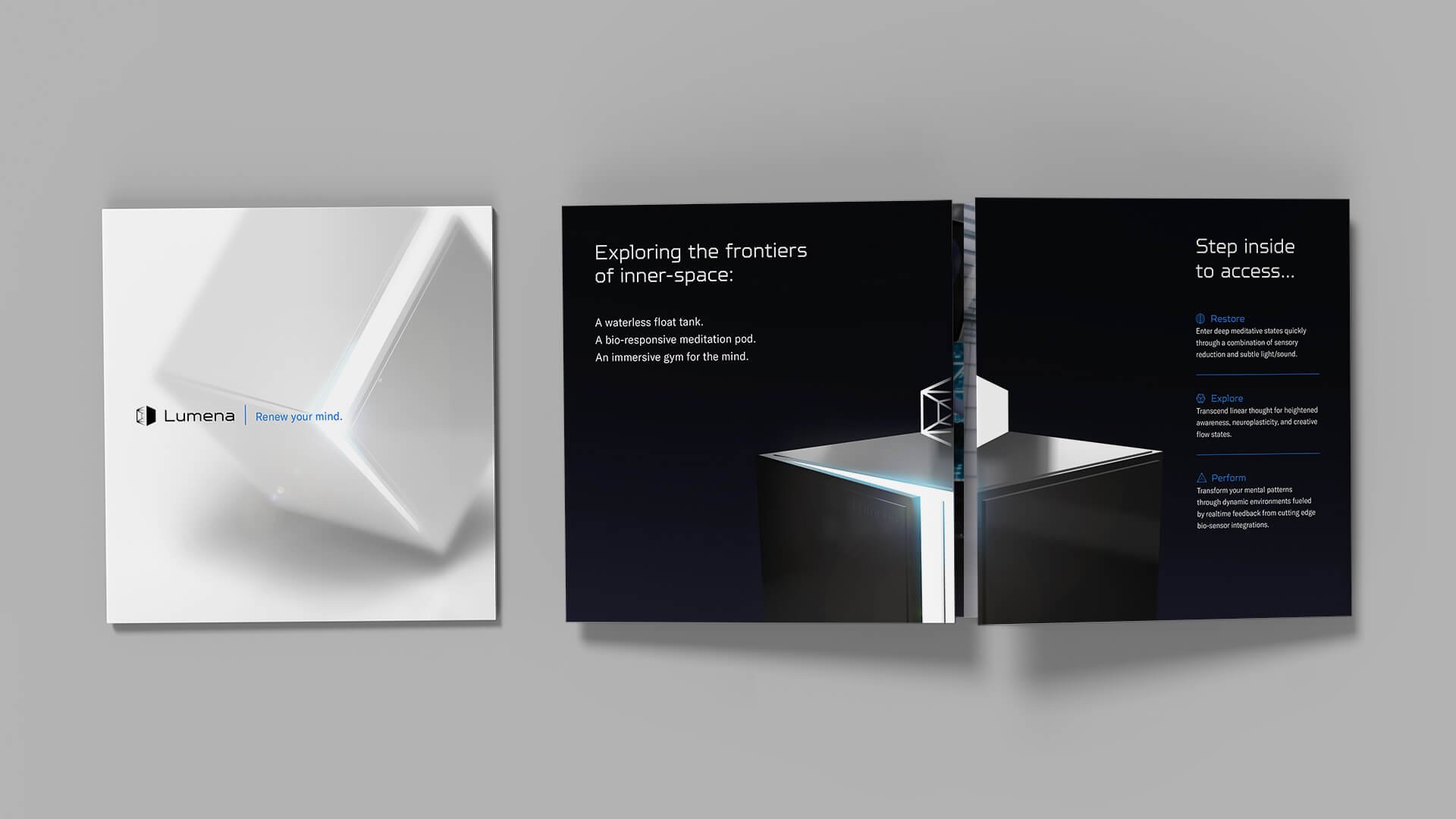
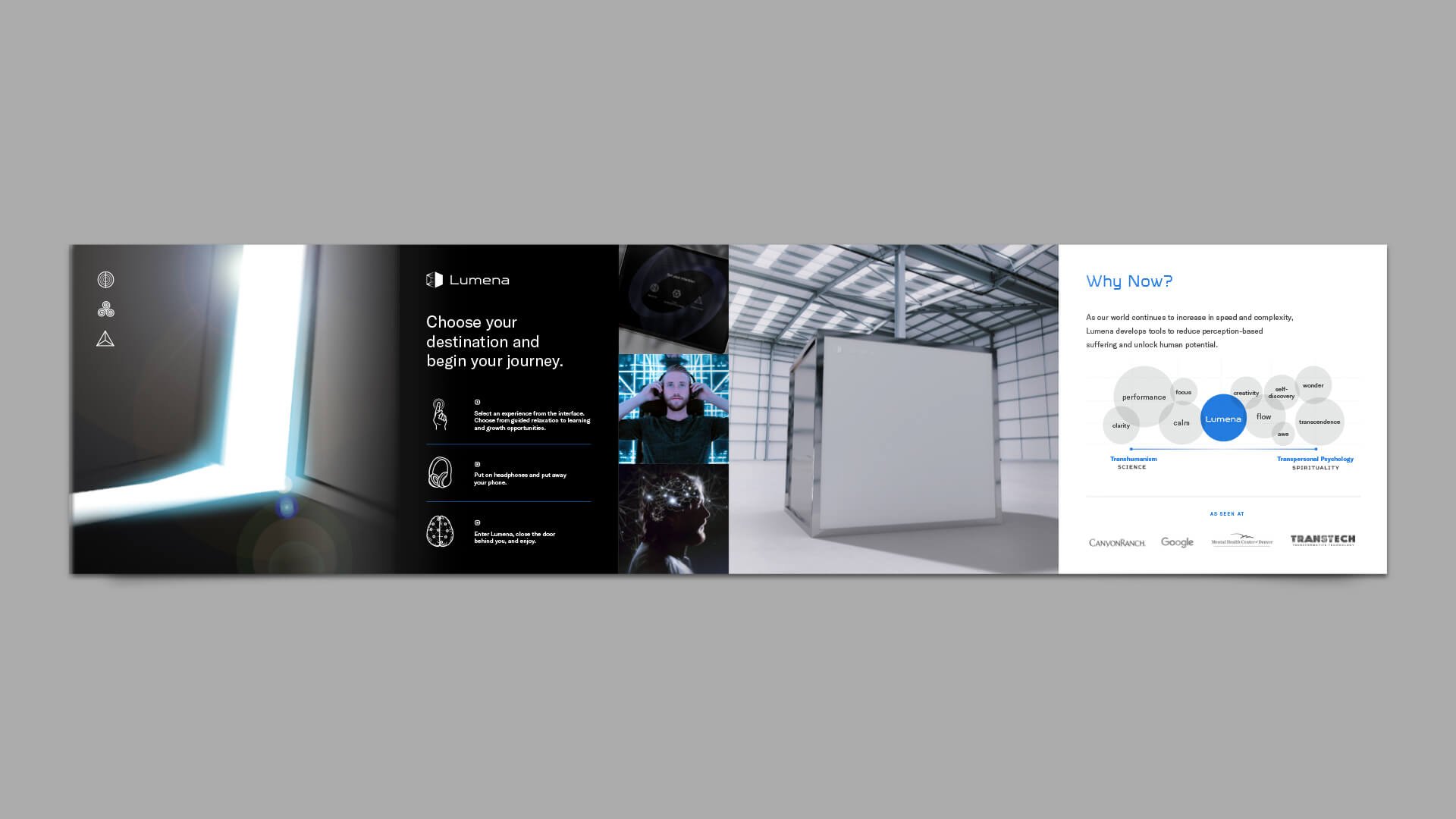
Lumena creates large-scale, immersive environments that seek to improve and enhance mental health through interactive light and sound experiences. Like a waterless float tank, its giant "Infinity Cube” arranges mirrors and lights in a way to place the user in a contemplative space free of distraction and allow them to train their mind.
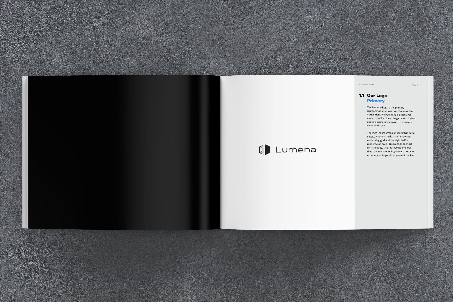
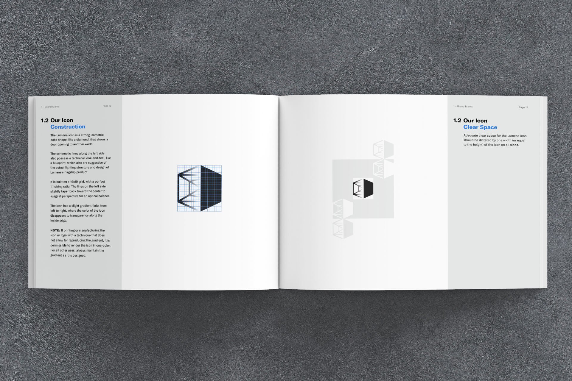
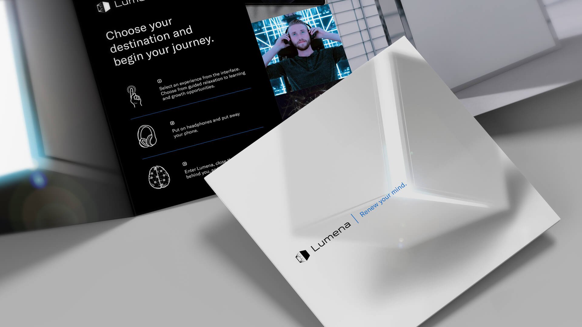
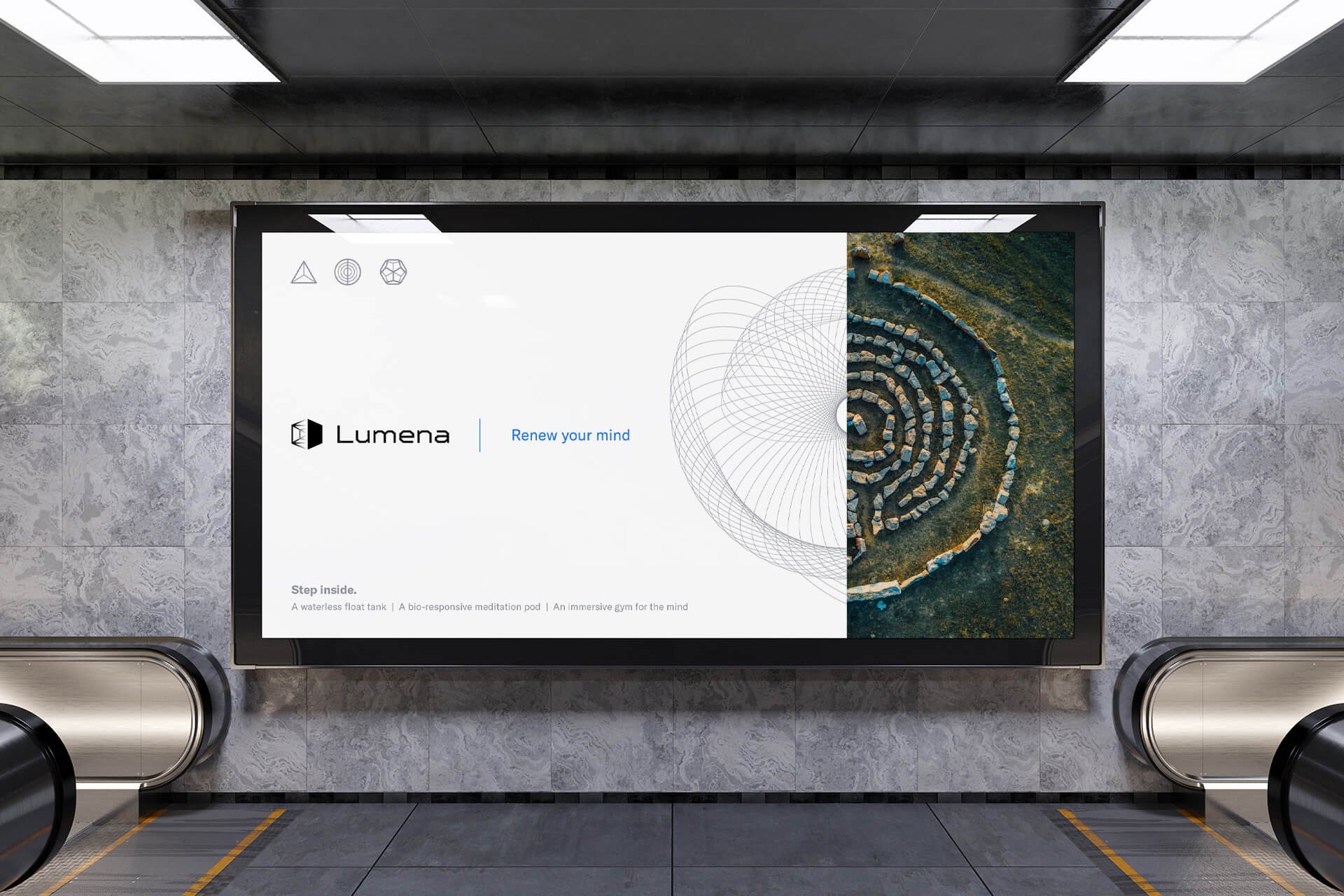
I worked closely with the founder, Kaleb Matson, to design a visual identity that captures the wonder of this enigmatic technology. Built all around the geometry of the product, the brand icon is a hexagon split into two halves: one a solid, and one like an open door seeing the diagram of the cube (and arranged to look like the light array inside the product). The wordmark has an angular typeface to match the geometry of the icon. All of this is complemented by unique and technical custom iconography, 3D renders of the cube with light emerging from an open door like a horizon, and spirographs that act as detailed background patterns in communication pieces and in the user interface design.


