New York Magazine, Vacations
Illustration
2019
Illustrations for New York Magazine’s series on tips and tricks for New Yorkers escaping winter in the city for warm, Caribbean vacations.
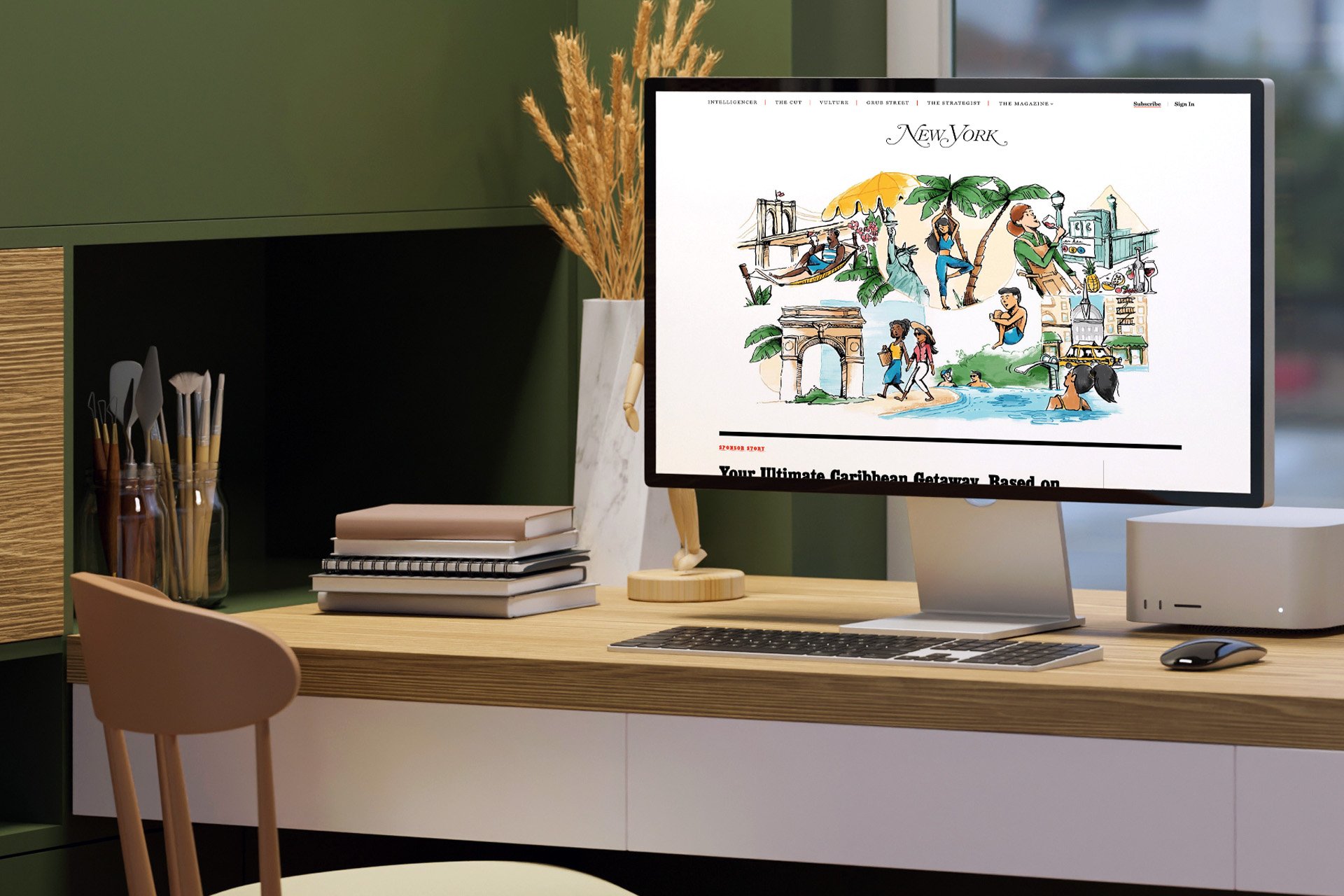
I worked with the New York staff to create artwork for a series of five articles about vacation tips and insights to help New Yorkers get away from the city for the winter.
Each article featured completely different content – from a “What To Wear This Winter” article that was a play on the topic by suggesting warmer weather attire, to advice on destinations for NYC residents based on what neighborhoods they live in – but the artwork remained consistent throughout the series. Working with a rich and colorful, Caribbean-inspired color palette, the artwork is vibrant and full-color with watercolor texture and depth, and a refined level of detail expressed through hand-drawn, pen-and-ink line work.

“Your Ultimate Caribbean Getaway, Based on Your NYC Neighborhood”

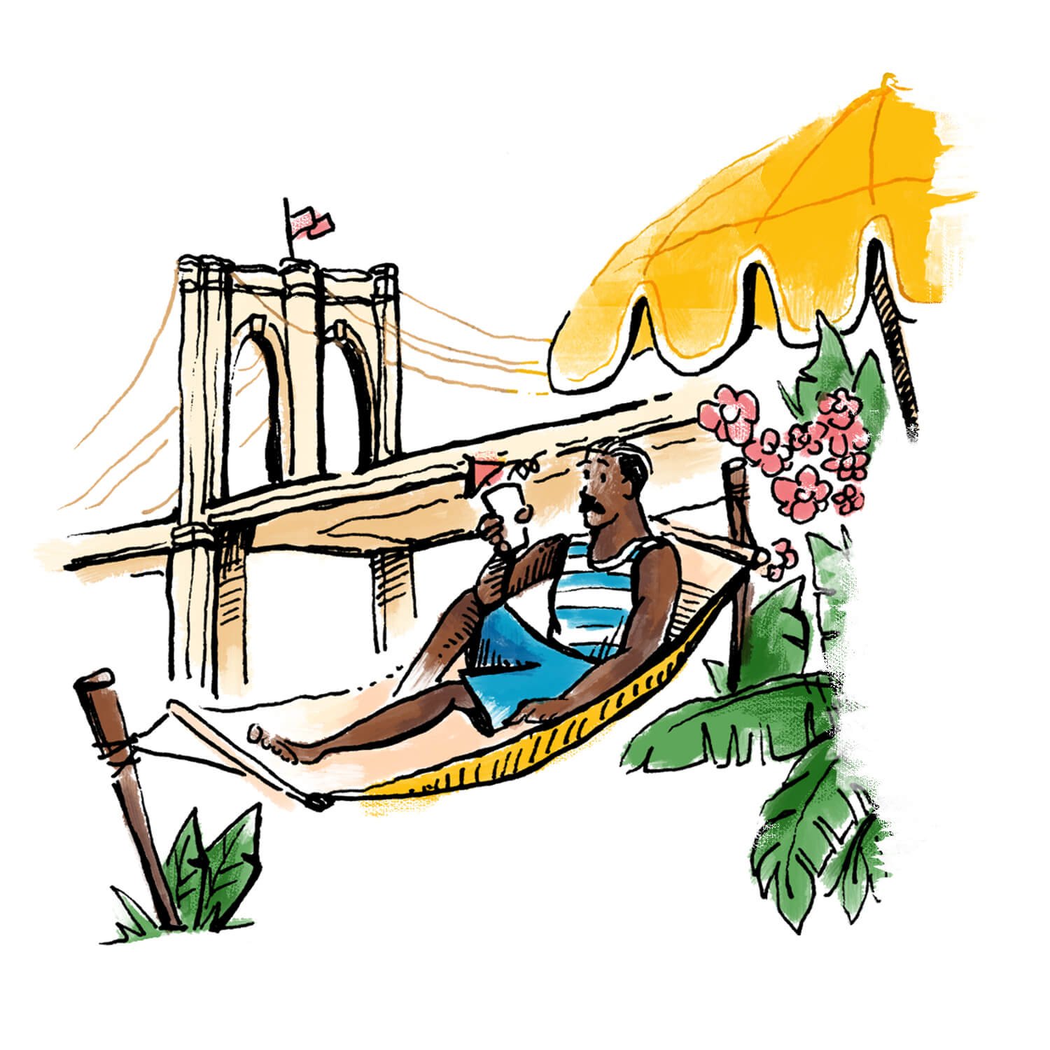
This was one of my favorite articles to illustrate in the series. The concept I developed shows these vignettes of New Yorkers enjoying vacations with an almost “picture-in-picture”-like effect of the city behind them. Because each location is suggested based on the residents’ neighborhood, the imagery shows the vacation activities and places in the foreground, and a suggestion of what New York neighborhood the characters left behind in the background. It was interesting to juxtapose the city against a tropical setting in each composition!

Union Square, Chelsea, Midtown, or Hell’s Kitchen → Aruba

Soho, Tribeca, the Financial District, or the Upper East Side → St. Barths

Williamsburg, Dumbo, or Long Island City → Barbados

Park Slope, Boerum Hill, Cobble Hill, or Brooklyn Heights → Curaçao

Bushwick, Greenpoint, Bed-Stuy, or Crown Heights → Cuba
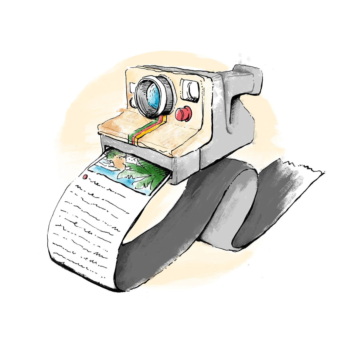
“The Art of Perfecting Your Social Media Captions on Vacation”

This article features tips and tricks on documenting your travels – it was a good excuse to get to draw all sorts of tropical leaves and waves and explore what type of imagery and color makes someone think, “I want to go there too.” I also was kind of a fan of – and glad that we got to introduce people to – this funny little Hashtag Island in the last spot illustration!

“Always Give Context”

“Get Personal – And Don’t Be Afraid to Go Long”

“Use Hashtags Selectively”
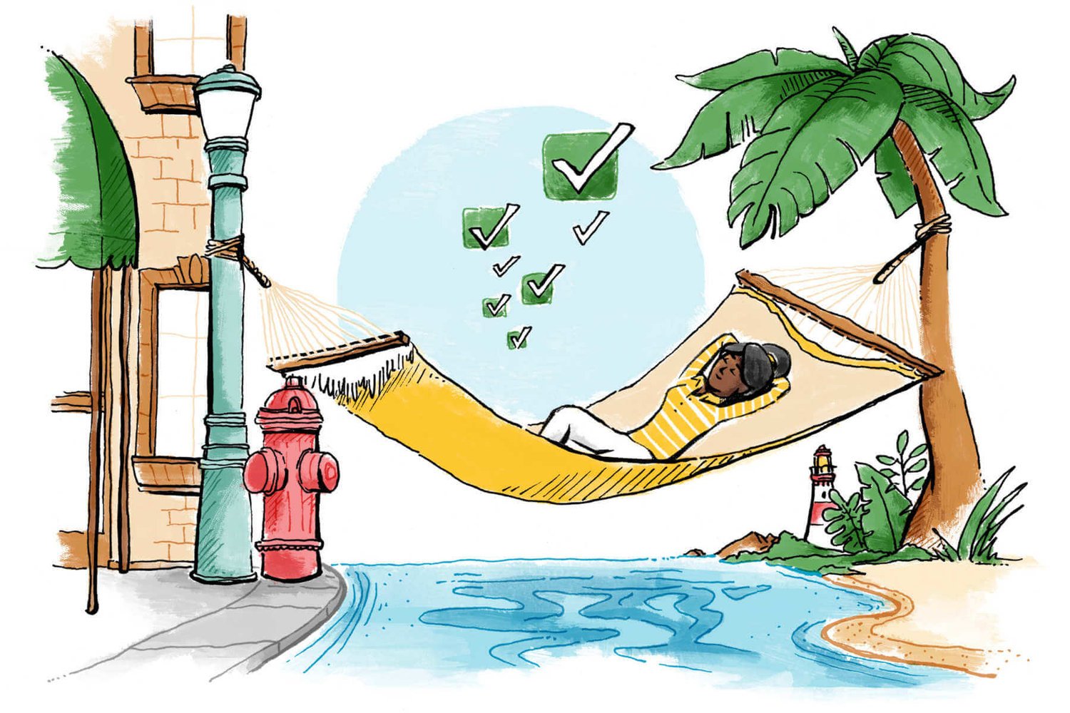
“The Art of the Mini-Vacation”

This article was all about mastering a quick getaway – something I am actually a pretty big fan of personally (I’d rather explore a lot of smaller, weekend trips rather than try to pack all of my vacation hopes-and-dreams into one big trip). This article also continued the concept of showing a New Yorker enjoying the vacation settings juxtaposed with scenes from the city in each illustration.

“Don’t Travel Too Far”

“Don’t Overload Your Itinerary”

“Stay Near Bars, Restaurants, and Stores”

Credits
Art Director
Sam Kim
Illustrator
Russell Shaw


