Paint Love
Web
2020
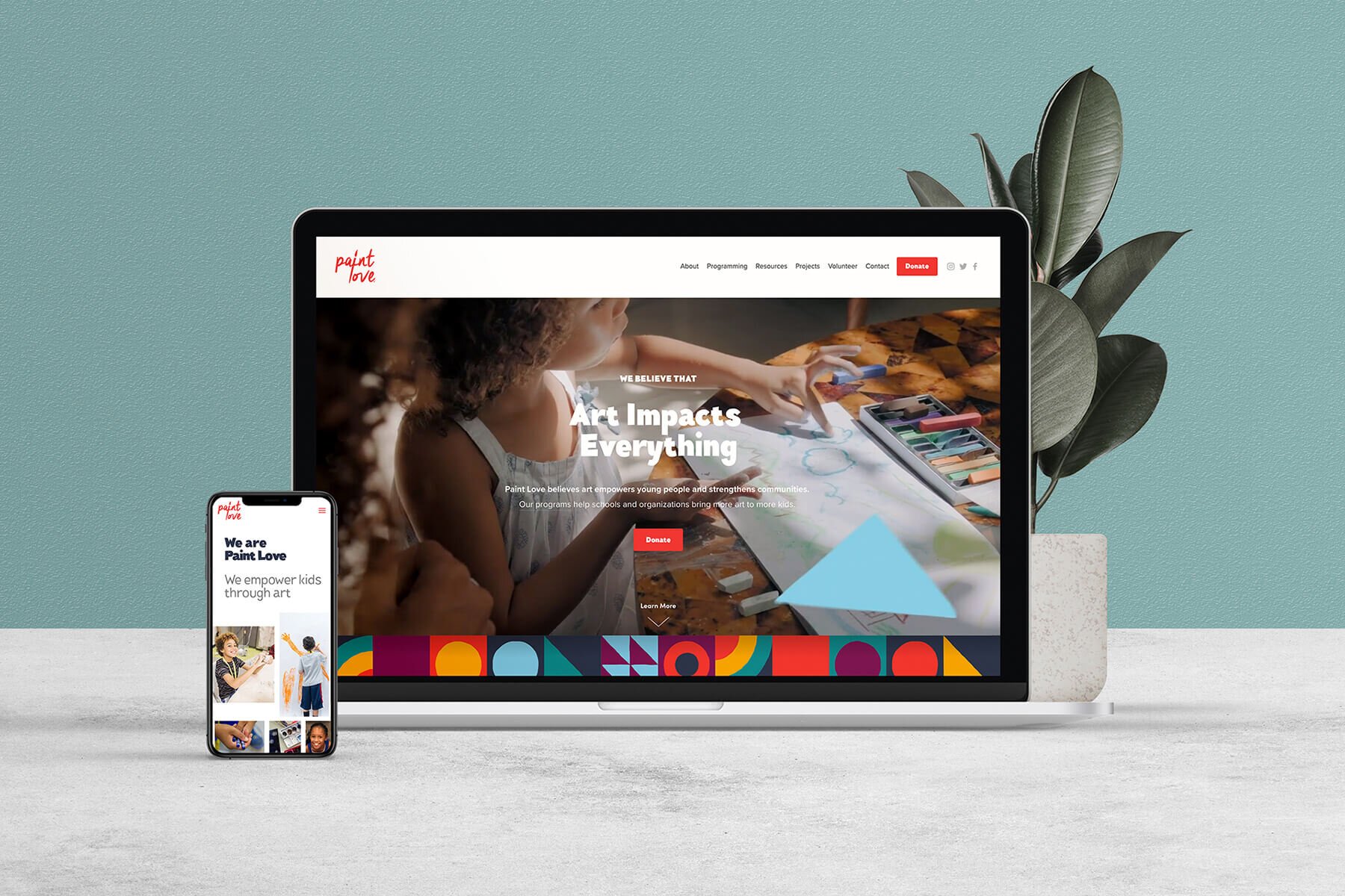
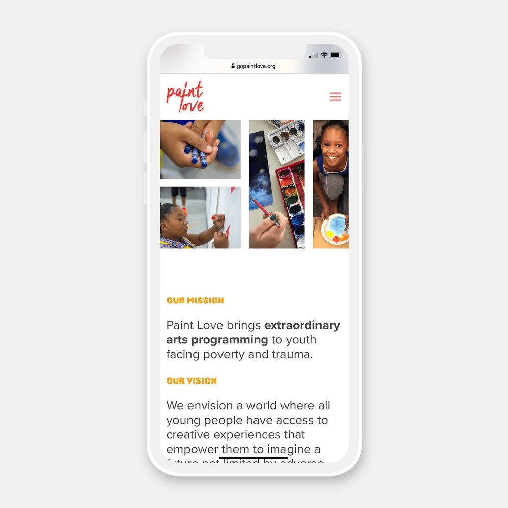
A brand refresh and holistic, complete website redesign for Paint Love, a non-profit organization whose mission is to bring extraordinary arts programming to youth facing poverty and trauma.
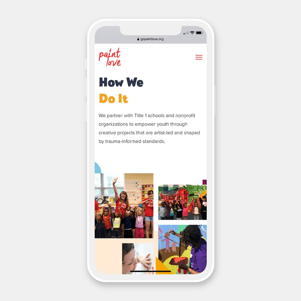
By partnering with Title 1 public schools and other youth-serving non-profits, Paint Love empowers youth through creative projects led by professional, high-quality artists with programming shaped by trauma-informed standards.
This organization means so much to me personally. Growing up in a public school system, good arts programming was everything to me. It not only meant a positive creative outlet, but it ultimately connected me with the possibility of working as an artist and opened the doors to what I do today.
It was a great pleasure to then help this organization tell their story, both narratively and visually, in a way that invites others into their mission through a complete redesign of their website and a refresh of their visual brand overall.

First, I audited the old site. Then I created a new sitemap and overall structure that would help to better tell the story.
This new format lays out the brand narrative more succinctly and tells a story as the user scrolls. Now, the narrative establishes that: art matters and impacts youth; Paint Love provides unique programming that creates that impact; casts a vision for a better world; and invites the viewer to join that vision.
This narrative overhaul also accompanied visual updates with a new typography system that creates a clearer information hierarchy and also feels appropriately whimsical and playful for an organization serving youth. I also created an expanded and engaging color palette to tie it all together.


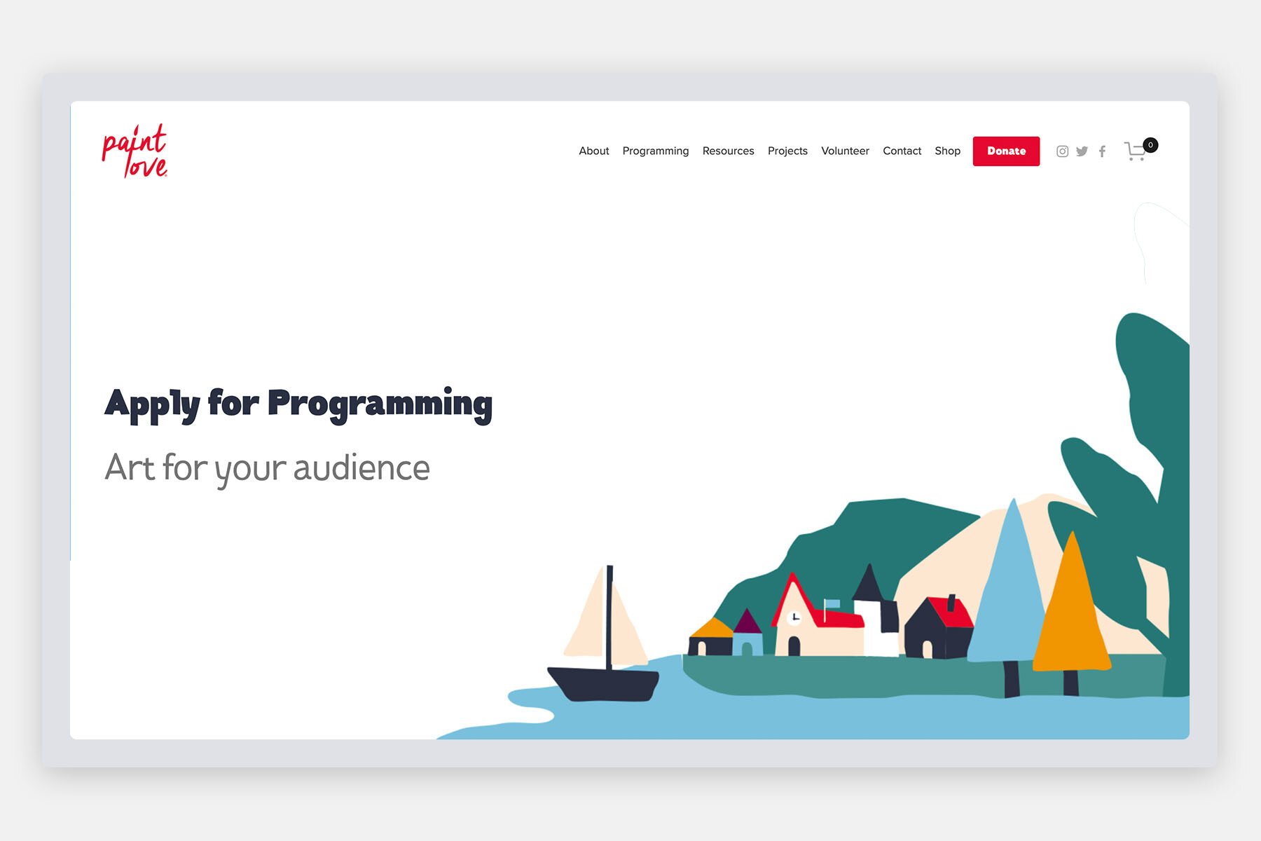
The website also includes a new series of rough-edge, paper-cut shapes and illustrations that create playful scenes of this envisioned “better world.”
These illustrations fill the hero areas at the top of certain key pages, or are animated to create impact around the vision statements on the homepage.
Other playful shapes cascade through the background of pages, or create rich patterns and borders that add personalization and character as the user scrolls.
All pages are built to be responsive and scale down well from a widescreen desktop to a mobile experience.


