

Dixon Rye
Branding, Guidelines, Packaging, Pattern, Illustration
2024-25
It’s not often you get a chance to re-brand your own design work.
As Dixon Rye approached its tenth anniversary, it sought to bring its separately-branded interior design studio (Bradley Odom Interiors) under the Dixon Rye brand umbrella (Dixon Rye Interiors) as well as prepare for a move to a new location that would house an event space and bar to expand the brand’s offerings. All of this change created a unique moment to mark the growth of the brand. Working closely with the Dixon Rye team, I revisited the brand identity work that we launched the company with ten years ago to take a pulse on what assets are still serving us well and what assets we felt ready to evolve to push us into the next chapter.
The resulting brand refresh holds true to several pillars that we established in the beginning — the logo did not change (although we finely tuned it in order to last another decade and onward) and the deep, navy blue stayed a distinctive core color. But while these visual elements anchored us, we cohesively expanded upon and added several tools to our brand tool chest: the monogram has been entirely redesigned to create a unique mark with enough character to represent the brand as a standalone symbol; the color palette is broadened to include color families used for the holiday season and for the new bar and event spaces; the typographic system is revitalized with something particular and classy yet contemporary; and a new, post-modern pattern that is striking and visually arresting wraps the packaging and materials in something uniquely Dixon Rye.
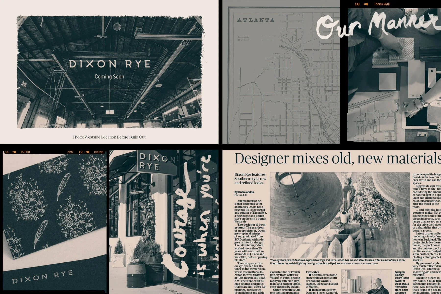
Auditing Our Origins
Taking a look back, we found elements of the brand that have aged well and become recognizable with time. The distinct and custom logotype still feels like Dixon Rye — a demi-serif that carries a mix of raw and refined. And the deep, navy blue that serves as the basis of our retail packaging as well as painted on bookshelves and walls in the store has become recognizable as well.
The original “DR” monogram, however, used the initials from the custom logotype and interlocked them together. The result was something that felt less ownable when abbreviated than when it was the full logotype. And the floral and feather pattern was elegant for our beginnings, but didn’t echo the more dramatic and modern tone that we wanted to set for the brand’s future.
So we kept the decade-running logo and the core navy color, and expanded outward from there.

Logotype Refinements
This moment did offer a chance to refine the logotype even further, so that it would last another decade and beyond, while only making changes that would be imperceptible to the established audience. A couple of rebalanced serifs, a few angular fixes on the caps of some letterforms, and minor kerning and baseline adjustments honed the logotype to scale and perform even better from mobile screens to storefront signage.
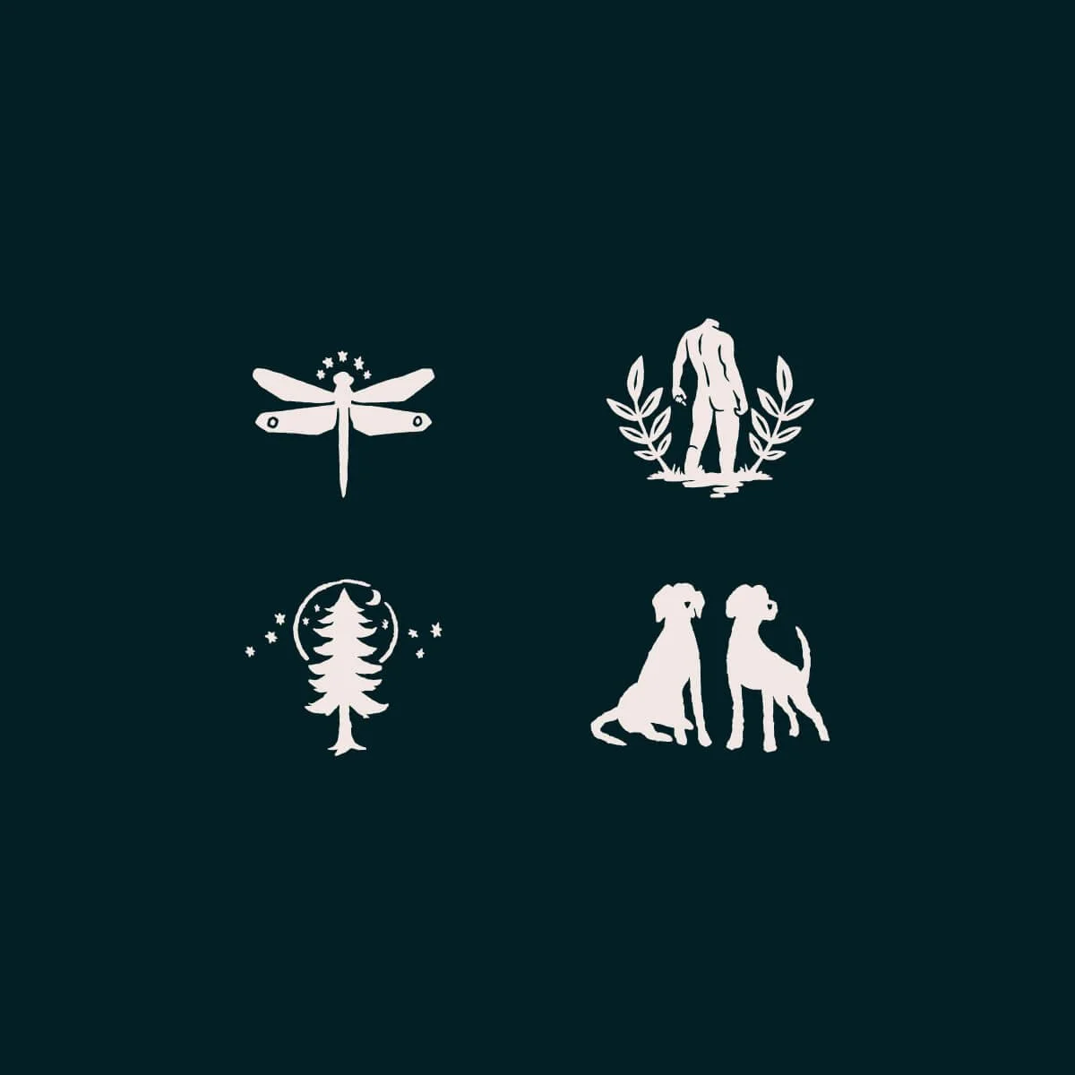
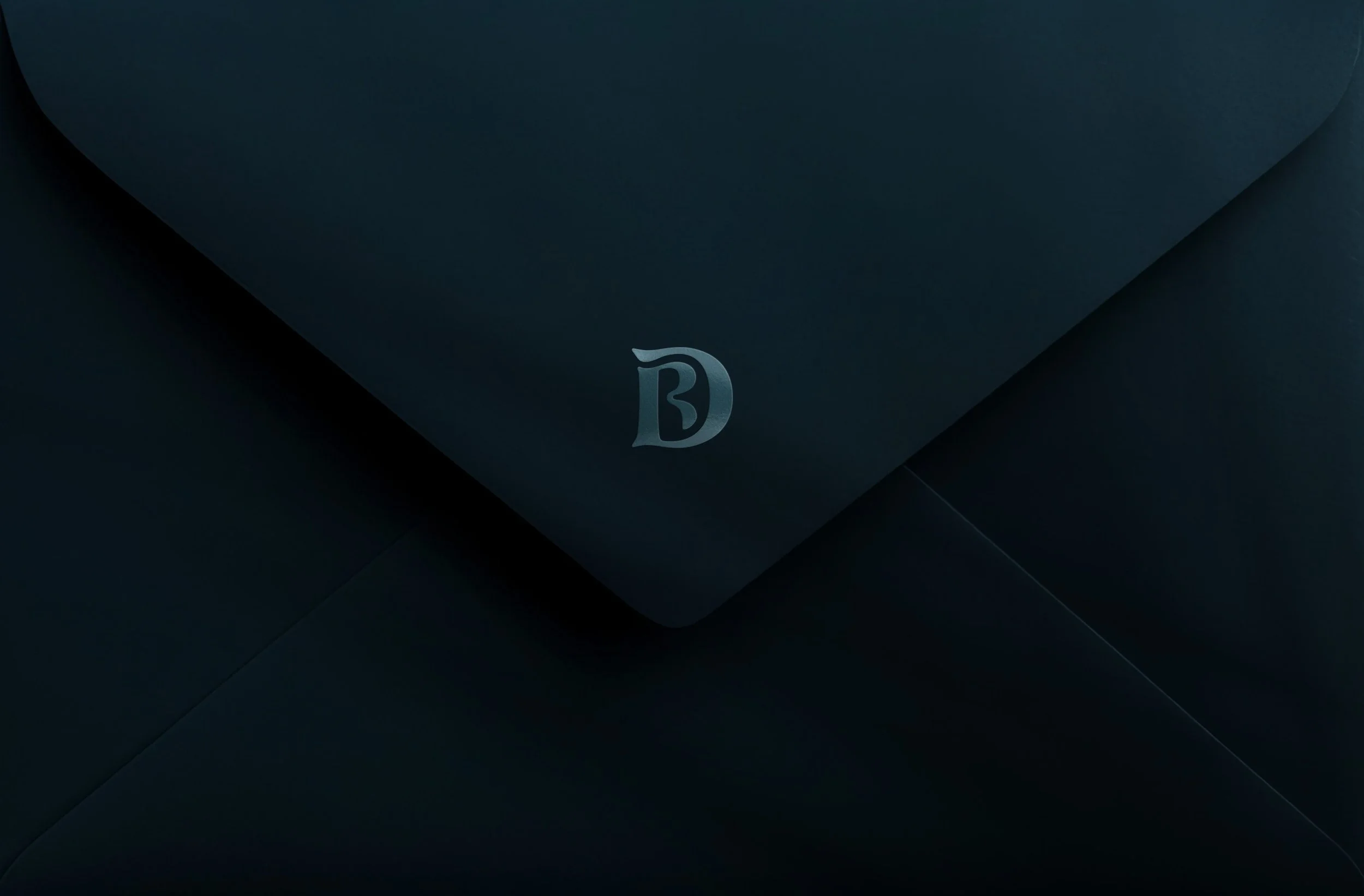
A New Symbol
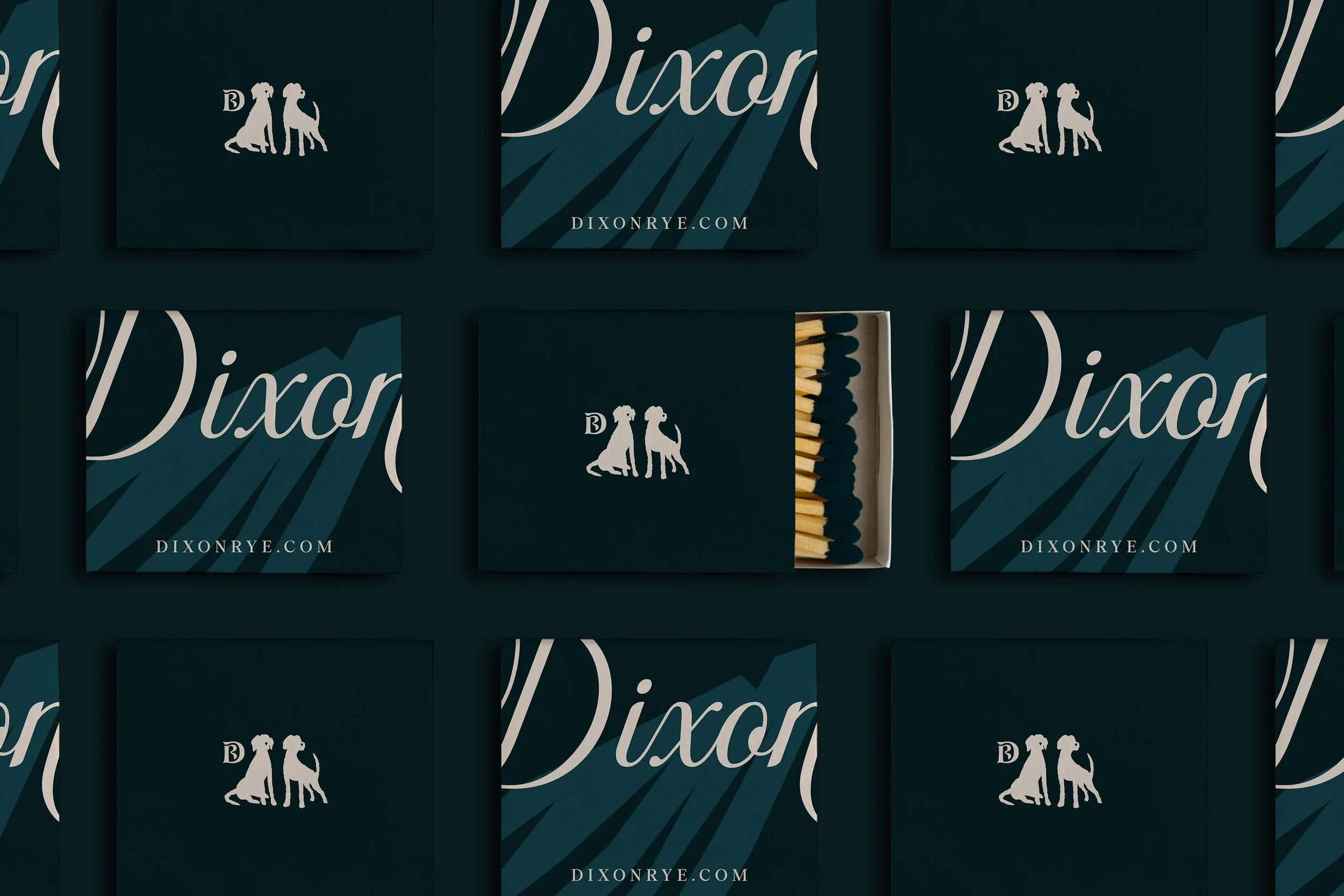
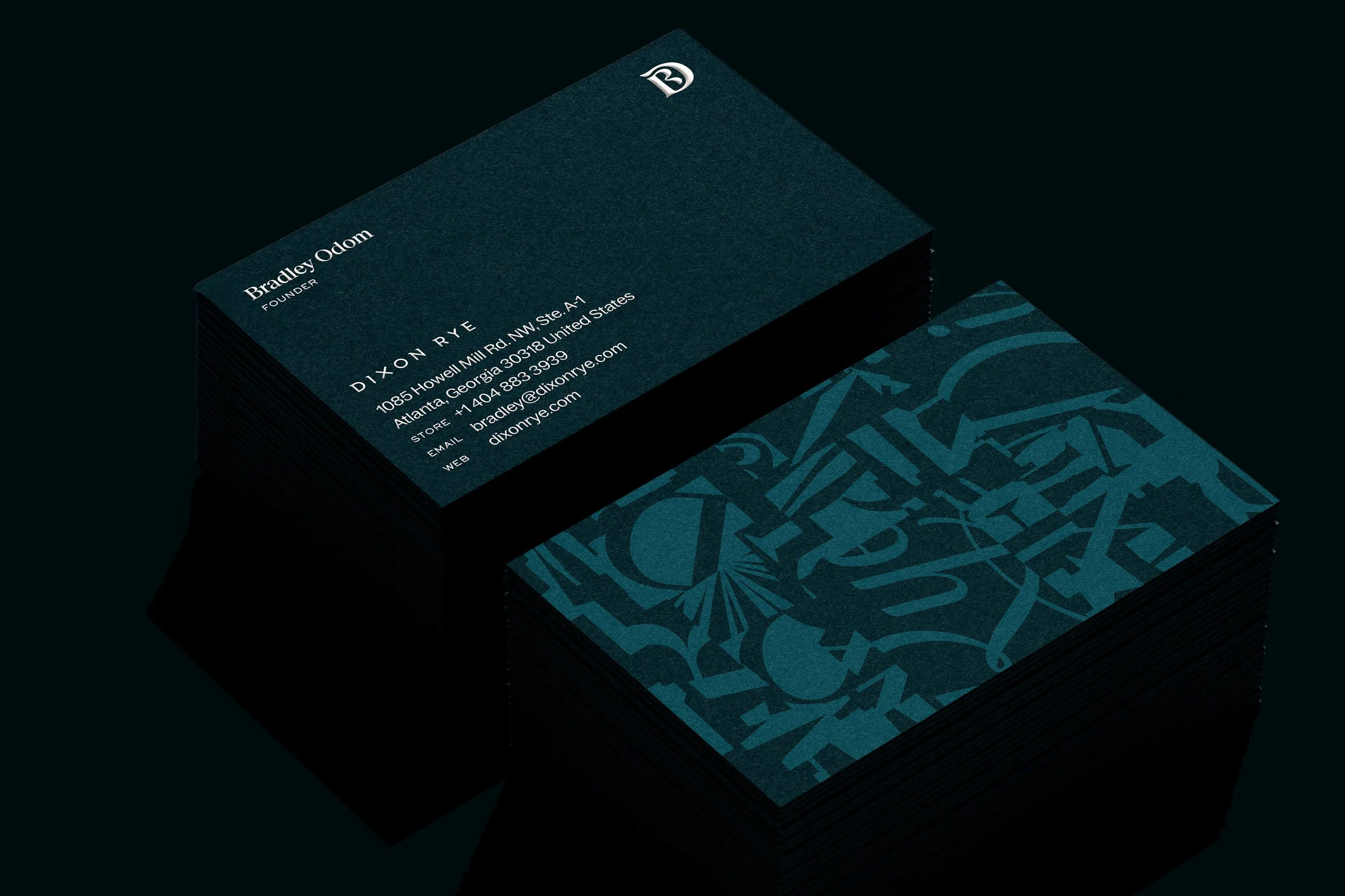
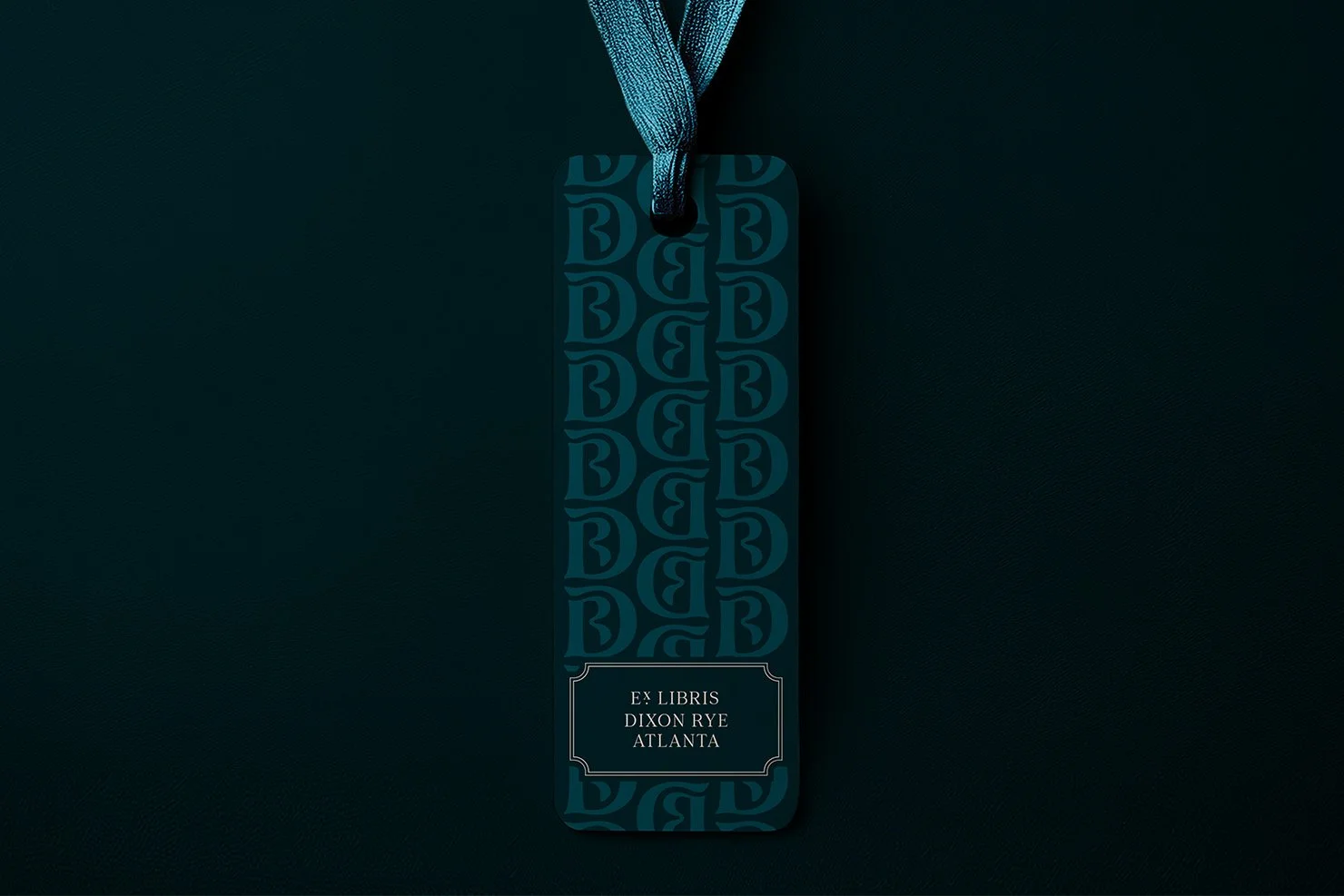
One of the largest opportunities for the rebrand was in creating a more distinctive and ownable monogram that could stand alone as a symbol for Dixon Rye. Where the old monogram used the initial letterforms of the custom logotype, the new monogram is drawn to hold its own: a woven “D” and “R”, crafted for the “R” to branch off of the stem of the “D” and nestle inside its bowl. The rich serifs give it class, the curves give it something sexy, and the overall form has verve and attitude that sets the tone for where the brand is headed next.
Brand Guidelines
A brand new set of guidelines document how the brand can stay consistent as it grows and expands over time with the new offerings and physical space.
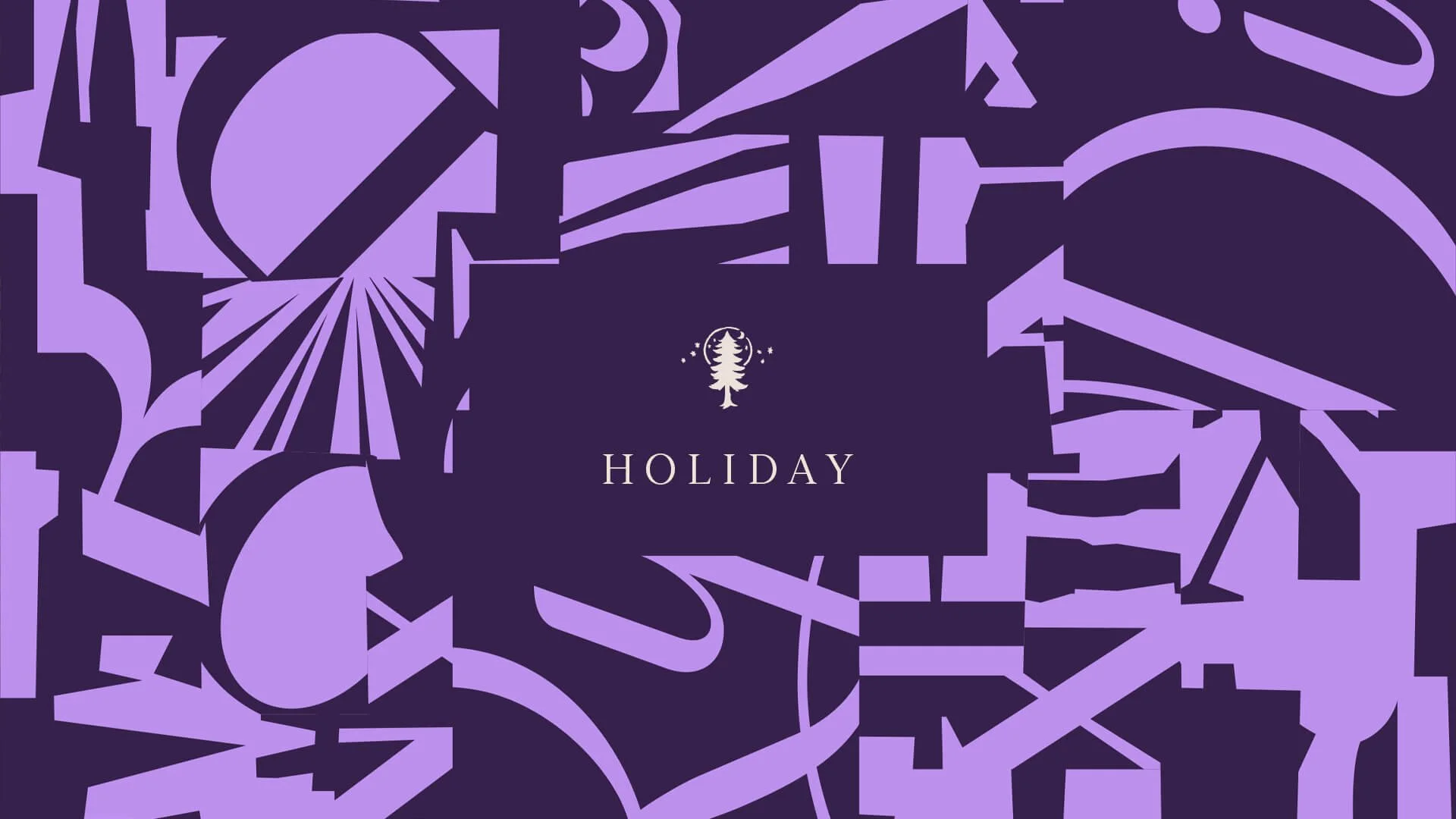
An updated color palette places an off-white “Cream” and deep, dark “Lagoon” as the new neutral bases for the brand. Our distinctive “Hague” navy is still at the forefront of the brand — and even pairs nicely with Lagoon for subtle tone-on-tone patterns. But the addition of Olive green, Port purple, and Cocoa brown — each with their own bright accent color to create a duotone family — gives us the opportunity to theme different parts of the new space with a color as well as have a distinct color palette for the holiday season.
A revised typographic system also refreshes the spirit of the brand, with an elegant yet angular serif for headlines and a solid workhorse sans-serif for long-form copy.
Signature Pattern
While the logotype stayed the same and acts as the primary face of the brand, we added a new, expressive signature to the system. The signature is a personal mark used on branded communication to insiders: subscribers, customers, and designers.
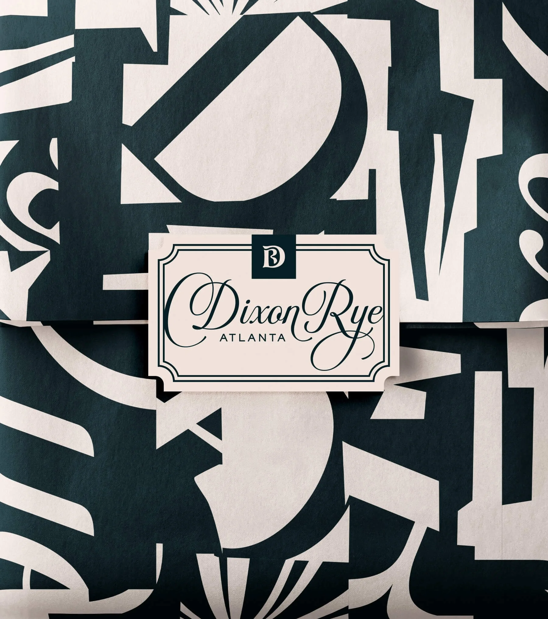
But my favorite part of the brand refresh is the new pattern that emerged from the work. The signature, logotype, and monogram are fractalized into a post-modern series of shapes and tiles form a striking, bold, and graphic pattern. As a tissue paper and packaging, it wraps the product with a more artful statement piece rather than a simple repeating pattern.


Dixon Rye Candles
Along with the other reasons marking the occasion for the brand refresh, Dixon Rye is also launching their own line of luxurious candles with two original scents: Au•Gust and Noteworthy.
The packaging design for the candles utilizes the new brand identity system, complete with the subtle tone-on-tone Hague + Lagoon pattern under the lid of the box as well as unique illustrated icons to represent each new scent. The box’s lid features the new monogram, while the bottom of the box “signs off” with the signature.


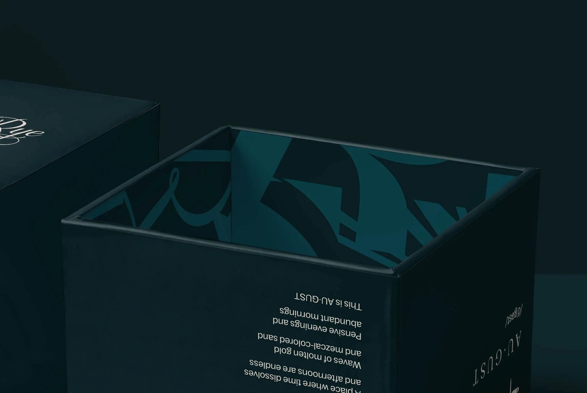
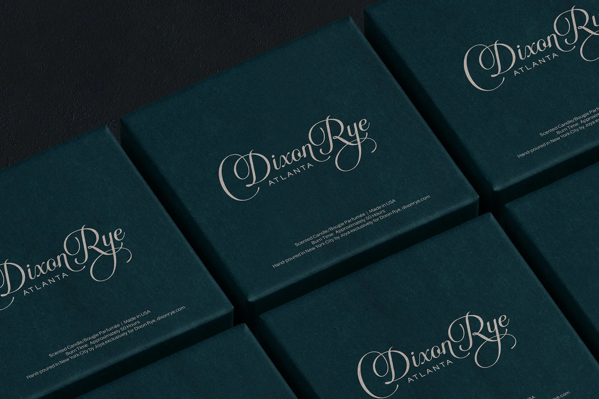
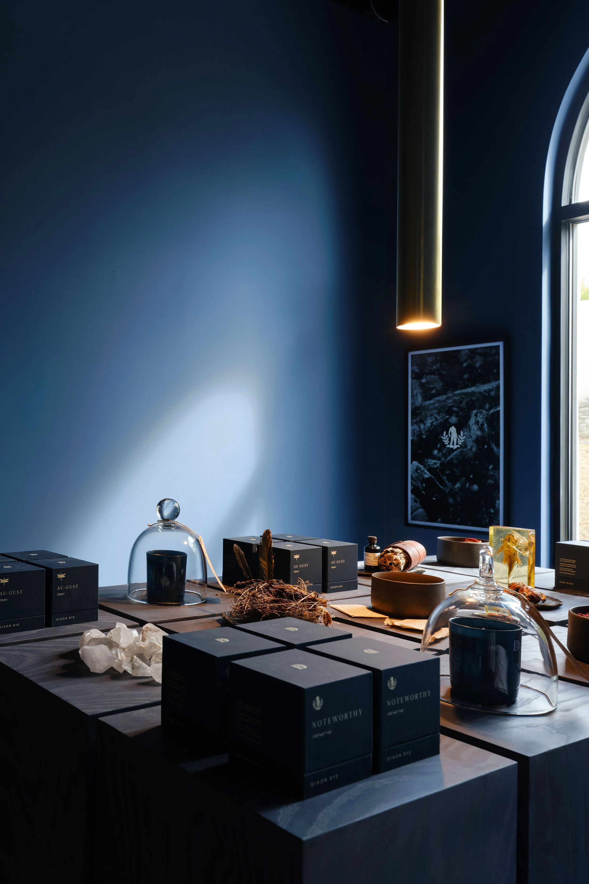
Photo by Mali Azima
Dieline Awards Winner
The packaging and design for the candle launch won third place at the 2026 Dieline Awards in New York.


Pardon our progress: The brand refresh is being teased out across many in-store surfaces, packaging, and social communications as we speak. The digital home for the unified store and interior design brands will debut soon with an all new ecommerce platform. Over the coming months, you’ll see more brand updates that align with this evolved vision. The result will be a more recognizable, more ownable Dixon Rye.

Credits
Client
Dixon Rye
Dixon Rye Team
Bradley Odom (Founder), Peter Huesemann-Odom (Design Director), Wes Graf, Adam Bryan, Brent Jacques
Creative Direction, Brand Design
Russell Shaw
Store and Interiors Photography
Mali Azima
SPECIAL THANKS
Garrett Callahan (Joya Studio), Bill Martin and Karen Robertson (Innovative Packaging Group), The Match Group, ASAP Signs Atlanta
Press, Awards & Recognition
2026 Dieline Awards Winner
“Dixon Rye Candles Rebrands and Marks the Growth of the Brand”
(THE DIELINE)

Docusign
Branding, Creative Direction, Guidelines
Heritage Halal Market
Branding, Guidelines, Illustration
