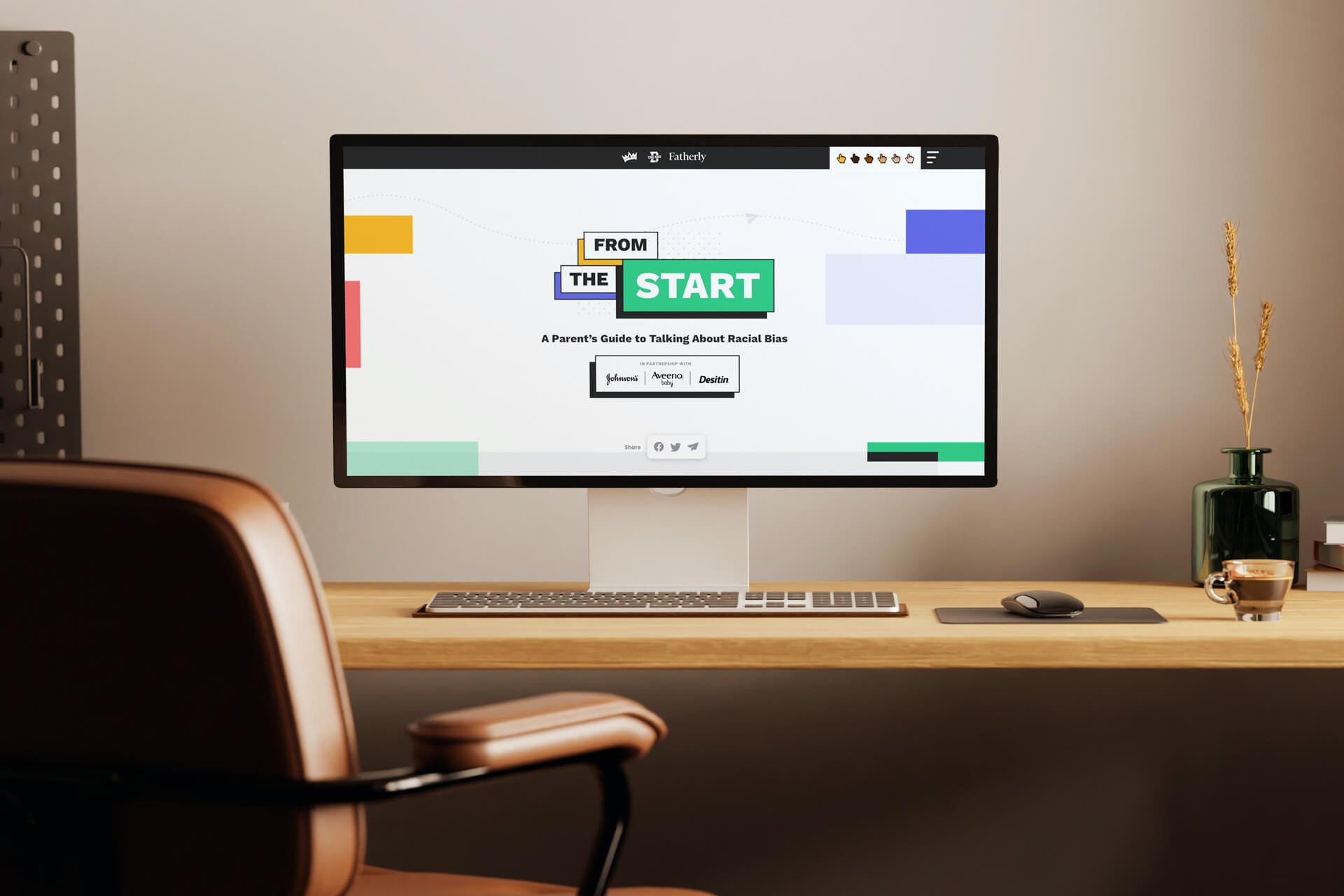
From the Start
Branding, Web
2020
I worked with the lovely people at Fatherly, Scary Mommy, and Some Spider Studios (now BDG) to craft a brand identity around and design the web experience for “From the Start,” a parent’s guide to talking about racial bias, in partnership with Johnson & Johnson. Our team created a video series, live event, social posts, articles, lists of resources and more for the launch of the digital hub. This project was meaningful to work on and the end product received great recognition from industry organizations.
The visual identity for the series was vibrant and energetic, with “coloring book”-like artwork, a 90s-inspired palette, and unique page layouts and elements to make it engaging (and even a bit nostalgic) for young parents.
Brand and web Design
Russell Shaw
Art Director
Anne Meadows
Illustrator
Alycea Tinoyan
Developer
Lou Harding

The slide-out menu design showed logos of all of the collaborators and big, colorful headings to jump to content on the page.

The horizontal scrolling carousel of articles linked to content on the Fatherly and Scary Mommy sites. Each article featured hero artwork of Alycea’s illustrations using the From the Start color palette; this made everything look cohesive throughout the hub page.
Interactive Cursor
The site used a custom cursor, and the top navigation featured a menu that allowed the user to select a different emoji-like skintone for the cursor based on their preference. It was a cool extra built into the experience that also reinforced the theme of the digital hub.
Animated Statistics
Subtle animations in the “By the Numbers” section of the site rotated different stats across the page to show the impact and scale of the discussion.

Hosted by Scary Mommy’s Micaéla Birmingham, the site launched with a digital live event featuring a panel of guests and in-depth conversation around raising children with awareness and understanding.
I designed the graphics package for the event using the visual identity of From The Start on everything from interstitial slides and lower-thirds to hold screens and a fun (though hopefully unused) “technical difficulties” slide.


Awards &
Recognition
Adweek
M&M Global Awards
Digiday
Pressboard
Campaign LIVE Awards
Festival of Media
Read more in BDG’s write-up about the project.


