Third Haus
Branding, Guidelines, Messaging, Illustration
2019
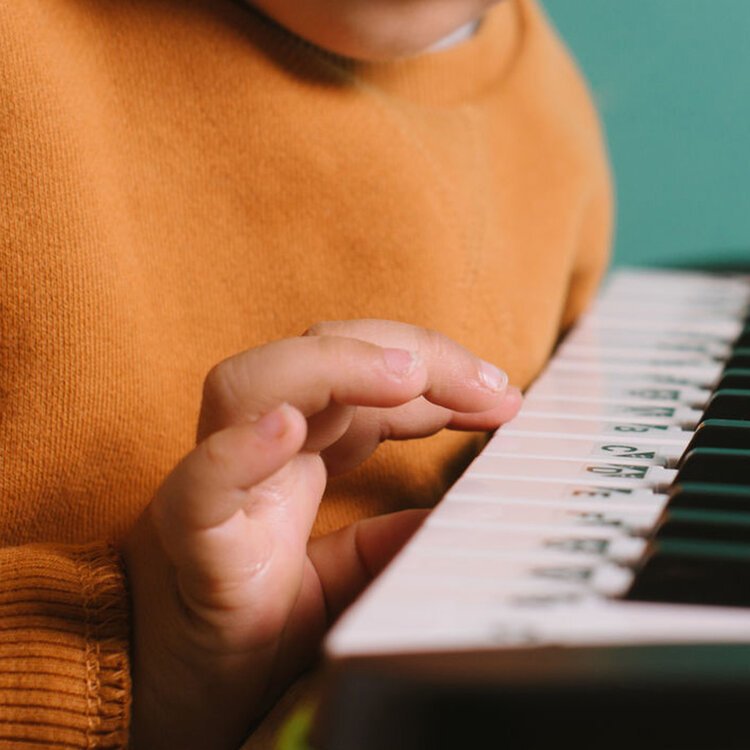
Third Haus is a place in the heart of San Francisco’s Mission neighborhood that provides a space for kids to realize their passions through curiosity, commitment, and patience.
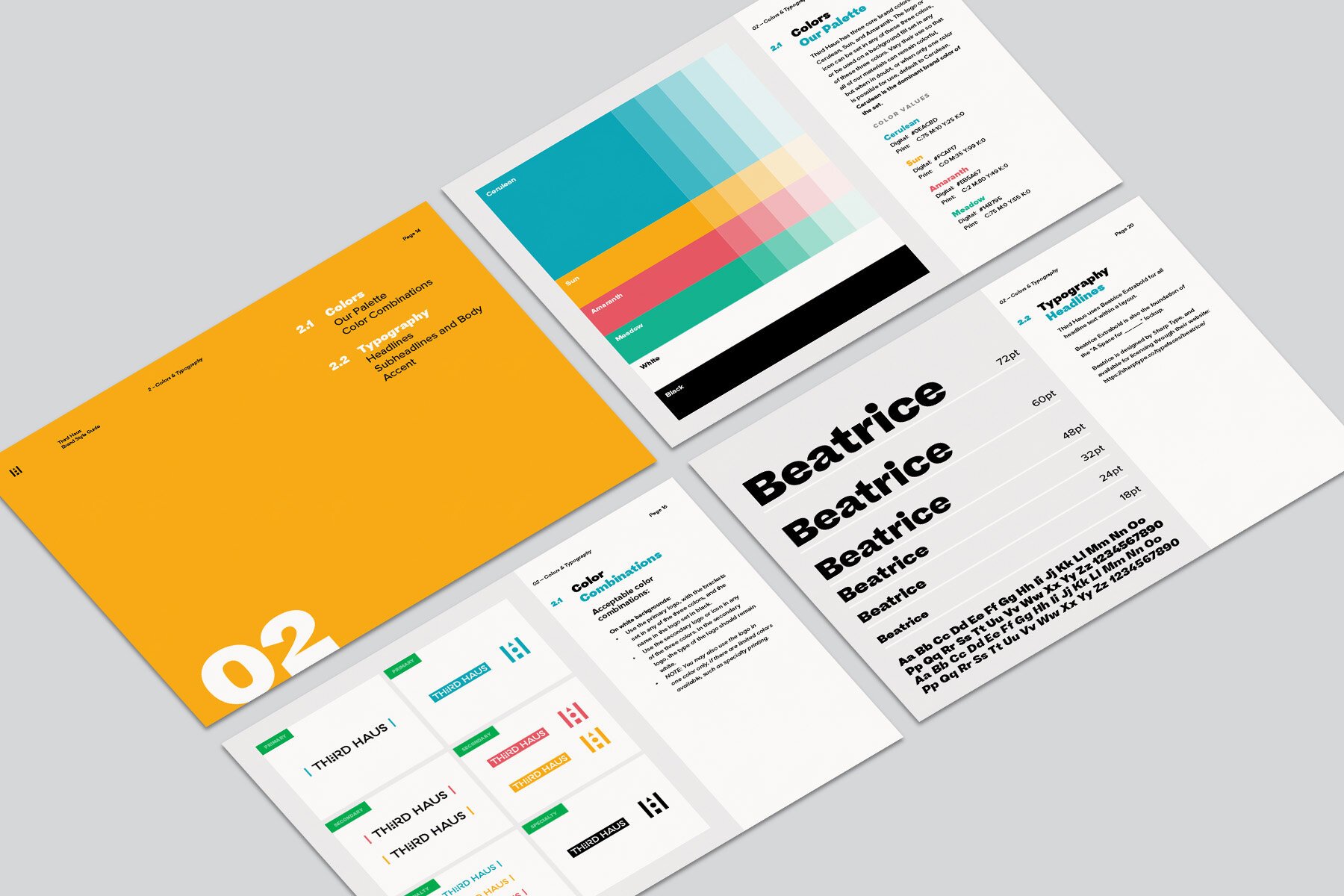
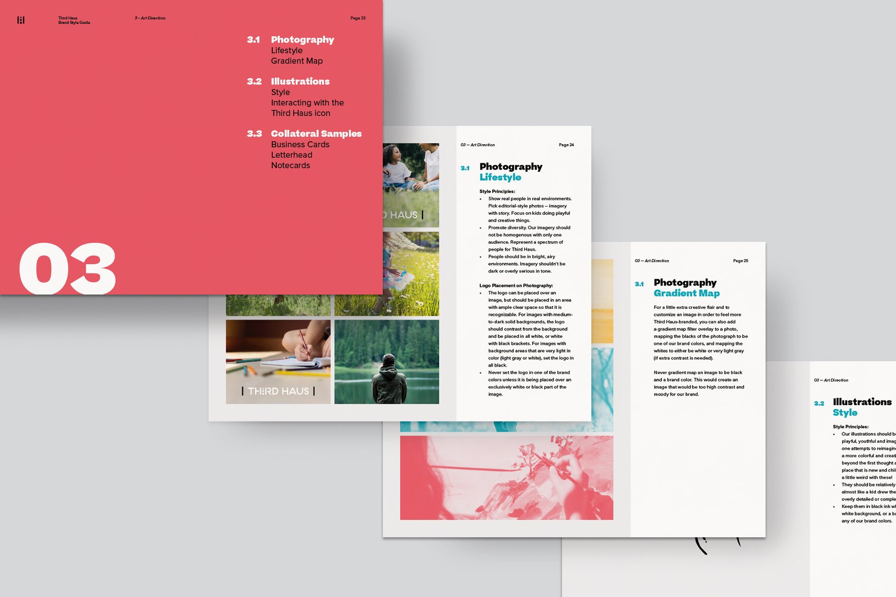
Third Haus offers a huge range of creative programming — from arts and design to music; from coding to hip hop dance classes. As such an inspiring organization, this project was a blast to work on with Tiffany Huey, the co-founder, and the Third Haus team. I helped them strategize and develop a cohesive brand identity package including the logo design, icon, font system, color palette, illustration library, and more. These elements work together to help build a recognizable brand for Third Haus’s community, artists, partners and parents.
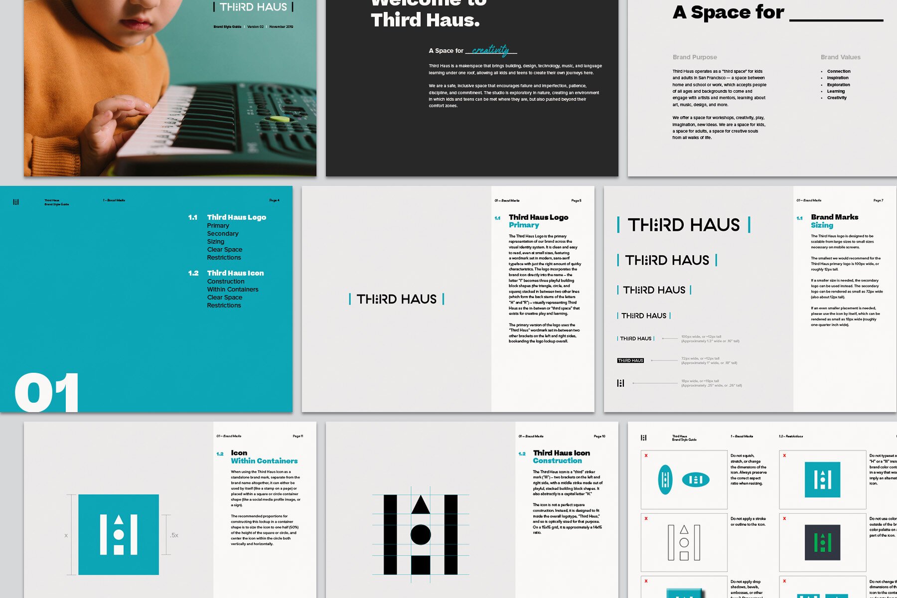
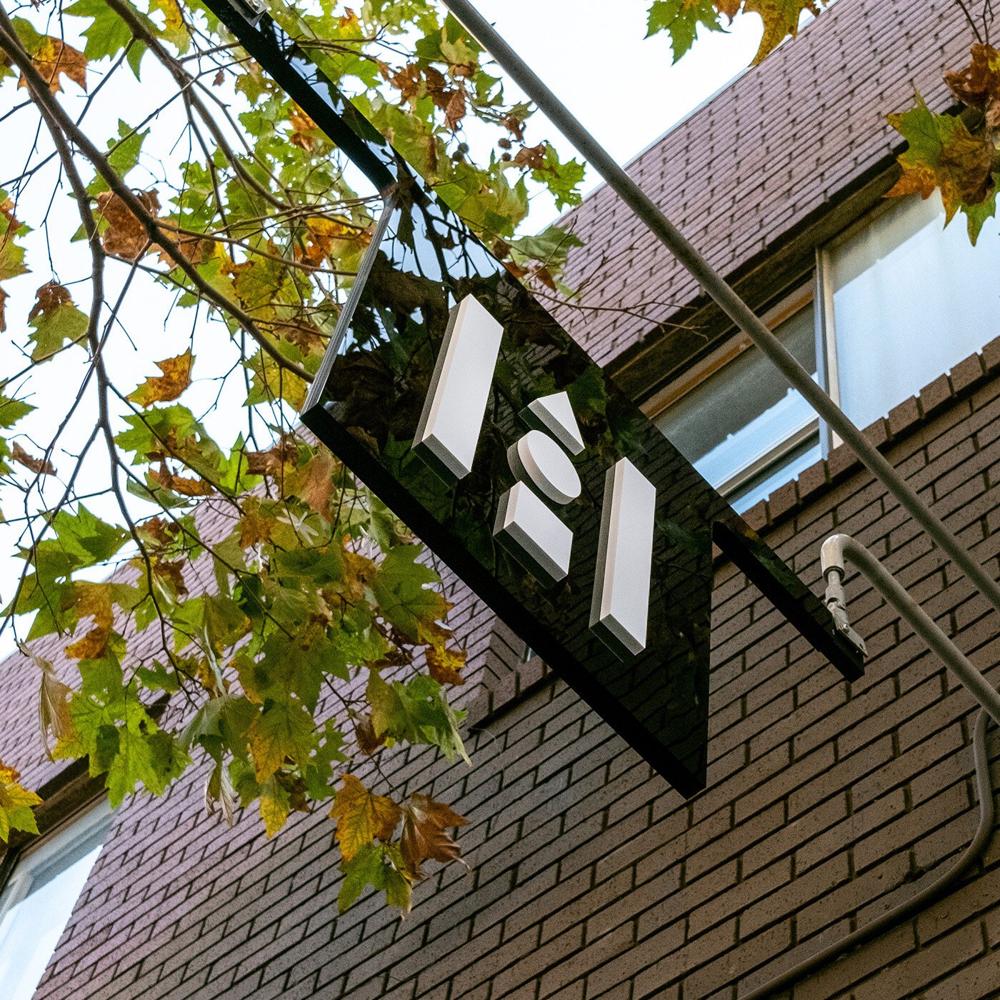
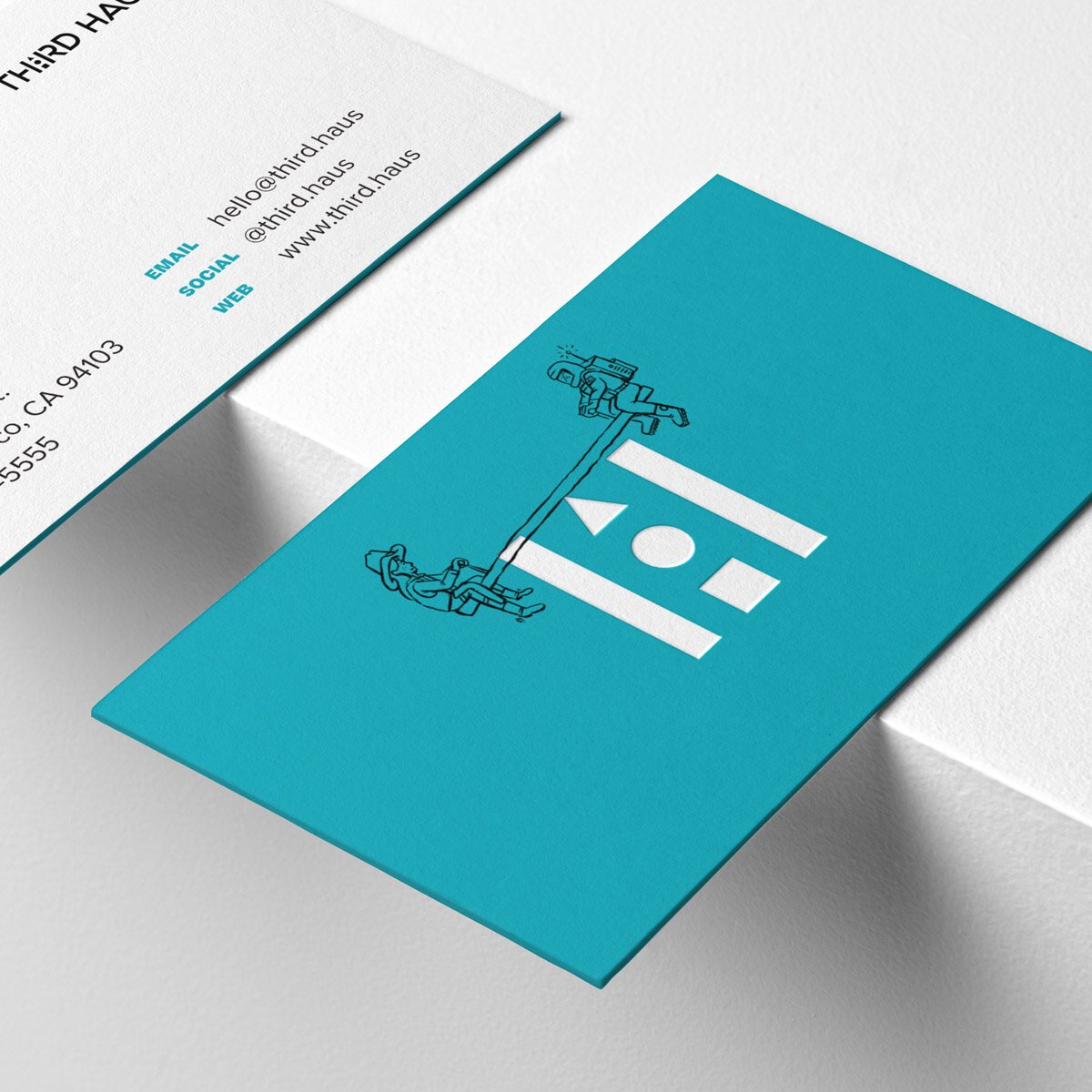
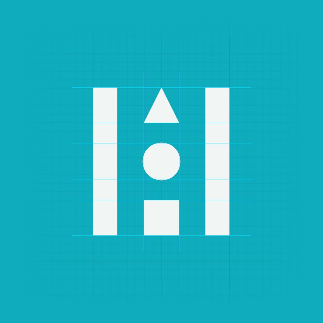
The logo design is inspired by the idea of “third spaces” — places that exist for the community in-between the spaces of home and work/school. This “in-between” space of Third Haus is inherently creative; so the icon represents a “third space” that, in the center, uses three playful little building block shapes to represent the space.
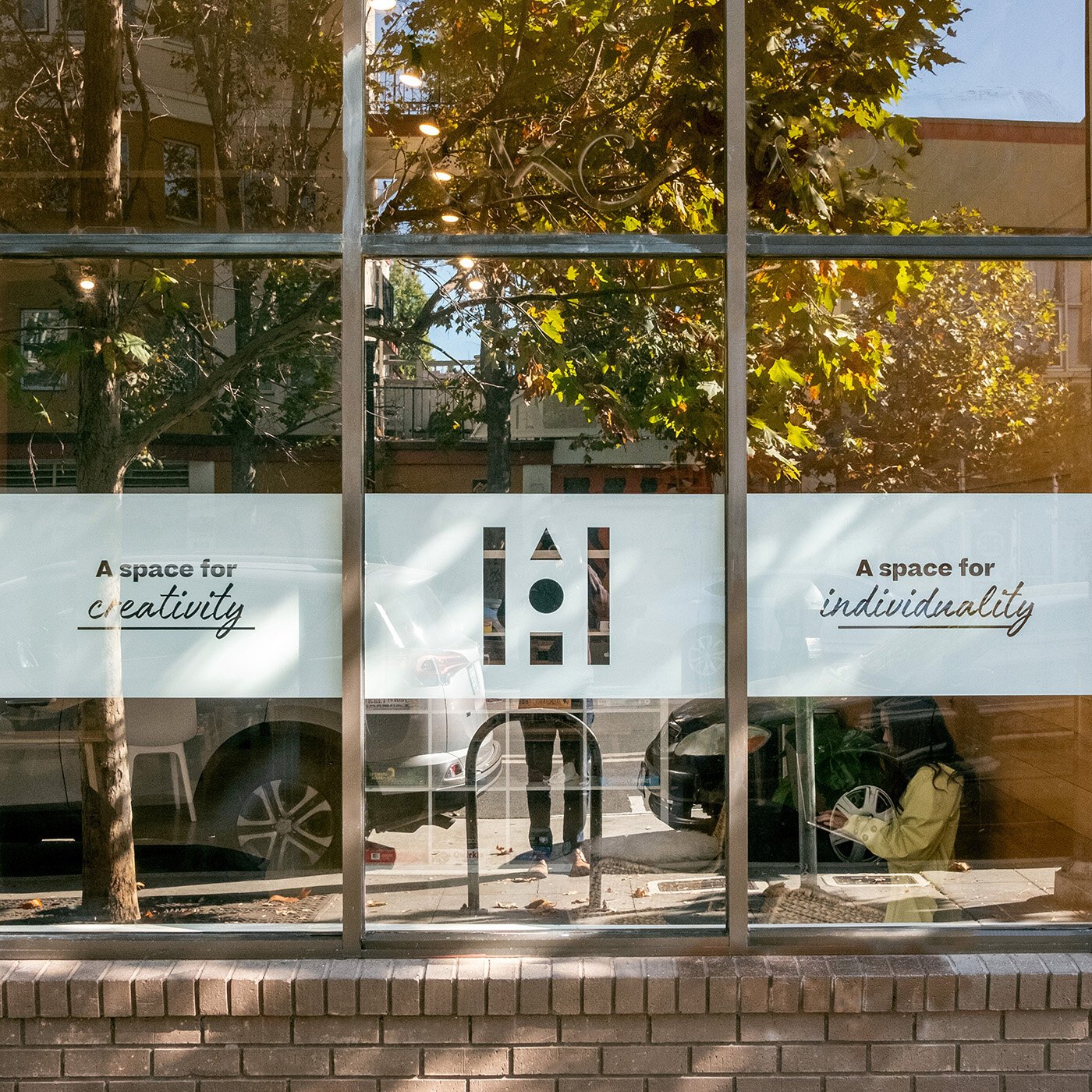
All of this together communicates the identity of Third Haus — a space for connection and creativity; a space for individuality and innovation; a space for kids.


The icon, embedded into the logotype, uses three playful, stacked shapes — a triangle, a circle, and a square — that have two vertical stripes running alongside them, formed out of the stems of the adjacent “H” and “R.” This creates a “three stripes” icon that communicates the idea of a “third” — and also, that the playful shapes are the stripe in the center, meaning that this “third space” is the in-between of home and work/school, and is for childlike creative play and exploration.



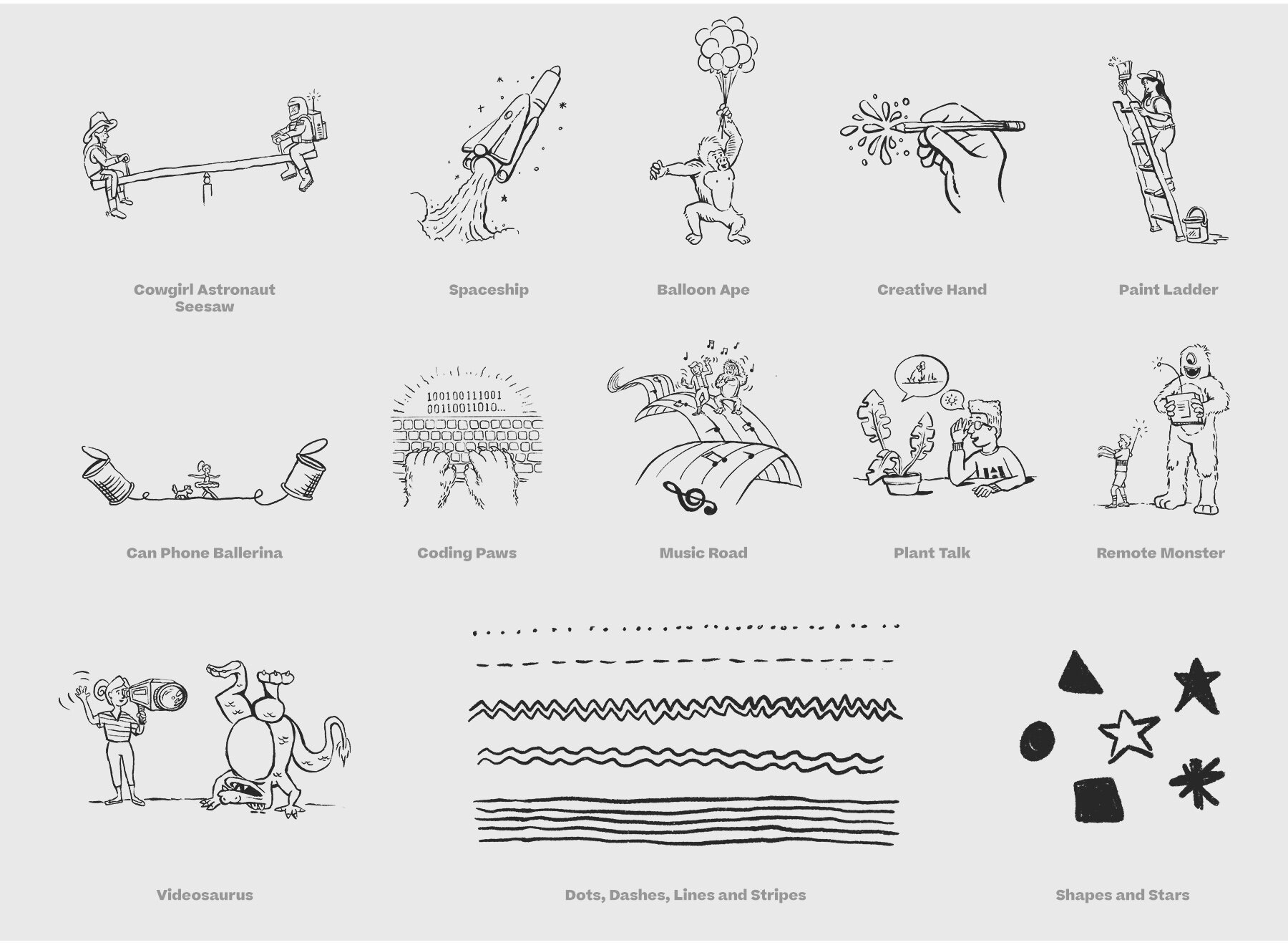
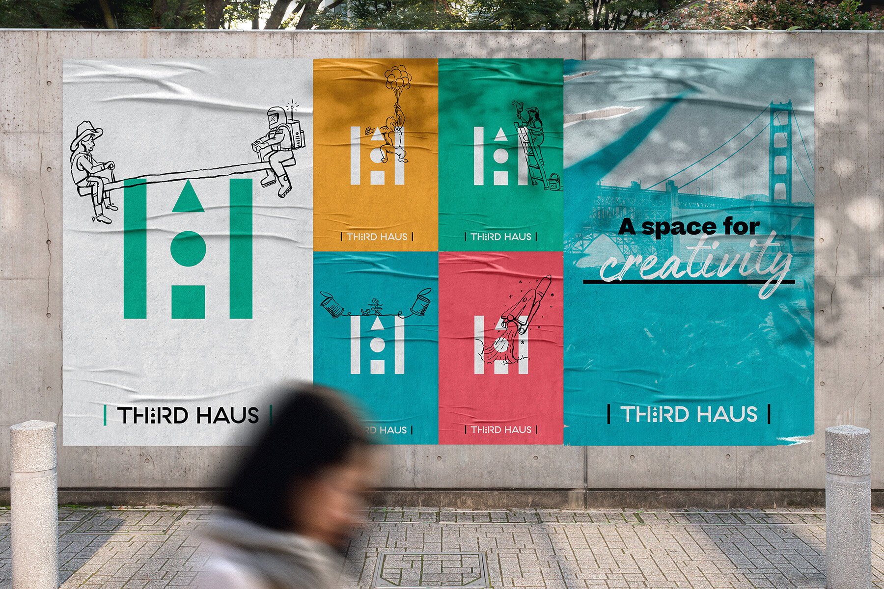
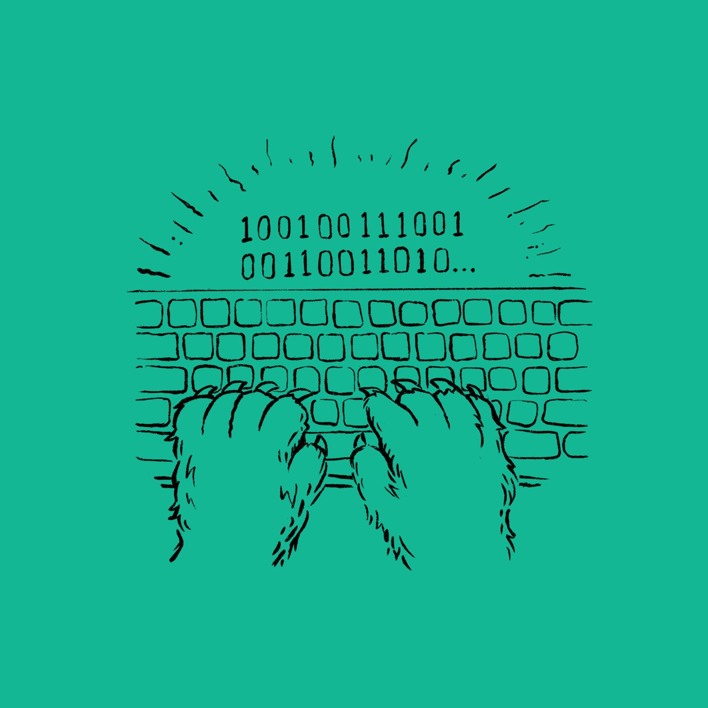
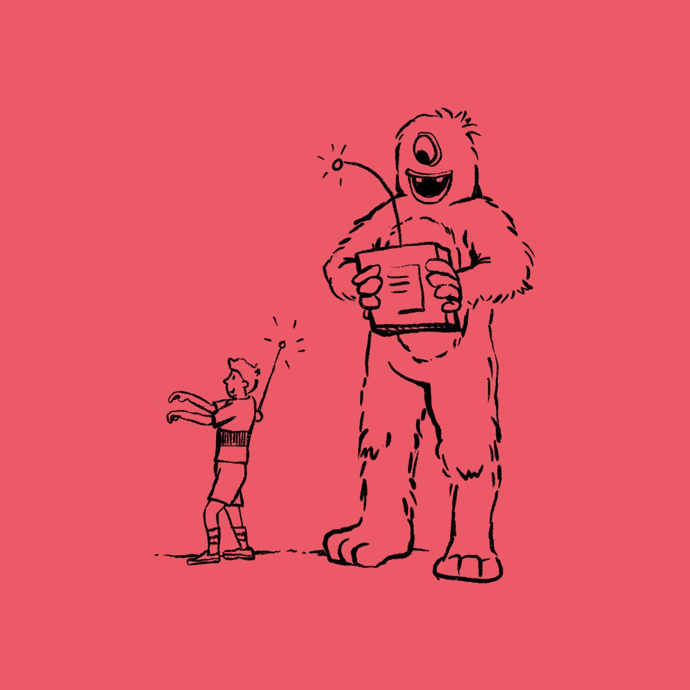
One of the biggest — and most fun to develop! — parts of the brand identity system was to create a growing illustration library, full of playful doodles and drawings that showcase a youthful re-imagining of the world, with everything from a ballerina on a high-wire to a cowgirl and an astronaut on a seesaw, or from a create learning to code to a girl and another creature dancing along a musical road.
The illustrations are designed to interact with the icon — showcasing that Third Haus is the space and stage where all of this creativity comes to life — by running on top of or behind the shapes. For example, the ape holding the cluster of balloons can wrap his arm around the triangle to show that he is floating up and away!
