

The National WWII Museum’s 2024 Annual Report
PUBLICATION DESIGN
2025
The National WWII Museum tells the story of the American experience in the war that changed the world—why it was fought, how it was won, and what it means today.
I have collaborated with the museum’s marketing and publications teams on the 2022 and 2023 annual reports, and partnered with them again to design on the new publication for their 2024 fiscal year. As they reflect on the campus’s recent completion, celebrate the 80th anniversary of D-Day, and prepare for a new capital campaign, we designed the report around the concept of putting people, buildings, and archival objects “in focus” — removing subjects from the background of the photograph to make them larger than life, spanning entire page spreads and overlapping with a rich, jewel-tone color family system, clean grid layouts, and a typographic hierarchy that blended mid-century modern sans-serifs with elegant, editorial serif typefaces.
Cover Design
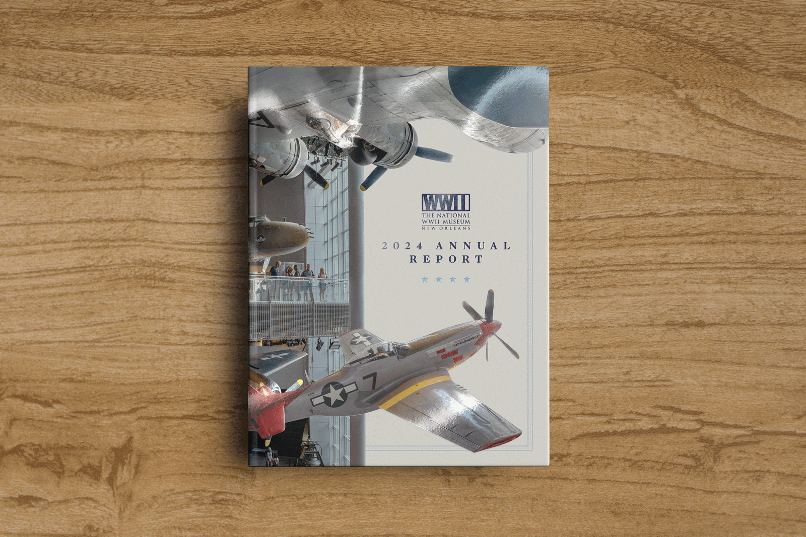
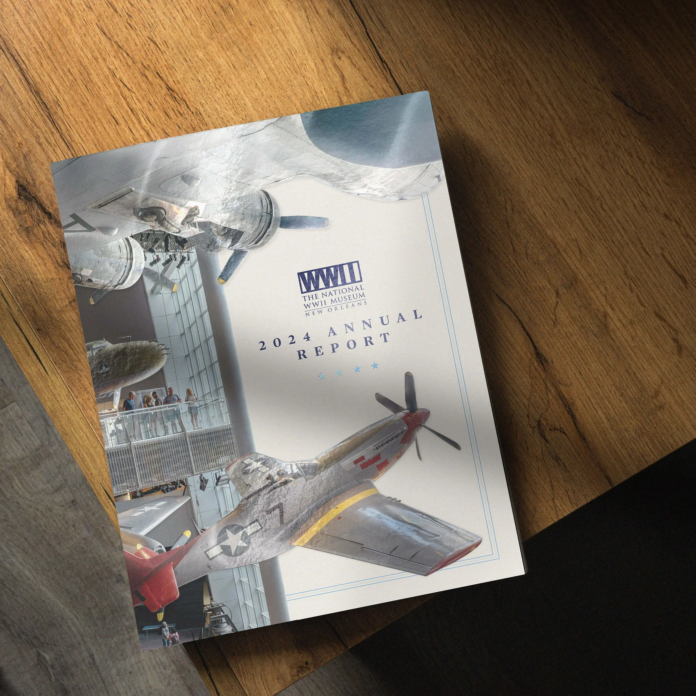
The cover design for the 2024 annual report features an embossed- and spot-UV-coated layer on the original planes that hang in the museum’s hall. This brings them to the foreground, creating a dimensional layer separate from the museum visitors, balcony, and structural column behind the planes in the middle ground. Lastly, the cover design is additionally layered by removing the photograph’s background to allow for placement of the museum’s logo, the report title, and a simple, striped border design that acts as a motif throughout the rest of the book.
Design System Details
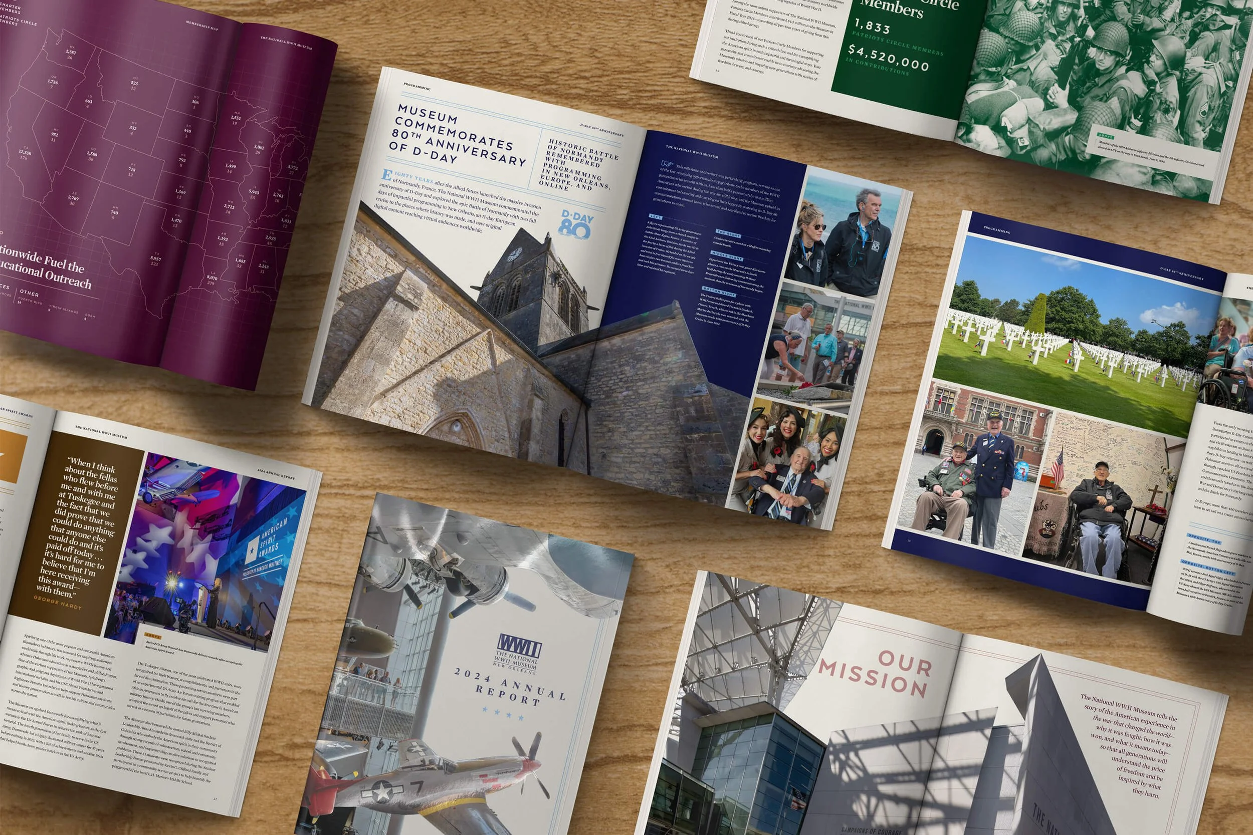
The graphic concept for the annual report is about placing people and places “in focus” — removing the subject from the background of a photo and enlarging it across a spread for a bold photographic treatment.
The rest of the design system uses clean grids and simple layouts with four duotone color families — a deep, rich, jewel tone base and a bright complementing accent tint of the same hue — that alternate throughout the book. The design system also features a combination of a bold, sans-serif typeface reminiscent of mid-century architecture typography and a more elegant and editorial-feeling serif typeface.
The solid stripe and dotted border is used throughout the book in conjunction with headlines as well as photography, highlighting the subject being cut out from the image’s background by continuing the border behind and around it.


Credits
CLIENT
The National WWII Museum
MUSEUM TEAM
Evann Cookmeyer
Keith Darcey
Kenn Perkins
Caitlin Simnick
Stephanie Verdin
Printer
Mele Printing
DESIGNER
Russell Shaw


The National WWII Museum’s 2023 Annual Report
Design, Publication

The National WWII Museum’s 2022 Annual Report
Design, Publication
